skip to Main Content

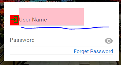
How do I force child element to occupy remaining width of the grid (Material UI)?.

I want "User Name" text field to occupy the remaining space of the grid cell. Unfortunately I am not able to do it.

I tried nested containers also but not success.

enter image description here

import {
  Grid,
  IconButton,
  InputAdornment,
  Link,
  Paper,
  TextField,
} from "@mui/material";
import Visibility from "@mui/icons-material/Visibility";
import React from "react";
import LoginIcon from "@mui/icons-material/Login";

function Login(props) {
  return (
    <div>
      <Paper
        elevation={24}
        sx={{
          width: 300,
          p: 2,
          borderRadius: 1,
          border: 0,
          backgroundColor: "white",
        }}
      >
        <Grid
          container
          justifyContent={"center"}
          direction={"column"}
          rowGap={2}
        >
          <Grid container direction={"column"}>
            <Grid container direction={"row"} alignItems={"flex-end"}>
              <Grid sx={{ backgroundColor: "red" }}>
                <LoginIcon
                  fontSize="medium"
                  sx={{ color: "green" }}
                ></LoginIcon>
              </Grid>
              <Grid sx={{ backgroundColor: "pink" }} xs={"auto"}>
                <TextField
                  fullWidth
                  inputProps={{ style: { fontSize: ".9em" } }}
                  InputLabelProps={{ style: { fontSize: ".9em" } }}
                  id="standard-basic"
                  label="User Name"
                  variant="standard"
                />
              </Grid>
            </Grid>           
          </Grid>
        </Grid>
      </Paper>
    </div>
  );
}
export default Login;

Please be informed, for brevity, I have copied only the relevant code working code.

2

Answers


  1. Chosen as BEST ANSWER

    Solved the issue by giving auto value to 1st cell and xs to 2nd cell (grid)

      <Grid item sx={{ backgroundColor: "red" }} xs={"auto"}> // <------- xs={"auto"}
                    <LoginIcon
                      fontSize="medium"
                      sx={{ color: "green" }}
                    ></LoginIcon>
                  </Grid>
                  <Grid item sx={{ backgroundColor: "pink" }} xs> // <------- xs
                    <TextField
                      fullWidth
                      inputProps={{ style: { fontSize: ".9em" } }}
                      InputLabelProps={{
                        style: { fontSize: ".9em", color: "lightgray" },
                      }}
                      id="standard-basic"
                      label="User Name"
                      variant="standard"
                    />
                  </Grid>
    

  2. flexGrow is a way to go:

    <Grid item xs={true} sx={{ backgroundColor: "pink", flexGrow: 1 }}>
                  <TextField
                    fullWidth
                    inputProps={{ style: { fontSize: ".9em" } }}
                    InputLabelProps={{ style: { fontSize: ".9em" } }}
                    id="standard-basic"
                    label="User Name"
                    variant="standard"
                  />
                </Grid>
    

    Reference: https://mui.com/system/flexbox/#flex-grow

    Login or Signup to reply.
Please signup or login to give your own answer.
Back To Top
Search