


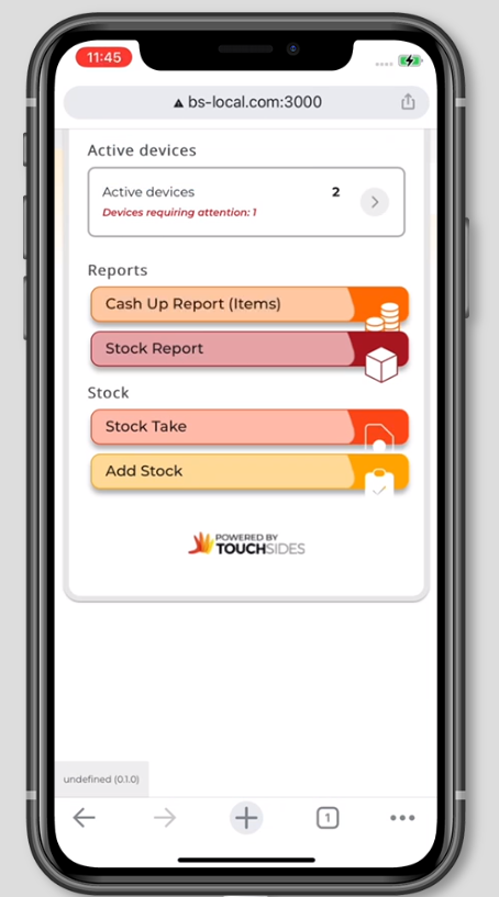
Every time I click on the Material UI text Field on login after I login the screen is pushed down cutting down content on the top of the page. enter image description here
-I checked my CSS thinking maybe because I set my container height to 100vh but that is not the reason.
-I added CSS for screen ratio below 450 to reduce the height to 80vh but still now solution the page doesn’t go back to how it was after typing on text Field
.app-container .unauthorised-view,
.not-found-view,
.login {
  width: 100%;
  height: 100vh;
  background-image: url('../../public/static/media/bg_unauth.jpg');
  background-size: contain;
  background-position: center center;
  background-color: #ededed;
  background-repeat: no-repeat;
  background-size: cover;
  display: flex;
  flex-wrap: wrap;
  justify-content: center;
  align-items: center;
}
2
Answers
Solution
-To resolve the screen always zooming when material ui textfileld and dropdown is clicked, I updated my index.html file with
<meta name="viewport" content="width=device-width, initial-scale=1.0, maximum-scale=1.0, user-scalable=no">-To resolve the problem where the page shifts or is scrolled downwards cutting off top content i added this on my App.js file
useEffect(() => { window.scrollTo(0, 0); });It sounds like the issue might be related to the behavior of the Material UI text field triggering a change in the layout after login. One potential cause could be the virtual keyboard on mobile devices pushing the content upwards when the input field is focused.
You mentioned setting the container height to
100vhand attempting to adjust it for smaller screens, but the issue persists. Have you tried usingoverflow-y: hidden;on thebodyor the.app-containerto prevent the page from scrolling when the keyboard is open?Here’s an example of how you might modify your CSS: