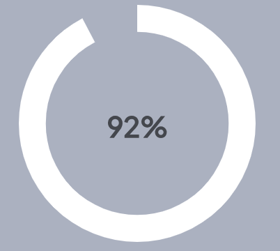
Using CirculaProgress I could get
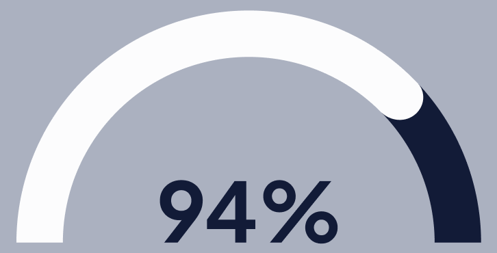
Is there an easy way to change it to semicirle like this?
2
I ended up doing the following.
SemiCircularProgress.tsx
import React from 'react'
import './SemiCircularProgress.css'
export interface SemiCircularProgressProps {
  value: number
}
const SemiCircularProgress = (props: SemiCircularProgressProps) => {
  return (
    <div role="semicircularprogressbar" style={{ ['--value' as any]: props.value }}>
      <span style={{ fontSize: 40, color: '#2b256b' }}>{props.value}%</span>
    </div>
  )
}

export default SemiCircularProgress
SemiCircularProgress.css
@keyframes semicircularprogress {
  0% {
    --percentage: 0;
  }

  100% {
    --percentage: var(--value);
  }
}

@property --percentage {
  syntax: '<number>';
  inherits: true;
  initial-value: 0;
}

[role="semicircularprogressbar"] {
  --percentage: var(--value);
  --primary: #ffffff;
  --secondary: #2b256b;
  --size: 300px;
  animation: semicircularprogress 2s 0.5s forwards;
  width: 100%;
  aspect-ratio: 2 / 1;
  border-radius: 50% / 100% 100% 0 0;
  position: relative;
  overflow: hidden;
  display: flex;
  align-items: flex-end;
  justify-content: center;
}

[role="semicircularprogressbar"]::before {
  content: "";
  position: absolute;
  top: 0;
  left: 0;
  width: 100%;
  height: 100%;
  background: conic-gradient(from 0.75turn at 50% 100%, var(--primary) calc(var(--percentage) * 1% / 2), var(--secondary) calc(var(--percentage) * 1% / 2 + 0.1%));
  mask: radial-gradient(at 50% 100%, white 55%, transparent 55.5%);
  mask-mode: alpha;
  -webkit-mask: radial-gradient(at 50% 100%, #0000 55%, #000 55.5%);
  -webkit-mask-mode: alpha;
}

[role="semicircularprogressbar"]::after {
  counter-reset: percentage var(--value);
  content: '';
  font-family: Helvetica, Arial, sans-serif;
  font-size: calc(var(--size) / 5);
  color: var(--primary);
}
use it like this
<SemiCircularProgress value={95} />
You can, but you won’t be able to use CircularProgressWithLabel. What you can do instead is:
CircularProgressWithLabel
CircularProgress
value
[0, 100]
[0, 50]
-90deg
It will probably look something like this:
import * as React from "react";
import Box from "@mui/material/Box";
import Typography from "@mui/material/Typography";
import CircularProgress from "@mui/material/CircularProgress";

function parse() { ... }

export const function ArcProgress({
  size,
  value,
  ...props,
}) {
  const [sizeValue, sizeUnit] = parse(size);
  const halfSize = `${ sizeValue / 2 }${ sizeUnit }`;
  const scaledValue = value / 2;

  return (
    <Box
      sx={{
        position: "relative",
        display: "inline-flex",
        width: size,
        height: halfSize,
        overflow: "hidden",
      }}>

      <Box
        sx={{
          position: "absolute",
          display: "inline-flex",
          top: 0,
          left: 0,
          transform: "rotate(-90deg)",
        }}>
        <CircularProgress
          { ...props }
          size={ size }
          value={ scaledValue } />
      </Box>

      <Typography
        variant="caption"
        sx={{
          position: "absolute",
          bottom: 0,
          left: 0,
          width: '100%',
          textAlign: 'center',
        }}>
        { value }%
      </Typography>

    </Box>
  );
}
Click here to cancel reply.


2
Answers
I ended up doing the following.
SemiCircularProgress.tsx
SemiCircularProgress.css
use it like this
You can, but you won’t be able to use
CircularProgressWithLabel. What you can do instead is:CircularProgress.valueprop from[0, 100]to[0, 50].CircularProgress-90deg(so that it stars from the left, rather than from the top.It will probably look something like this: