skip to Main Content

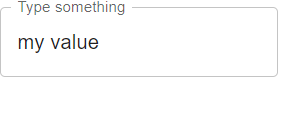
I have a MUI TextField with and with default settings all look good:

enter image description here

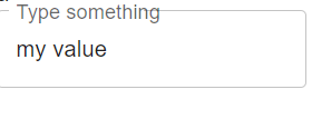
But if I size the font larger (see theme below) then the borderline overlaps the label:

enter image description here

function MyForm() {
return (
    <>
        <div>a</div>
        <div><TextField variant={'outlined'} label="Type something" value={'my value'}/></div>
    </>
);}


const themeOptions: ThemeOptions = {
components: {
    MuiInputLabel: {
        styleOverrides: {
            root: {
                fontSize: '1rem', // make labelfont bigger
            },
        },
    },

2

Answers


  1. The problem comes from the fact that it only increases the size of the label but not the size of the input.

    To solve this, you can do the following:

    import * as React from "react";
    
    import FormControl from "@mui/material/FormControl";
    import InputLabel from "@mui/material/InputLabel";
    import OutlinedInput from "@mui/material/OutlinedInput";
    
    export default function MyForm() {
      return (
        <FormControl>
          <InputLabel htmlFor="input-outlined" sx={{ fontSize: 20 }}>
            Type something
          </InputLabel>
          <OutlinedInput
            id="input-outlined"
            label="Type something"
            sx={{ fontSize: 20 }}
          />
        </FormControl>
      );
    }
    
    
    Login or Signup to reply.
  2. There are two main aspects of the text field that impact the sizing of the notch in the outline and whether the label fits in that notch.

    InputLabel sizing

    When the label is up in the notch of the outline, that means shrink=true which by default occurs when the input has focus or already has a value. The relevant styles applied in the shrink case are transform: 'translate(14px, -9px) scale(0.75)', so the label text will 0.75 * the size of the label when not in the shrink state.

    notch sizing

    The space for the notch in the outline is controlled by the size of a legend element within a fieldset element within the OutlinedInput. The relevant styles for that legend element are fontSize: '0.75em'. This means that the legend space will be based on the size of the label using a font size that is 0.75 * the font size of the OutlinedInput. Note that this legend does NOT display the label. It contains a copy of the label text to control the sizing, but it has opacity: 0 in its styles so that it is invisible apart from its block creating a notch in the outline. The InputLabel element then places the label text in that same location.

    An important thing to realize then is that the default notch sizing is dependent on the font size of the OutlinedInput being the same as the InputLabel font size.

    There are two different options for how to fix the size of the notch:

    1. Change the font-size for the OutlinedInput to be the same as the label, so that the text of the input will match the non-shrink label size.
    import * as React from "react";
    import TextField from "@mui/material/TextField";
    import { createTheme, ThemeProvider } from "@mui/material/styles";
    
    const labelFontSize = "1.25rem";
    export default function TextFieldWithLargerLabel() {
      const theme = createTheme({
        components: {
          MuiInputLabel: {
            styleOverrides: {
              root: {
                fontSize: labelFontSize
              }
            }
          },
          MuiOutlinedInput: {
            styleOverrides: {
              root: {
                fontSize: labelFontSize
              }
            }
          }
        }
      });
      return (
        <ThemeProvider theme={theme}>
          <TextField id="outlined-basic" label="Type something" />
        </ThemeProvider>
      );
    }
    

    Edit text field label size

    1. If you want to have the label size bigger than the input text size, then you can change the font-size of the legend that controls the notch to match the shrink label size.
    import * as React from "react";
    import TextField from "@mui/material/TextField";
    import { createTheme, ThemeProvider } from "@mui/material/styles";
    
    const labelFontSize = "1.25rem";
    export default function TextFieldWithLargerLabel() {
      const theme = createTheme({
        components: {
          MuiInputLabel: {
            styleOverrides: {
              root: {
                fontSize: labelFontSize
              }
            }
          },
          MuiOutlinedInput: {
            styleOverrides: {
              root: {
                "& > fieldset > legend": {
                  fontSize: `calc(0.75 * ${labelFontSize})`
                }
              }
            }
          }
        }
      });
      return (
        <ThemeProvider theme={theme}>
          <TextField id="outlined-basic" label="Type something" />
        </ThemeProvider>
      );
    }
    

    Edit text field label size

    Login or Signup to reply.
Please signup or login to give your own answer.
Back To Top
Search