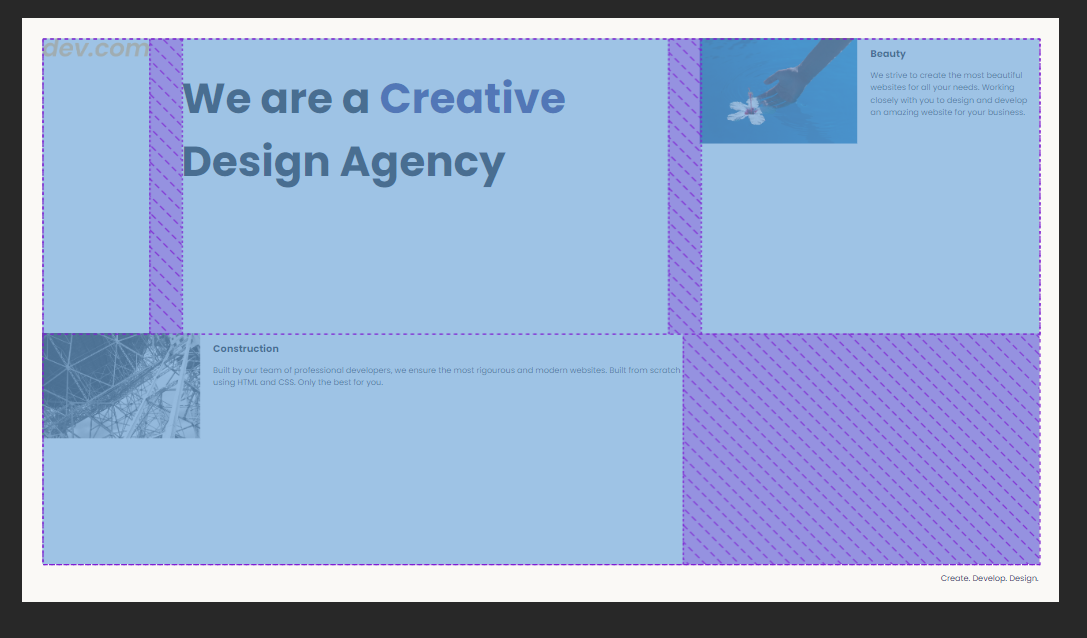
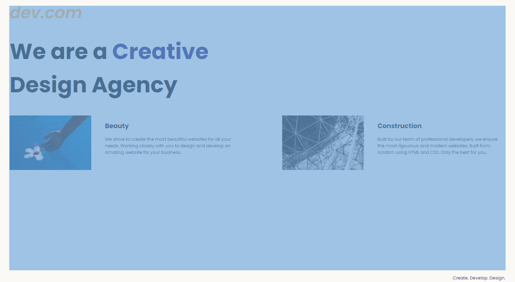
As seen in the following picture, i make terrible mistakes in CSS, because the task is to edit only CSS and make it look like the goal image.
Now to my questions: What are the purple things in my attempts and how do i control them? What am i missing? When i move down to mobile size, it looks quite nice…
The tasks code (HTML):
<!DOCTYPE html>
<html lang="en">

<head>
  <meta charset="UTF-8">
  <meta name="viewport" content="width=device-width, initial-scale=1.0">
  <title>Agency</title>
  <link rel="stylesheet" href="./style.css">
  <link rel="preconnect" href="https://fonts.googleapis.com">
  <link rel="preconnect" href="https://fonts.gstatic.com" crossorigin>
  <link href="https://fonts.googleapis.com/css2?family=Poppins:wght@400;700&display=swap" rel="stylesheet">
</head>

<body>
  <div class="main">
    <div class="logo-container">
      <img class="logo" src="./assets/images/logo.png" alt="logo">
    </div>
    <h1>We are a <span>Creative</span> Design Agency</h1>

    <div class="left card"><img class="tile-image" src="./assets/images/beautiful.jpg" alt="hand and flower in water">
      <h2 class="card-title">Beauty</h2>
      <p class="card-text">We strive to create the most beautiful websites for all your needs. Working closely with you
        to
        design and
        develop an amazing website for your business.</p>
    </div>

    <div class="right card"><img class="tile-image" src="./assets/images/construction.jpg" alt="metal structure">
      <h2 class="card-title">Construction</h2>
      <p>Built by our team of professional developers, we ensure the most rigourous and modern websites. Built from
        scratch using HTML and CSS. Only the best for you.</p>
    </div>

  </div>
  <footer>
    <p>Create. Develop. Design.</p>
  </footer>
</body>

</html>
My CSS code:
body {
  font-family: "Poppins", sans-serif;
  margin: 50px 50px 0 50px;
  background-color: #faf9f6;
  display: flex;
  flex-direction: column;
  min-height: 95vh;

}
.main {
  display: inline-flex;
  flex: 1;
  flex-direction: row;
  flex-wrap: wrap;
  column-gap: 5rem;
}
.logo {
  max-width: 20rem;
}

.logo-container {
max-height: 50px;
}

.card {
  flex: 1;
  text-align: start;
  max-width: max-content;
}

.preview {
  max-width: 100%;
}

.left .tile-image {
  max-height: 260px;
  float: left;
  margin-right: 2rem;
  margin-bottom: 2rem;
}

.right .tile-image {
  max-height: 260px;
  float: left;
  margin-right: 2rem;
  margin-bottom: 2rem;
}

h1 {
  font-size: 6.5rem;
  max-width: 1200px;
}

span {
  color: midnightblue;
}

footer {
  clear: both;
  text-align: right;
  color: midnightblue;
}

p {
  font-size: 1.25rem;
}

@media (max-width: 680px){

  h1 {
    font-size: 3rem;
    text-align: center;
  }

  .left .tile-image {
    max-width: 100%;
    float: left;
    margin-right: 50px;
    margin-bottom: 10px;
  }

  .right .tile-image {
    max-width: 100%;
    float: left;
    margin-right: 50px;
    margin-bottom: 10px;
  }

  .logo {
    max-width: 6rem;
  }

  .card {
    flex: 1;
    text-align: start;
    max-width: 100%;
  }

  p {
    font-size: 1rem;
  }

  span {
    color: midnightblue;
  }

  footer {
    clear: both;
    text-align: right;
    color: midnightblue;
  }
}
Did try everything with max-width, but as soon as i changed the size it wouldn’t fit. The site should be responsive, i only managed to do the mobile size quite OK.


2
Answers
U can do it with Flex, and maybe try with Grid. I recomend use codepen so can modify anything and see it in seconds and share the link
try this if still not correct then roll the cards in one div both card and then give properties of width 100% justify content: space between.
.main {display: flex;flex-direction: column;column-gap: 5rem;}
.card {flex: 1;text-align: start;max-width: 100%;}
.tile-image {max-height: 260px;float: left;margin-right: 2rem;margin-bottom: 2rem;}
.left .tile-image,
.right .tile-image {max-width: 100%;}