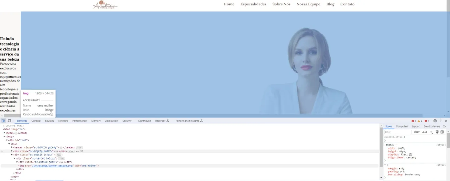
I want the text to be side by side with the image aligned with the nav bar logo. But it seems like the image is taking up all the space, I didn’t add a smaller width, because I want the image to be that size but with the text next to it. What should I do, guys? why the image is not inside the HomeContent? it looks like it has it own container
// Home.jsx
import React from 'react';
import { FaWhatsapp } from 'react-icons/fa';
import pessoa from '../assets/banner-pessoa.png';
import { HomeContainer, HomeContent } from '../styles/Home.style';

const Home = () => {
  return (
    <HomeContainer>
      <HomeContent>
        <div>
          <h3>
            Unindo tecnologia e ciência a serviço da <strong>sua beleza</strong>
          </h3>
          <p>
            Protocolos exclusivos com equipamentos avançados de alta tecnologia e profissionais capacitados, entregando resultados excelentes em tratamentos corporais e faciais.
          </p>
          <div>
            <button>
              <FaWhatsapp />
              Agendar Consulta
            </button>
          </div>
        </div>
        <img src={pessoa} alt="uma mulher" />
      </HomeContent>
    </HomeContainer>

  );
};

export default Home;
import styled from "styled-components";

export const HomeContainer = styled.div`
    width: 100%;
    height: 640px;
    background-color: var(--beige-100);
    display: flex;
    align-items: center;
    justify-content: center;
`;

export const HomeContent = styled.div`
    display: flex;
    justify-content: space-between;
    align-items: center;

`;


3
Answers
You can try with some css tips:
You put the image as a element, could use as a background image for the text container.
Anyway, if you want the image as a element and the text beside it, you will need to put the image or the text container as a absolute element and control it width.
If you want they side-by-side, you need to control they size (width: 50% for example).
Your "text and image side by side" request instantly reminded me of the lesser known CSS property shape-outside which is used like this…
The beauty of this property is that the image doesn’t necessarily have to be a rectangle, it could be a star yet the text will render perfectly on the shape’s outline.
Here’s an easy to follow example of shape-outside…
https://css-tricks.com/almanac/properties/s/shape-outside/