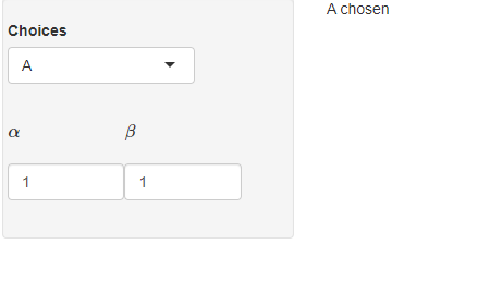
There seems to be an excessive amount of vertical space between the Choices widget, and the next row of widgets when math symbols are used as labels. A lot of tinkering with padding and margin didn’t seem to reduce the space. Is there a way to reduce said space? Thanks in advance for any help.
props <- 'padding:0px; margin:0px;'

ui <- fluidPage(
  sidebarLayout(
    sidebarPanel(
      withMathJax(),
      fluidRow(
        column(width=8, selectInput("chooser", "Choices",
                                             choices = c("A", "B")),
               style=props
               )
      ),
      tabsetPanel(
        id = "params",
        type = "hidden",
        tabPanel("A",
                 fluidRow( column(5, numericInput("a", "$$ \alpha $$", value = 1),style=props),
                           column(5, numericInput("b", "$$ \beta $$", min = 0, value = 1),style=props)
                 )
        ),
        tabPanel("B",
                 fluidRow(column(6,numericInput("c", "b1", value = 0),style=props),
                          column(6,numericInput("d", "b2", value = 1),style=props)
                 )
        )
      ),
    ),
    mainPanel(
      textOutput("txt")
    )
  )
)


server <- function(input, output, session) {

  observeEvent(input$chooser, {
    updateTabsetPanel(inputId = "params", selected = input$chooser)
  })

  sample <- reactive({
    switch(input$chooser,
           A = "A chosen",
           B = "B chosen")
  })
  output$txt <- renderText(sample())
}

# Run the application
shinyApp(ui = ui, server = server)


2
Answers
You have a few other elements with margins which are inside div inside columns inside rows etc… of your inputs.
The best way to identify the elements class or id which you want to change their css properties is to launch your app in a browser and use your browser inspector (CTRL + I)
You cann add this code in your fluidPage to get rid of the space between your inputs:
It seems like the spacing issue lies in the MathJax text you are using as input labels. Conveniently, input labels can also be html, so instead of using text like
"$$ \beta $$"as a label, you can pass the same text as adiv()with the required margin and padding, like this:div("$$ \beta $$", style = "margin-top: -20px; padding: 0;")