


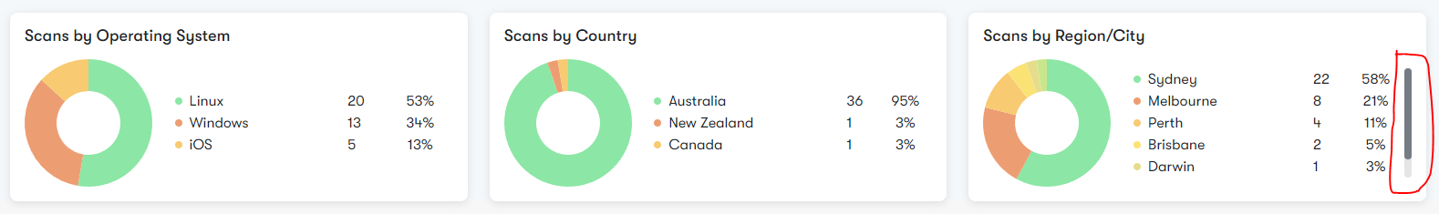
Here I have added a table with max height if it exceeds the height then custom scroller shows.The issues is it’s not showing on mobile devices until its scrolled.
.scan-by-blocks .scan-by-block .legend {
  max-height: 120px;
  overflow-y: auto;
}

.scan-by-blocks .scan-by-block .legend::-webkit-scrollbar {
  width: 8px;
}

.scan-by-blocks .scan-by-block .legend::-webkit-scrollbar-thumb {
  background-color: var(--grey-dark);
  border-radius: 5px;
  -webkit-box-shadow: inset 0 0 6px var(--grey-dark);
}

.scan-by-blocks .scan-by-block .legend::-webkit-scrollbar-track {
  background-color: rgba(0, 0, 0, 0.1);
  border-radius: 5px;
}
I want to keep them on mobile devices even it’s not scrolled.
2
Answers
I’m not quite sure yet, but can you try to change your
overflow-y: autointooverflow-y: scroll?Change your
overflow-y: auto;tooverflow-y: scroll;in.scan-by-blocks .scan-by-block .legend. If the issue persists, comment out all your custom scrollbar styles below and then retry it.