skip to Main Content

Form

Here is the code that I wrote to achieve the result. I tried to apply solution found here, but either my problem is different, or I’m missing the point.

<div class="container">
  <div class="grid">
    <div class="left_flex">
      <div class="img"><img src="https://dummyimage.com/250x350/ddd/000000.png" /></div>
      <div class="a_link"><a href="#" target="_blank">a link</a></div>
    </div>
    <div class="right_flex">
      <div class="short_text">Short text</div>
      <div class="long_text">
        Lorem ipsum (...)
      </div>
    </div>
  </div>
</div>
.container {
  width: 600px;
}
.grid {
  display: flex;
  flex-flow: row nowrap;
  align-content: stretch;
  overflow: auto;
}
.left_flex,
.right_flex {
  flex-flow: column nowrap;
  display: flex;
  align-content: stretch;
}
.right_flex {
  overflow: auto;
}
.long_text {
  min-height: min-content;
}
.img img {
  max-width: 250px;
}

I omitted the code used for styling and elongating the paragraph. Full code can be found in the pen.

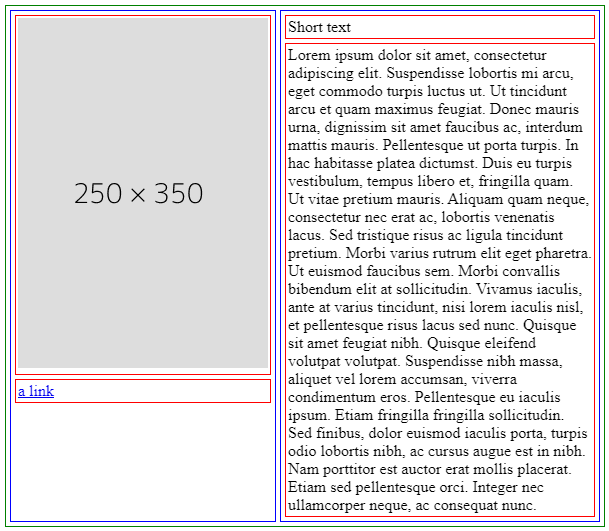
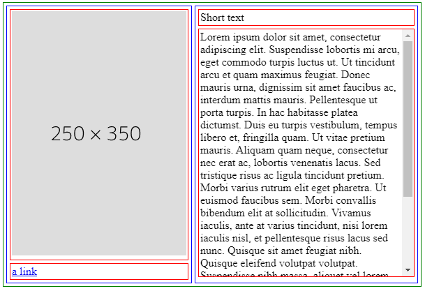
My goal is to have a form for users to fill in. The img div is a place for a picture, that can vary in size and aspect ratio, but will not exceed 250px, and the right side of the form will adjust to its’ size. The whole container has 600px.

I wanted the long_text div to extend to fill the space, so the left_flex and right_flex will have the same height. And if long_text will have too much content, then a scrollbar will appear and the content will scroll.

I wanted to achieve an effect presented in this image:

Form2

2

Answers


  1. The overflow: hidden; property should be applied to the .grid class.

    The .right_flex class should have flex: 1; to occupy the remaining horizontal space within the .grid.

    The .long_text class should have min-height: 0; to reset the minimum height, allowing it to expand based on the available space.

    Both the .right_flex and .long_text classes should have overflow: auto; to enable scrolling when the content exceeds the available space.

    Login or Signup to reply.
  2. I would consider a grid configuration:

    .container {
      width: 600px;
    }
    .grid {
      display: grid; /* a grid container */
      grid-template-columns: 1fr 1fr; /* 2 columns */
      border: 1px solid green;
      padding: 2px;
    }
    .left_flex,
    .right_flex {
      display: grid; /* grid also */
      border: 1px solid blue;
      padding: 2px;
      margin: 2px;
    }
    .right_flex {
      contain: size; /* make sure the left column dictate the height  */
    }
    .long_text {
      overflow: auto; /* sccroll on the long text */
    }
    .img,
    .a_link,
    .short_text,
    .long_text {
      border: 1px solid red;
      padding: 2px;
      margin: 2px;
    }
    .img img {
      max-width: 100%;
      display: block
    }
    <div class="container">
      <div class="grid">
        <div class="left_flex">
          <div class="img"><img src="https://dummyimage.com/250x350/ddd/000000.png" /></div>
          <div class="a_link"><a href="#" target="_blank">a link</a></div>
        </div>
        <div class="right_flex">
          <div class="short_text">Short text</div>
          <div class="long_text">
            Lorem ipsum dolor sit amet, consectetur adipiscing elit. Suspendisse lobortis mi arcu, eget commodo turpis luctus ut. Ut tincidunt arcu et quam maximus feugiat. Donec mauris urna, dignissim sit amet faucibus ac, interdum mattis mauris. Pellentesque ut porta turpis. In hac habitasse platea dictumst. Duis eu turpis vestibulum, tempus libero et, fringilla quam. Ut vitae pretium mauris. Aliquam quam neque, consectetur nec erat ac, lobortis venenatis lacus.
    
            Sed tristique risus ac ligula tincidunt pretium. Morbi varius rutrum elit eget pharetra. Ut euismod faucibus sem. Morbi convallis bibendum elit at sollicitudin. Vivamus iaculis, ante at varius tincidunt, nisi lorem iaculis nisl, et pellentesque risus lacus sed nunc. Quisque sit amet feugiat nibh. Quisque eleifend volutpat volutpat.
    
            Suspendisse nibh massa, aliquet vel lorem accumsan, viverra condimentum eros. Pellentesque eu iaculis ipsum. Etiam fringilla fringilla sollicitudin. Sed finibus, dolor euismod iaculis porta, turpis odio lobortis nibh, ac cursus augue est in nibh. Nam porttitor est auctor erat mollis placerat. Etiam sed pellentesque orci. Integer nec ullamcorper neque, ac consequat nunc.
          </div>
        </div>
    
      </div>
    </div>
    Login or Signup to reply.
Please signup or login to give your own answer.
Back To Top
Search