skip to Main Content

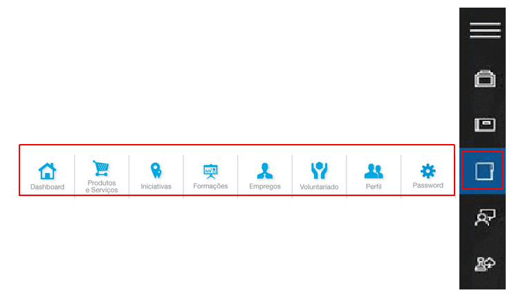
I want to span horizontal icon bar when clicking on an icon in a vertical icon bar.
For example, in the image below, clicking on the 3rd icon from the bottom (in the red box) in the vertical icon bar, will show the horizontal icon bar (in the red box) in the same line of the clicked icon.
Which layout options (e.g. grid) should I use to achieve this?

Thanks

enter image description here

2

Answers


  1. You can define the horizontal bar as a sibling to the vertical icon button (both inside a parent div), and use position: absolute together with left: 0 and transform: translateX(-100%) to move the bar left of the icon.

    The bar itself could be created with display: flex

    Login or Signup to reply.
  2. By myself i would like to go into some flex’es it’s have not that bad support
    https://caniuse.com/?search=flex

    Some quick code

    // Add event listeners to toggle the active class on li elements
    const iconListItems = document.querySelectorAll('.icon-list li');
    
    iconListItems.forEach((item) =>
    {
      item.addEventListener('click', () =>
      {
        var wasAlreadyActive = item.classList.contains('active');
        document.querySelectorAll('.icon-list li').forEach((mainItem) =>
        {
            mainItem.classList.remove('active');
        });
        
        if(! wasAlreadyActive)
        {
            item.classList.add('active');
        }
      });
    });
    
    document.body.addEventListener('click', (event) =>
    {
        if (!event.target.closest('.icon-list'))
        {
            // If the click is outside of the icon list, close all nested lists
            iconListItems.forEach((item) =>
            {
                item.classList.remove('active');
            });
        }
    });
    body {
      font-family: Arial, sans-serif;
    }
    
    .icon-list
    {
      list-style-type: none;
      padding: 0;
      width: 50px;
      display: flex;
      flex-direction: column;
      align-items: center;
    }
    
    .icon-list li
    {
      position: relative;
      padding: 10px;
      cursor: pointer;
      transition: background-color 0.2s;
      display: flex;
      align-items: center;
    }
    
    .icon-list li:hover
    {
      background-color: #f0f0f0;
    }
    
    /* Style for the icons */
    .icon {
      width: 24px;
      height: 24px;
      background-color: #333;
      color: #fff;
      text-align: center;
      line-height: 24px;
      margin-right: 10px;
    }
    
    /* Expand the nested list on hover or click */
    .icon-list li:hover .nested-list,
    .icon-list li.active .nested-list
    {
      display: flex;
    }
    
    /* Style for the nested list */
    .nested-list
    {
      position: absolute;
      top: 0;
      left: 100%;
      list-style-type: none;
      width: 50vw;
      padding: 0;
      margin: 0;
      display: none;
      background-color: #f0f0f0;
      z-index: 1;
      flex-direction: row;
      align-items: center;
      overflow-x: auto;
    }
    
    /* Style for subpage items */
    .nested-list li
    {
      margin-right: 5px;
      word-wrap: no-wrap;
      flex-shrink: 0;
      flex-direction: column;
      align-items: center;
    }
    <html>
    <body>
        <ul class="icon-list">
            <li>
                <div class="icon">I1</div>
                <ul class="nested-list">
                    <li>
                        <div>Icon</div>
                        <div>
                            <a href="#">Subpage 1.1</a>
                        </div>
                    </li>
                </ul>
            </li>
            <li>
                <div class="icon">I2</div>
                <ul class="nested-list">
                    <li><a href="#">Subpage 2.1</a></li>
                    <li><a href="#">Subpage 2.2</a></li>
                </ul>
            </li>
            <li>
                <div class="icon">I3</div>
                <ul class="nested-list">
                    <li><a href="#">Subpage 3.1</a></li>
                    <li><a href="#">Subpage 3.2</a></li>
                    <li><a href="#">Subpage 3.3</a></li>
                    <li><a href="#">Subpage 3.4</a></li>
                    <li><a href="#">Subpage 3.5</a></li>
                    <li><a href="#">Subpage 3.6</a></li>
                    <li><a href="#">Subpage 3.7</a></li>
                </ul>
            </li>
        </ul>
    </body>
    </html>

    How about something like this

    // Add event listeners to toggle the active class on li elements
    const iconListItems = document.querySelectorAll('.icon-list li');
    
    iconListItems.forEach((item) =>
    {
      item.addEventListener('click', () =>
      {
        document.querySelectorAll('.icon-list li').forEach((mainItem) =>
        {
            mainItem.classList.remove('active');
            item.classList.add('active');
        });
      });
    });
    body {
      font-family: Arial, sans-serif;
    }
    
    .icon-list
    {
      list-style-type: none;
      padding: 0;
      width: 50px;
      display: flex;
      flex-direction: column;
      align-items: center;
    }
    
    .icon-list li
    {
      position: relative;
      padding: 10px;
      cursor: pointer;
      transition: background-color 0.2s;
      display: flex;
      align-items: center;
    }
    
    .icon-list li:hover
    {
      background-color: #f0f0f0;
    }
    
    /* Style for the icons */
    .icon {
      width: 24px;
      height: 24px;
      background-color: #333;
      color: #fff;
      text-align: center;
      line-height: 24px;
      margin-right: 10px;
    }
    
    /* Expand the nested list on hover or click */
    .icon-list li:hover .nested-list,
    .icon-list li.active .nested-list
    {
      display: flex;
    }
    
    /* Style for the nested list */
    .nested-list
    {
      position: absolute;
      top: 0;
      left: 100%;
      list-style-type: none;
      width: 50vw;
      padding: 0;
      margin: 0;
      display: none;
      background-color: #f0f0f0;
      z-index: 1;
      flex-direction: row;
      align-items: center;
      overflow-x: auto;
    }
    
    /* Style for subpage items */
    .nested-list li
    {
      margin-right: 5px;
      word-wrap: no-wrap;
      flex-shrink: 0;
    }
    <html>
    <body>
        <ul class="icon-list">
            <li>
                <div class="icon">I1</div>
                <ul class="nested-list">
                    <li><a href="#">Subpage 1.1</a></li>
                </ul>
            </li>
            <li>
                <div class="icon">I2</div>
                <ul class="nested-list">
                    <li><a href="#">Subpage 2.1</a></li>
                    <li><a href="#">Subpage 2.2</a></li>
                </ul>
            </li>
            <li>
                <div class="icon">I3</div>
                <ul class="nested-list">
                    <li><a href="#">Subpage 3.1</a></li>
                    <li><a href="#">Subpage 3.2</a></li>
                    <li><a href="#">Subpage 3.3</a></li>
                    <li><a href="#">Subpage 3.4</a></li>
                    <li><a href="#">Subpage 3.5</a></li>
                    <li><a href="#">Subpage 3.6</a></li>
                    <li><a href="#">Subpage 3.7</a></li>
                </ul>
            </li>
        </ul>
    </body>
    </html>
    Login or Signup to reply.
Please signup or login to give your own answer.
Back To Top
Search