


I tried using Justify on my tailwind flex but it isnt working
I tried refreshing the page, deleting browser history then refresh, try all of the flex (the justify, justify items, align, align items, etc)
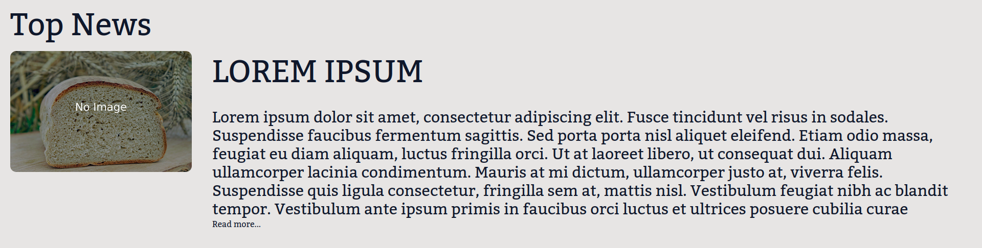
    <main class="flex-grow text-slate-900 font-kadwa bg-stone-200">

        <p class="mx-5 my-5 text-4xl text-center md:text-6xl md:text-left">Top News</p>

        <div class="md:flex md:justify-center">

            <img src="default.jpg" class=" shrink rounded-xl w-screen h-30 md:w-full md:h-full md:mx-5">

            <div class="">

                <p class="text-2xl text-center my-3 md:text-left md:mx-5 md:text-4xl md:mb-10 2xl:text-6xl">LOREM IPSUM</p>

                <p class="text-wrap mx-5 text-sm text-center md:text-left md:text-xl 2xl:text-3xl">Lorem ipsum dolor sit amet, consectetur adipiscing elit.</p>

                <a class="mx-5">Read more...</a>

            </div>

        </div>

    </main>
Result : enter image description here
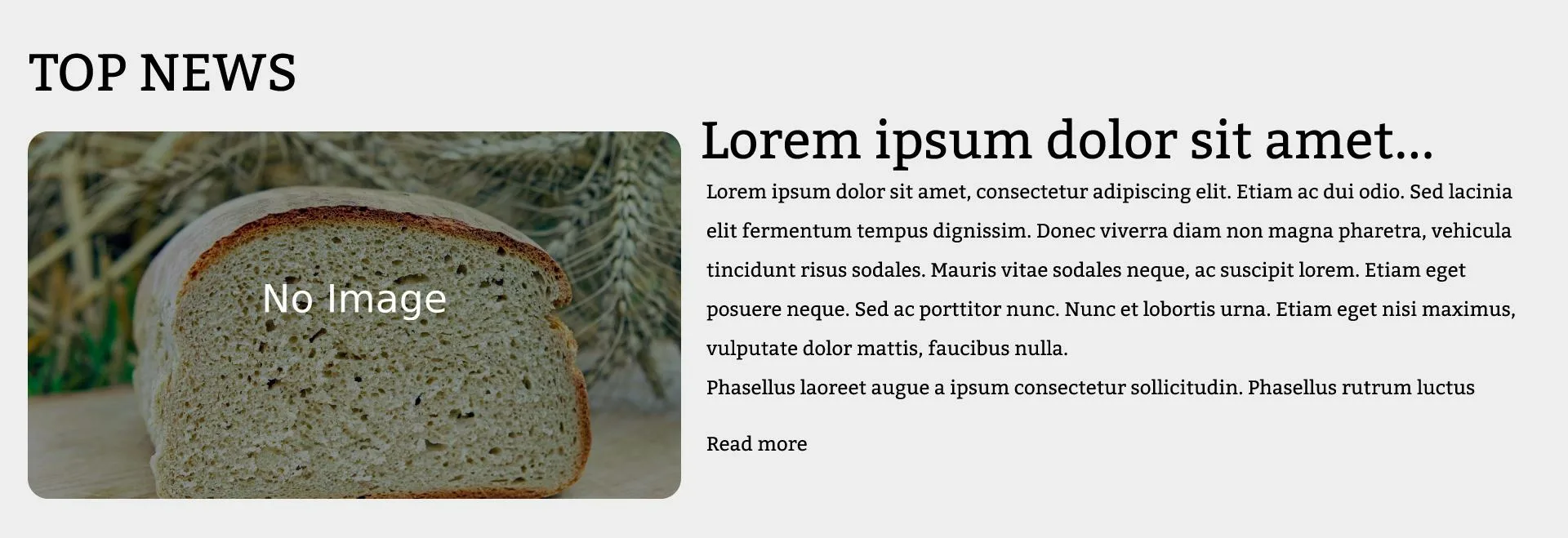
What I expected : enter image description here
2
Answers
What I understood is the width is not working? It is not the issue with
justifyand the solutions is todefine widthfor both of the flex items.Here the code is as per your requirement. I have set both sections to 50% and set them to justify and align.
If you can set the image section to be small, just set the width of the image section, it will work fine.