


During a transition on backdrop-filter, I’m noticing a dark inset shadow, only visible during the transition.
It seems this only happens in chrome/webkit based browsers on windows (10 & 11) :
My current chrome version is: ‘Version 116.0.5845.190 (Official Build) (64-bit)’
It also seems that this does happen in stackoverflows inline ‘run code snippet’
But not for stackoverflows code snippet editor
In my actual project I’m also seeing these inset borders.
I would like to get rid of the inset borders.
Is this an issue with the code or unintended/undefined behavior on the browsers part?
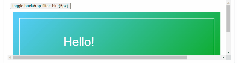
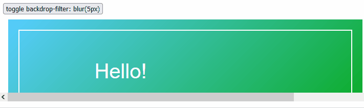
Examples
Chrome with issue:
And Firefox seems fine:
Example code:
Clicking this button in chrome will show these black inset borders;
Though within stackoverflow snippet editor, the borders are not visible.
In this jsfiddle the behavior can also be observed.
function toggle() {
  document.getElementsByClassName("inner")[0].classList.toggle('blurred')
}
.inner {
margin: 20px;
padding: 10px;
width: 100%;
height: 200px;
display: inline-block;
border: 2px solid white;
border-bottom: 2px solid rgba(0, 0, 0, .1);
box-sizing: border-box;
transition: backdrop-filter 500ms;
}
.blurred {
backdrop-filter: blur(5px);
}
.text {
position: absolute;
left: 20%;
top: 20%;
font-size: 40px;
color: white;
font-family: sans-serif;
margin: 20px;
padding: 10px;
width: 100%;
height: 200px;
display: inline-block;
box-sizing: border-box;
}
.container {
margin: 10px;
display: flex;
position: relative;
background: linear-gradient(135deg, #57cdff, #05a915);
}<button onclick="toggle()">toggle backdrop-filter: blur(5px)</button>
<div class="container">
<div class="text">
Hello!
</div>
<div class="inner">
</div>
</div>
2
Answers
You can change the
opacityof an element that already has abackdrop-filter.Changed your code a bit in the example:
I’ve been experiencing the same issue and here are my findings:
Whether Chrome 91 fixed this issue two years ago and it has since returned, I can’t say. My fix for right now was what imhvost suggested, which is to have the backdrop-filter blur effect on its own div always, and simply transition the opacity of that div from 0 to 1. It’s not ideal, but it gets the job done for now while I wait and hope they fix the behavior.