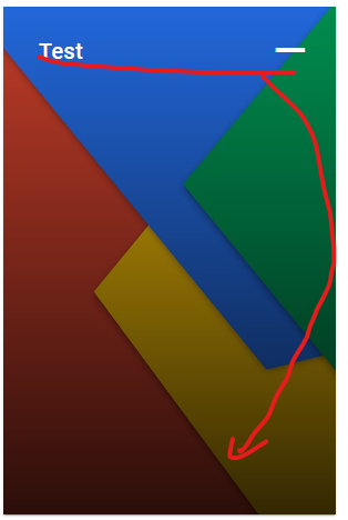
I’m using Vue and vuetify and I want to align a row to the end of the container, which is located in an image.
This is what it looks like right now.
I already tried to set the "align-end" to the v-img and it worked, but I want to add more rows to the container in the futurue, so I need to get a different approach, since I only can add one alignment.
Following code has been used.
<template>
    <v-card
        class="rounded-0"
        width="300px"
    >
        <v-img
            :src="cover"
            gradient="to bottom, rgba(0,0,0,.1), rgba(0,0,0,.8)"
            cover
        >
            <v-container full-height fluid height="100%">
                <v-row class="align-self-end">
                    <v-col cols="9">
                        <v-card-title class="text-white">{{ title + ' ' + number }}</v-card-title>
                    </v-col>
                    <v-col cols="3">
                        <v-btn
                            v-if="showAddButton"
                            class="icon"
                            variant="plain"
                            color="white"
                            icon="mdi-plus"
                            @click="addToCollection(id)"
                        >
                        </v-btn>
                        <v-btn
                            v-if="showRemoveButton"
                            class="icon"
                            variant="plain"
                            color="white"
                            icon="mdi-minus"
                            @click="removeFromCollection(id)"
                        >
                        </v-btn>
                    </v-col>
                </v-row>
            </v-container>
        </v-img>
    </v-card>
</template>

<style>
.icon {
    font-size: 30px !important;
    opacity: 1 !important;
}
</style>


2
Answers
If you inspected your v-container in your browser you’d see it’s height is not actually 100%. Your container:
From the documentation:
Emphasis on class of
fill-heightand not prop.heightis also not a valid prop. Remove both and add the class to the element (the class also appliesdisplay: flexfor you):Alternatively, you don’t need to rely on Vuetify provided props and class names for everything. You always have the option to apply good old CSS:
The VImg allows you to pass props to its nested VResponsive. Using the
:content-classprop, you can make the responsive container flex, allowing you to use simple alignment on your container: