skip to Main Content

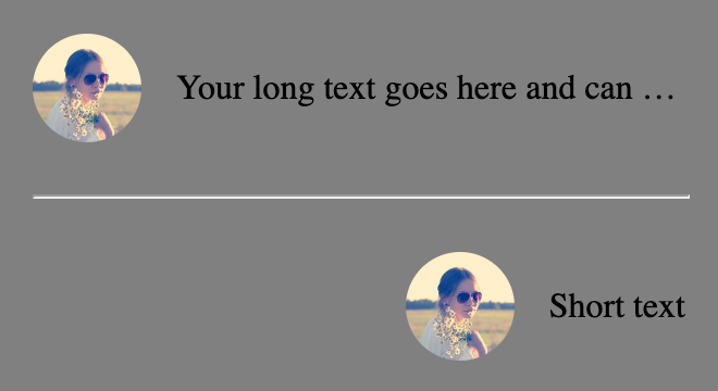
I’m trying to achieve this layout where there is an image that is a set width and the text next to it is truncated if it is too long. I also want the content of flex container to be right aligned.

enter image description here

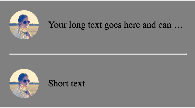
I have been playing with this at https://codepen.io/zeckdude/pen/jOQeRoZ and when I set flex: 1 on the paragraph in order to ensure that the image gets its full width, I can’t figure out how to still right align all of the content. Unfortunately, I still end up with this result:

enter image description here

Here’s the code that I have in the codepen:

.container {
  display: flex;
  flex-direction: column;
  gap: 16px;
  width: 300px;
  padding: 16px;
  background-color: gray;
}

hr {
  width: 100%;
}

.flex-container {
  display: flex;
  align-items: center;
  justify-content: flex-end;
  gap: 16px;
  width: 100%;
}

/* Make the image container take 50px width */
.flex-container .image-container {
  width: 50px;
  height: 50px;
  border-radius: 25px;
  overflow: hidden;
}

/* Make the image take its full width and height within the image container */
.flex-container img {
  width: 100%;
  height: 100%;
  object-fit: cover;
}

/* Make the text truncate with ellipsis when there's not enough space */
.flex-container p {
  flex: 1;
  white-space: nowrap;
  overflow: hidden;
  text-overflow: ellipsis;
}
<div class="container">
  <div class="flex-container">
<div class="image-container">
  <img src="https://picsum.photos/id/64/200" alt="Image">
</div>
<p>Your long text goes here and can keep going for a long time</p>
  </div>
  
  <hr />
  
  <div class="flex-container">
<div class="image-container">
  <img src="https://picsum.photos/id/64/200" alt="Image">
</div>
<p>Short text</p>
  </div>
</div>

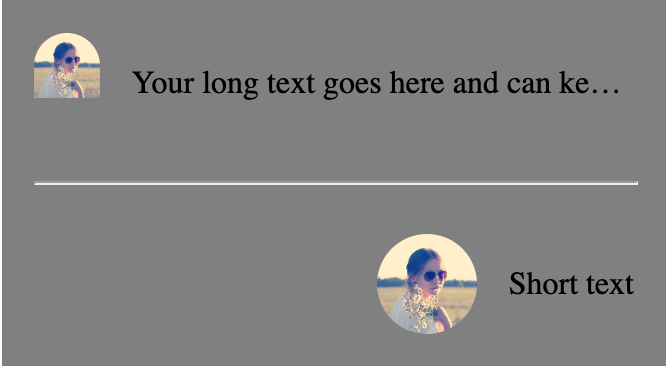
Some folks have suggested removing the flex: 1 on the .flex-container p but unfortunately I need that there in order to ensure that the image gets to take its full width. You can see that in this screenshot where I have removed it and the image isn’t looking correct:

enter image description here

2

Answers


  1. Here is a different solution as these contents are dynamic. The changes I have made:

    .flex-container .image-container {
        /* overflow: hidden; */
    }
    .flex-container img {
        width: 50px;
        height: 50px;
        border-radius: 25px;
    }
    .flex-container p {
        /* flex: 1; */
    }
    
        .container {
      display: flex;
      flex-direction: column;
      gap: 16px;
      width: 300px;
      padding: 16px;
      background-color: gray;
    }
    
    hr {
      width: 100%;
    }
    
    .flex-container {
      display: flex;
      align-items: center;
      justify-content: flex-end;
      gap: 16px;
      width: 100%;
    }
    
    /* Make the image container take 50px width */
    .flex-container .image-container {
      width: 50px;
      height: 50px;
      border-radius: 25px;
      /* overflow: hidden; */
    }
    
    /* Make the image take its full width and height within the image container */
    .flex-container img {
      width: 50px;
      height: 50px;
      border-radius: 25px;
      object-fit: cover;
    }
    
    /* Make the text truncate with ellipsis when there's not enough space */
    .flex-container p {
      /* flex: 1; */
      white-space: nowrap;
      overflow: hidden;
      text-overflow: ellipsis;
    }
    <div class="container">
      <div class="flex-container">
        <div class="image-container">
          <div class="image-inner-container">
            <img src="https://picsum.photos/id/64/200" alt="Image">
          </div>
        </div>
        <p>Your long text goes here and can keep going for a long time</p>
      </div>
    
      <hr />
    
      <div class="flex-container">
        <div class="image-container">
          <div class="image-inner-container">
            <img src="https://picsum.photos/id/64/200" alt="Image">
          </div>
        </div>
        <p style="flex: initial;">Short text</p>
      </div>
    </div>
    Login or Signup to reply.
  2. You can achieve the layout with two simple adjustments to your code:

    .flex-container p {
       /* flex: 1; */ /* you don't need this */
       white-space: nowrap;
       overflow: hidden;
       text-overflow: ellipsis;
    }
    
    .flex-container .image-container {
       width: 50px;
       height: 50px;
       border-radius: 25px;
       overflow: hidden;
       flex-shrink: 0; /* new; disable flex-shrink */
    }
    
    .container {
      display: flex;
      flex-direction: column;
      gap: 16px;
      width: 300px;
      padding: 16px;
      background-color: gray;
    }
    
    hr {
      width: 100%;
    }
    
    .flex-container {
      display: flex;
      align-items: center;
      justify-content: flex-end;
      gap: 16px;
      width: 100%;
    }
    
    /* Make the image container take 50px width */
    .flex-container .image-container {
      width: 50px;
      height: 50px;
      border-radius: 25px;
      overflow: hidden;
      flex-shrink: 0; /* new */
    }
    
    /* Make the image take its full width and height within the image container */
    .flex-container img {
      width: 100%;
      height: 100%;
      object-fit: cover;
    }
    
    /* Make the text truncate with ellipsis when there's not enough space */
    .flex-container p {
      /* flex: 1; */
      white-space: nowrap;
      overflow: hidden;
      text-overflow: ellipsis;
    }
    <div class="container">
      <div class="flex-container">
        <div class="image-container">
          <img src="https://picsum.photos/id/64/200" alt="Image">
        </div>
        <p>Your long text goes here and can keep going for a long time</p>
      </div>
      
      <hr />
      
      <div class="flex-container">
        <div class="image-container">
          <img src="https://picsum.photos/id/64/200" alt="Image">
        </div>
        <p>Short text</p>
      </div>
    </div>

    You wrote:

    Some folks have suggested removing the flex: 1 on the
    .flex-container p but unfortunately I need that there in order to
    ensure that the image gets to take its full width.

    A default setting on a flex container is flex-shrink: 1. This means that flex items will automatically shrink to avoid overflowing the container.

    To force flex items to respect their defined lengths, you must disable flex-shrink.

    Login or Signup to reply.
Please signup or login to give your own answer.
Back To Top
Search