


I have a page built with Tailwind which is loading a table of data in the bottom left of the page. However, this is overflowing quite a lot and I’d ideally like it to size itself to the available space and scroll from that point.
In this instance, size to fit the bottom left corner (the browser viewport being the dotted box). The two panels on the left are contained within the red div.
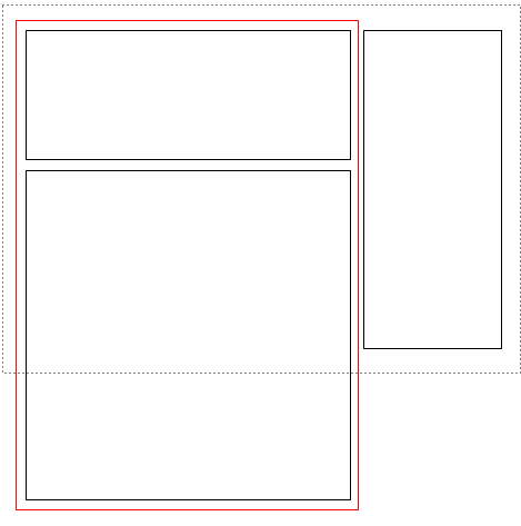
How can I ensure that the bottom left panel never overflows below the browser viewport?
2
Answers
You could set the height of the entire block to be
100svh(smallest view height of the device, very useful for mobile screen with a moving search field).Remember to add the
overflow-y-scrollto define that you want this section to be scrollable even with content flowing out of it.If you would like, you could also let the block get a max-h-[100svh] instead so that it does not take up the entire screen if it does not need to. Hope this guides you in the correct direction. Have a great day!
Apply the
overflow-y: autoproperty to the element containing the table. This will add a vertical scrollbar when the content overflows the height of the container.Additionally, you can use the
overflow-x: hiddenproperty to hide any horizontal overflow. This is optional depending on your table’s content and layout.Here’s an example Tailwind CSS code snippet:
overflow-y-auto:This adds a vertical scrollbar when content overflows.overflow-x-hidden:This hides any horizontal overflow.