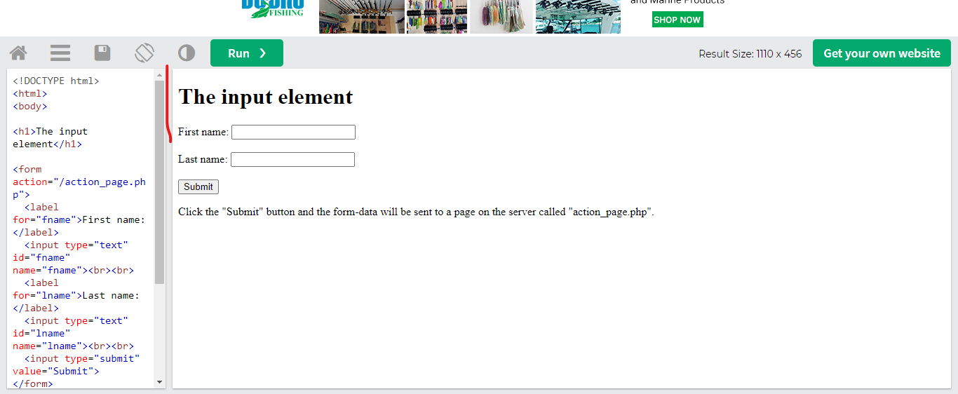
You can see the example from this page of w3 school where the width of two columns adjusts depending on the mouse left and right movement. I want to apply this functionality in my react app but don’t know how to do that.
my jsx code:
... return(
<>
    Container fluid>
            <Row>
              <Col xs={3} style={{ backgroundColor: "red" }}>
                Column 1
              </Col> //here Want to create a middle bar between two columns and add functionality like increase and decrease width depending on the mouse left and right move.
              <Col style={{ backgroundColor: "black" }}>column 2</Col>
            </Row>
          </Container>
</>
)
I tried this
const admin = () => {
  const [leftColumnWidth, setLeftColumnWidth] = useState(3); // Initial width for left column
  const [isResizing, setIsResizing] = useState(false);

  const handleMouseDown = () => {
    setIsResizing(true);
  };

  const handleMouseUp = () => {
    setIsResizing(false);
  };

  const handleMouseMove = (e) => {
    if (!isResizing) return;

    const containerWidth = e.currentTarget.offsetWidth;
    const mouseX = e.clientX;
    const newLeftColumnWidth = Math.min(
      Math.max((mouseX / containerWidth) * 100, 10), // Minimum width 10%
      90 // Maximum width 90%
    );

    setLeftColumnWidth(newLeftColumnWidth);
  };
  return (
    <>  <Container fluid onMouseMove={handleMouseMove} onMouseUp={handleMouseUp}>
        <Row>
          <Col
            xs={leftColumnWidth}
            style={{
              backgroundColor: "red",
              borderRight: "1px solid black",
              height: "100vh",
              overflow: "hidden",
            }}
          >
            1 of 3
            <div
              style={{
                width: "10px",
                cursor: "col-resize",
                position: "absolute",
                right: 0,
                top: 0,
                bottom: 0,
              }}
              onMouseDown={handleMouseDown}
            ></div>
          </Col>
          <Col style={{ backgroundColor: "black", height: "100vh" }}>
            2 of 3 (wider)
          </Col>
        </Row>
      </Container>
    </>  );
};
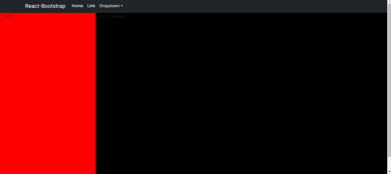
but not working see the result
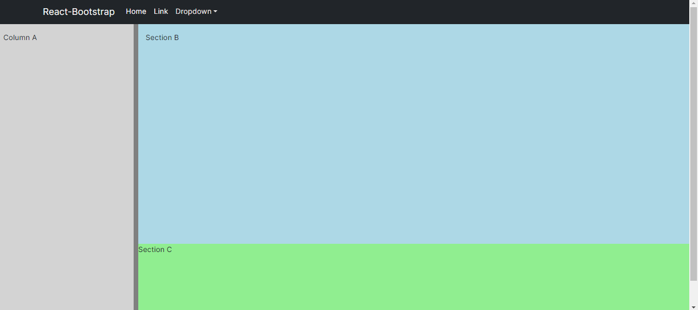
khurram shafique answer working but also want to know how to do it B and C section also
my updated code for A B C section :
 <div
        ref={containerRef}
        style={{ display: "flex", height: "100vh", width: "100%" }}
      >
        <div
          style={{
            width: `${columnWidth}%`,
            background: "lightgrey",
            overflow: "auto", // Enable scrollbar when content exceeds height
          }}
        >
          <div style={{ height: "500px", padding: "16px" }}>Column A</div>
        </div>
        <div
          ref={handleRef}
          onMouseDown={onMouseDown}
          style={{ cursor: "ew-resize", width: "10px", background: "grey" }}
        />
        <div
          style={{
            width: `${100 - columnWidth}%`,
            display: "flex",
            flexDirection: "column",
          }}
        >
          <div
            style={{
              background: "lightblue",
              overflow: "auto", // Enable scrollbar when content exceeds height
              flex: "70%", // 70% of the available space
            }}
          >
            <div style={{ height: "300px", padding: "16px" }}>Section B</div>
          </div>
          <div
            style={{
              background: "lightgreen",
              height: "30%", // 30% of the available space
              overflow: "auto", // Enable scrollbar when content exceeds height
            }}
          >
            Section C
          </div>
        </div>
      </div>


2
Answers
in React what Framework you are using , Bootstrap, Tailwind or martial UI, and i am giving you generic code which you can
use according to your situation
here is the Rendering part where you have return so you just need to add rows in colum be so now you are dividing column in two or as many rows as you want .