


This is the code:
.container {
display: flex;
flex-wrap: wrap;
width: 400px;
height: 400px;
background-color: antiquewhite;
}
.first {
width: 200px;
background-color: aquamarine;
}
.second {
width: 200px;
background-color: rgb(122, 88, 177);
}
.third {
width: 200px;
height: 200px;
background-color: rgb(79, 152, 91);
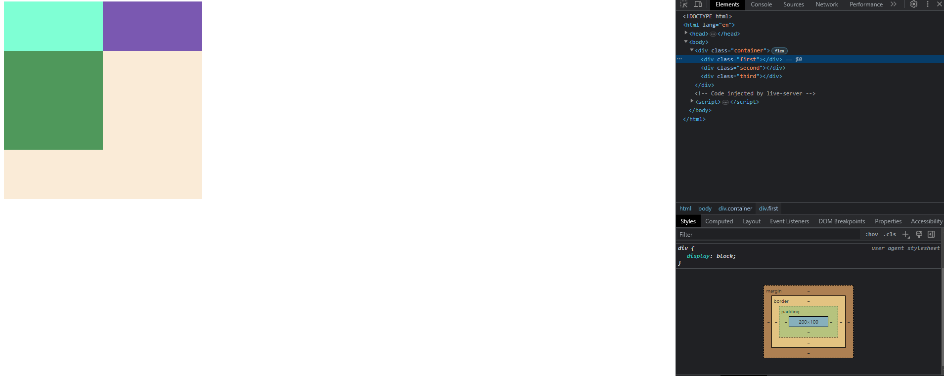
}<div class="container">
<div class="first"></div>
<div class="second"></div>
<div class="third"></div>
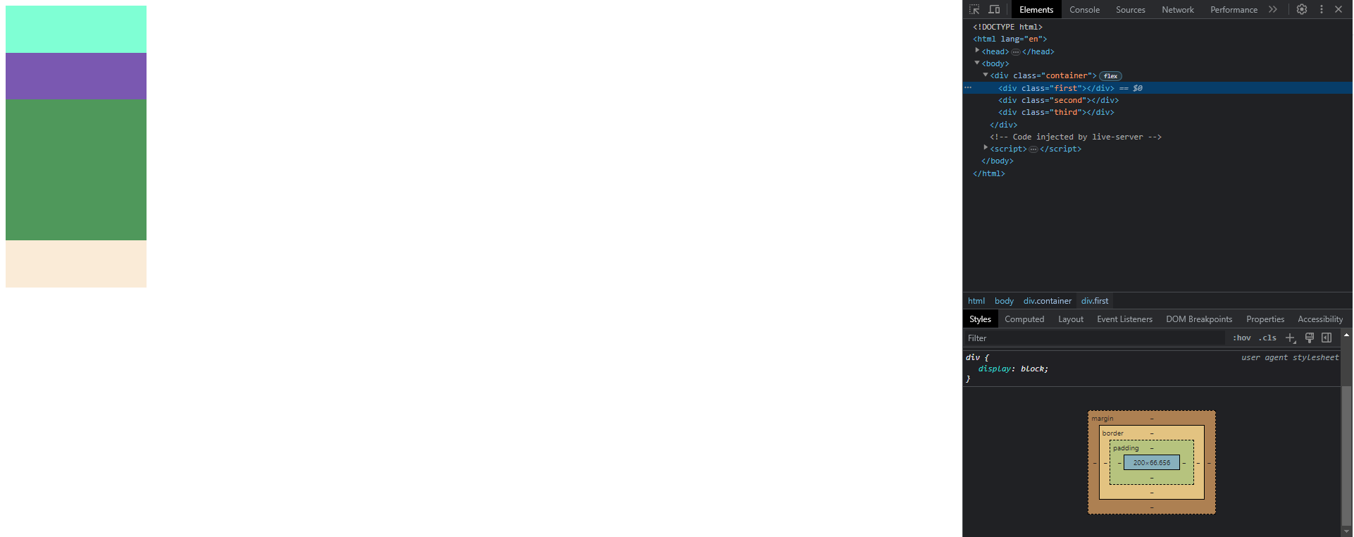
</div>When .container has 400px width .third block wrap onto another line and .first and .second. elements have height 100px, but when .container has 200px width .first and .second element have 66.6px height.
I don’t understand why this happening and how it works.
I tried to to figure it out in some logical way but dimensions don’t fit any calculations.
2
Answers
The @media query has been added to the CSS. This query will only be applied when the browser window width is less than or equal to 200px.
The flex-wrap property has been changed to nowrap in the @media query. This will prevent the flex items from wrapping when the browser window width is less than or equal to 200px.
This will ensure that the .first and .second elements have a height of 100px at all widths, regardless of the width of the container.
TL;DR The Flexbox Algorithm specification [1] has the answers you are looking for, but it’s kinda complicated.
To begin, we need to answer a question why first and second div even have any height at all – as they don’t have any content nor defined
heightvalue. In normal conditions they should be invisible! But we can see them. This is because flex container will try to stretch the items across the cross axis (by default).In considered flex container, main axis is X (related to width) and cross axis is Y (related to height). In other words,
heightis "cross" dimension. Determining height of your items is therefore described in the spec as "Cross Size Determination". Here is an excerpt:Taken from: https://www.w3.org/TR/css-flexbox-1/#cross-sizing
You can follow these steps to figure out the principle you are asking for. The 66.6px you are seeing probably comes from the calculation of "hypothetical cross size" in step 7 above.
[1] https://www.w3.org/TR/css-flexbox-1/#layout-algorithm