


I am working on a chat app whose UI is made with React 18.
The app has a sidebar containing user profiles. The app is no taller then the browser window, so the list of user profiles has to be scrollable if necessary.
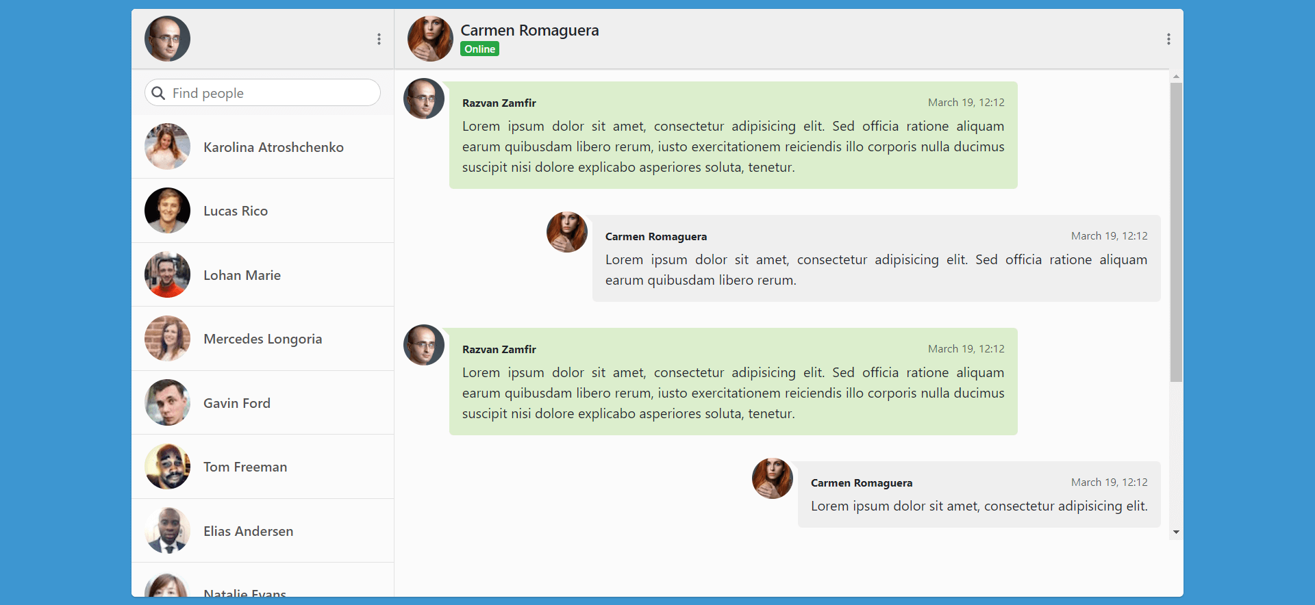
For this purpose, in the UsersList.jsx React-Perfect-Scrollbar:
import './_usersList.css';
import axios from 'axios';
import PerfectScrollbar from 'react-perfect-scrollbar';
import { useLocation } from 'react-router-dom';
import { useEffect, useState } from 'react';

export default function UsersList() {

  const API_URL = 'https://randomuser.me/api';
  const location = useLocation();
  const [users, setUsers] = useState([]);

  const getUsers = async () => {
    const { data: { results } } = await axios.get(`${API_URL}/?&results=20&inc=id,name,email,picture`, {
    });

    setUsers(results);
  }

  const usersList = () => {
    return users.map(user => (
      <li className="d-table-row w-100">
        <div className="user-image-container d-table-cell">
          <img src={user.picture.thumbnail} alt={`user.name.first user.name.last`} className="rounded-circle" />
        </div>
        <div className="text d-table-cell">
          <h3 className="display-name m-0">{user.name.first} {user.name.last}</h3>
        </div>
      </li>
    ))
  }

  useEffect(() => {
    getUsers();
  }, [location])

  return (
    <div className="chat-users">
      <PerfectScrollbar>
        <ul className="users-list list-unstyled m-0 d-table w-100">
          { usersList() }
        </ul>
      </PerfectScrollbar>
    </div>
  );
}
In _usersList.css, instead of a fixed height for the <div className="chat-users"> element, I have:
.chat-users {
  position: relative;
  flex: 1;
}
This is because I need the element to stretch across all the available space.
But there is a problem. Unless there is a fixed height in pixels (e.g. height: 400px;) on the element, the scrollbar is not rendered, even if necessary.
The problem is fixed for mobile only, if I add overflow-y: auto, like so:
.chat-users {
  position: relative;
  flex: 1;
  overflow-y: auto;
}
But it persists on desktop.
There is a sandbox with the code here.
2
Answers
I have solved the problem by doing the following:
Adding
overflow-y: autofor all resolutions.And a calculated height for desktop:
I replaced it with above css and its showing me vertical scrollbar.