 Question posted in


Here’s a simple bit of HTML:
<html>
    <head>
        <style>
            .container {
                display: flex;
                flex-direction: column;
            }
        </style>
    </head>
    <body>
        <div class="container">
            <button>Button 1</button>
            <button>Button 2</button>
        </div>
    </body>
</html>
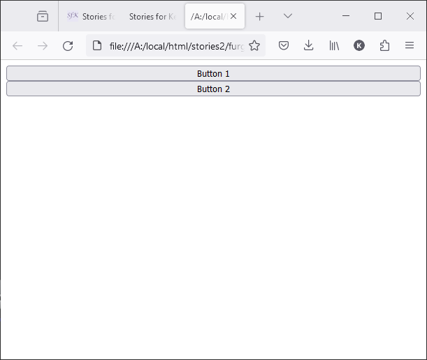
This makes a column of two buttons occupying the width of the window:
If I surround the first button in a div with no class like this:
<html>
    <head>
        <style>
            .container {
                display: flex;
                flex-direction: column;
            }
        </style>
    </head>
    <body>
        <div class="container">
            <div><button>Button 1</button></div>
            <button>Button 2</button>
        </div>
    </body>
</html>
then I would expect there to be no change to the output, but that’s wrong. I get:
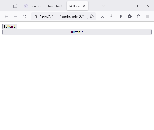
Why is this?
2
Answers
This is because the by default width of contents like div’s in HTML is fit-content
So this div is also adjusting it’s width according to the content inside it
As you can see this in following example
the button is no more directly affected by the display property of the parent container(div with the class name of container)… the button is now nested inside a div(with no class). if you want the button to take full width, give it a width property of 100%. this way it now takes the full width of the new parent container which is the div that has no class.
the ‘display: flex;’ style affects the direct children of the parent container