 Question posted in


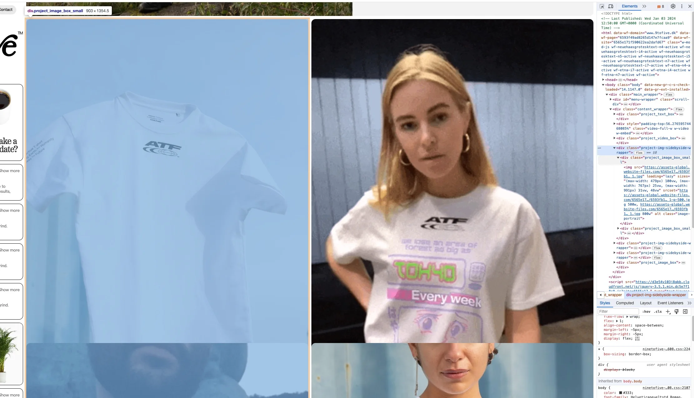
To explain it as shortly as possible; I have two pictures inside a wrapper. I want these pictures to retain a ratio 3:2. I want the pictures to just push the next object further down the page. This works fine when below a certain browser width, but above a certain browser width it starts overflowing the wrapper… ? Why does the wrapper div stop growing in height? the max-height is set to: none;
I feel like there’s something obvious I’m missing here?
My thinking is that the img has a certain width defiened by the browser width. And because I’ve defined the ration to be 3:2 (portrait) it should automatically calculate the height as well.
I’ve tried giving the wrapper a css property
*
max-height: none !important;*
but it doens’t seem to work.
2
Answers
I don’t know if i understand the problem correctly, but if you want to have the menu-wrapper at the top and the content_wrapper at the bottom under 500px you have to remove position: sticky; from menu-wrapper with some media query.
Try updating the styles for the selector
.project-img-sidebyside-wrapperlike this:This should resolve the issue of overlapping. I couldn’t figure out how to solve it using flex.