


I’m not so much looking for a solution as I am trying to understand what is happening.
In the code below, I have a flex enabled div with two child elements.
- I explicitly set its width of the first child to 18rem.
- I set the width of the second child to 100%.
.flex {
  display: flex;
}

.w-72 {
  width: 18rem;
}

.w-full {
  width: 100%;
}

.bg-blue-300 {
  --tw-bg-opacity: 1;
  background-color: rgb(147 197 253 / var(--tw-bg-opacity));
}

.bg-orange-200 {
  --tw-bg-opacity: 1;
  background-color: rgb(254 215 170 / var(--tw-bg-opacity));
}
<div class="flex">
<nav class="bg-blue-300 w-72">Nav</nav>
<article class="w-full bg-orange-200">Article</article>
</div>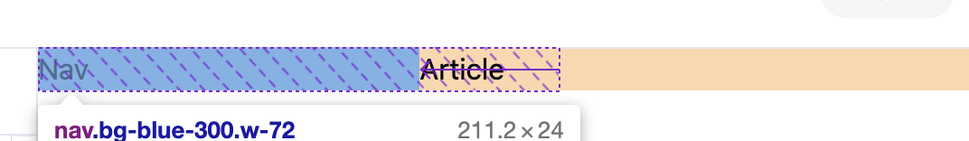
I thought this would expand the <article> to fill the remaining horizontal width, but it actually causes the width of the neighboring <nav> to shrink. (Try running this code with and without w-full to see for yourself.)
Why does this happen?
3
Answers
This is because flex always compromises widths when there are conflicts. It cannot both make the right side
100%and the left side18remso it cuts the same amount out of both to make them both fit. For example, if you were to have two items in a flex box, and each one is set towidth: 60%, the working width of each item will be50%, because flex will shave10%off each side to make them both fit. To fix this, you can specify amin-widthwhich is much more powerful thanwidthby itself.However, the correct way to have an item fill the remaining space in a flexbox is to use
flex: 1instead of using width, as shown below.A default setting on a flex container is
flex-shrink: 1. This means that flex items will automatically shrink to avoid overflowing the container.To force flex items to respect their defined lengths, you must disable
flex-shrink.Add this to your code:
(The equivalent shorthand for the code above would be
flex: 0 0 18rem.)Applying the
w-fullclass to the element causes it to have a width: 100%, while the element has a fixed width of 18rem. Since the total available space is limited, flex distributes the available space proportionally, causing both elements to shrink so they fit within the container.Using
flex: 1is the correct way to make an item fill the remaining space in a flex container, allow it to grow and occupy the available space proportionally, and not have an effect on the width of other elements.This should work: