 Question posted in


I am triying to do a card to showcase services. It only has a image and a little text. Nothing too fancy and not really difficult to achieve…But for some reason that i can’t figure out, the image is not taking the full width and height of the container.
Am i missing something?
This is my code so far:
PS: Images(type) is just a list of possible sources that can be passed through props to the component. Nothing to worry about.
ServiceImage.tsx:
type Props = {
  source: Images;
  title: string;
};

export default function ServiceImage({
  source,
  title,
}: Props) {
  return (
    <div
      className="service-image__container"
    >
      <div className="image-container">
        <img
          src={`/assets/services/${source}`}
          alt={title}
          className={`service-image`}
        />
      </div>
      <p>{title}</p>
    </div>
  )
}
SASS:
.service-image {
width: 100%;
height: 100%;
object-fit: cover;
}
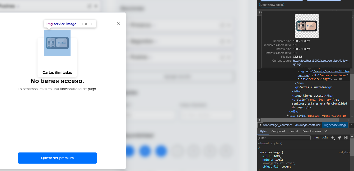
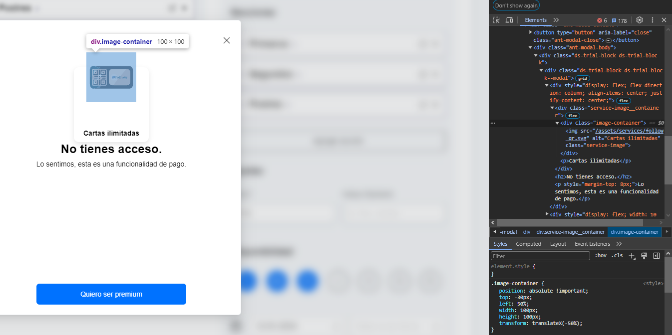
.image-container {
position: absolute !important;
top: -30px;
left: 50%;
width: 100px;
height: 100px;
transform: translateX(-50%);
}
.service-image__container {
align-items: center;
justify-content: center;
background: #FFFFFF;
border-radius: 10px;
box-shadow: 0px 4px 10px rgba(0, 0, 0, 0.1);
padding: 10px;
width: 150px;
height: 150px;
display: flex;
position: relative;
text-align: center;
p {
font-weight: bold;
font-size: 14px;
align-self: flex-end;
}
}
Thanks beforehand!
2
Answers
It is.
Your
.image-containeris100px x 100px.According to
object-fit: cover, the image is covering that area.In the example below, I have changed
top: -30px;totop: 0;so you can see the whole of.image-container.Working Example:
It is doing the cover but also you don’t need the
positionstuff if you use a grid.Note that
place-items: center;is a shortcut to "super-center" in the container.I took liberty to set the font to 16px which is many modern browsers default anyway then used
embecause my brain likes it better as a more modern approach IMHO. I added a body background color just to show what is where a bit.I added multiple cards with different image sizes to show it was doing the cover.
Note I turned your CSS kind of upside down as I like to define my containers first then what fits in them. Same for the class on title so now I can make that element a div or span or whatever I want without changing CSS.