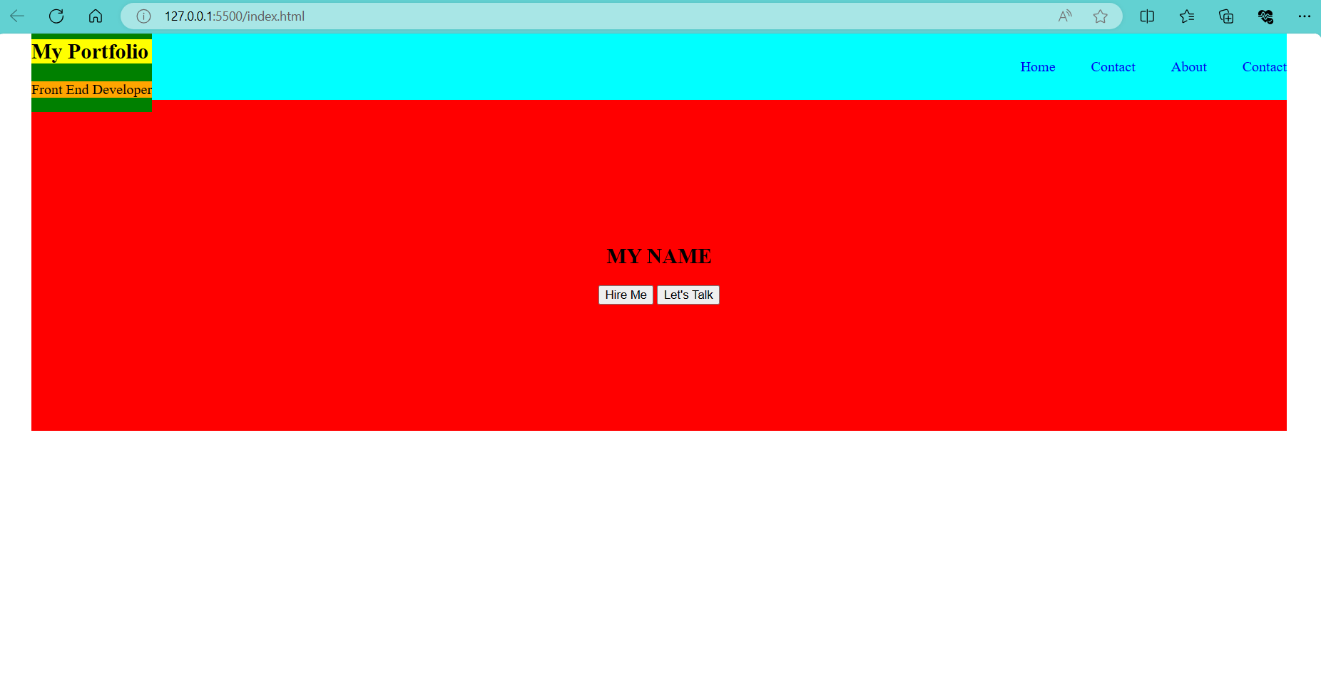
I decided to make a personal project where I am trying to make my own portfolio by making a website which I will be adding HTML, CSS, and JavaScript. I am currently styling the header (I add bright colors to see if the width and height of images are correct) and I noticed the green box to be overflowing and I can’t seem to point what causes this. Basically I want the "My Portfolio" and "Front End Developer" to be closer to each other. Is there a way to make this happen? Here’s my code and a sample image for reference:
body{
    margin:0;
    padding:0;
    box-sizing: border-box;
}

.hero-page-container{
    height:100vh;
    width:100vw;
    padding:0px 40px;
    box-sizing: border-box;
}

header{
    display: flex;
    align-items: center;
    height:10%;
    justify-content: flex-end;
    background-color: aqua;
}

.header-title{
    margin-right: auto;
    align-items: center;
    background-color: green;
}

.header-title h1{
    background-color: yellow;
}

.header-title p{
    background-color: orange;
}


ul{
    display:flex;
    list-style-type: none;
    margin: 0;
    padding: 0;
    overflow: hidden;
}

header ul li{
    display: inline-block;
    margin-left:40px;
}

header ul li a{
    text-decoration: none;
}

.header-contact-btn{
    text-decoration: none;
    margin-left:40px;
}

.hero-content{
    width:100%;
    background-color: red;
    text-align: center;
    height:50vh;
    display: flex;
    justify-content: center;
    align-items: center;
}
<!DOCTYPE html>
<html lang="en">
<head>
<meta charset="UTF-8">
<meta name="viewport" content="width=device-width, initial-scale=1.0">
<link rel="stylesheet" href="style.css">
<title>Document</title>
</head>
<body>
<section class="hero-page-container">
<header>
<div class="header-title">
<h1>My Portfolio</h1>
<p>Front End Developer</p>
</div>
<nav>
<ul>
<li><a class="active" href="#home">Home</a></li>
<li><a href="#contact">Contact</a></li>
<li><a href="#about">About</a></li>
</ul>
</nav>
<a href="#" class="header-contact-btn">Contact</a>
</header>
<div class="hero-content">
<div>
<h1>MY NAME</h1>
<button>Hire Me</button>
<button>Let's Talk</button>
</div>
</div>
</section>
</body>
</html>
 Question posted in


2
Answers
Remove the 10% height on the header, and remove the margins on the
h1and the<p>.As others have pointed out, the reason is that the
h1andpin yourheaderhave default top and bottom margins which all together extends theheight:10%;you applied toheader.To avoid this, you can change
height:10%;tomin-height:10%;in theheaderrule. This will extend the height of your header, but it will also prevent it from getting smaller than 10%.If you don’t want the
headerto get higher than 10%, you need to reset the margins for the elements inside it and in general overthink if these would at at fit in there (i.e. probably not…).