


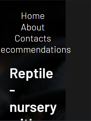
I have a site fully adapted for mobile devices, but there is one problem, when you open the site on a phone, it seems to be zoomed in, and in order to see it in its normal state, you need to move it away.
It looks something like this:

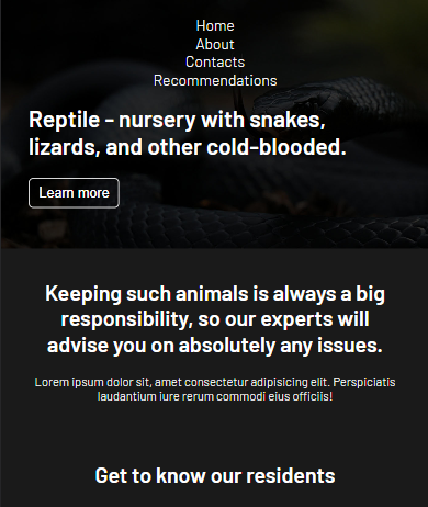
The full version looks like this:
I think that the problem is in the styles of the delimiter blocks.
.wrapper {
    min-width: 1400px;
}

.container {
    max-width: 1700px;
    padding-left: 40px;
    padding-right: 40px;
    margin: 0 auto;
}
The section structure is something like this:
<div class="wrapper">
       <section class="header">
            <div class="container">
                <h1 class="header__header">
                    Reptile - nursery with snakes, lizards, and other cold-blooded.
                </h1>
                <p>content content content content content content </p>
                <button class="header__button">Learn more</button>
            </div>
        </section>
</div>
But at the same time, if you remove the styles of the bounding boxes, the site does not scale adequately:
How can this be fixed?
2
Answers
It turned out that the problem was not at all in the delimiter blocks, but in the size of the text on the site, it did not scale well due to fixed values Remove the min-width in .wrapper and add:
With the code you provided, the wrapper will never be less than 1400px, which means it will overflow on any viewport narrower than that. You need to set the wrapper width to 1400px, and then add a max-width