skip to Main Content

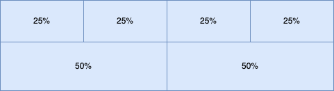
Below is my flexbox layout with property flex-wrap: wrap; gap: 0;. All the elements in the flexbox have width in percentage as shown.

Sample flexbox layout

But when I set gap: 1px, the layout is breaking. So I tried applying 1px border for all the elements inside flexbox, but the borders look 2px as the elements are all next to each other. Is there a way to provide the gap inside this layout without affecting the width percentage? Reason being, the layout width is dynamic and is not known before hand.

2

Answers


  1. You can subtract the gap and border width from each child’s basis width using calc function. For example,

    .container {
      display: flex;
      flex-flow: row wrap;
      gap: 1px;
    }
    
    .container>div {
      border: 1px solid lightblue;
      display: flex;
      justify-content: center;
      align-items: center;
    }
    
    .child-25 {
      flex-basis: calc(25% - 3px);
      height: 50px;
    }
    
    .child-50 {
      flex-basis: calc(50% - 3px);
      height: 100px;
    }
    <div class="container">
      <div class="child-25">25%</div>
      <div class="child-25">25%</div>
      <div class="child-25">25%</div>
      <div class="child-25">25%</div>
      <div class="child-50">50%</div>
      <div class="child-50">50%</div>
    </div>
    Login or Signup to reply.
  2. You can subtract the margin or gap from each child width using calc function. Try this:

    .myflex-gap > * {
      margin: 12px 0 0 12px;
      width: calc(25% - 12px);
      background: bisque;
    }
        
    .myflex-gap {
      display: flex;
      flex-wrap: wrap;
      margin: -12px 0 0 -12px;
      width: 100%;
    }
    <div class="myflex-gap">
      <div>1</div>
      <div>2</div>
      <div>3</div>
      <div>4</div>
      <div>5</div>
      <div>6</div>
    </div>
    Login or Signup to reply.
Please signup or login to give your own answer.
Back To Top
Search