skip to Main Content

I have a grid layout in an existing app:

<div id="wrapper">
  <div class="block">
    <div class="card"></div>
  </div>
  <div class="block">
    <div class="card"></div>
  </div>
  <div class="block">
    <div class="card"></div>
  </div>
  <div class="block">
    <div class="card"></div>
  </div>
  <div class="block">
    <div class="card"></div>
  </div>
  <div class="block">
    <div class="card"></div>
  </div>
  <div class="block">
    <div class="card"></div>
  </div>
  <div class="block">
    <div class="card"></div>
  </div>
  <div class="block">
    <div class="card"></div>
  </div>
  <div class="block">
    <div class="card"></div>
  </div>
</div>

and CSS:

#wrapper {
  display: grid;
  grid-template-columns: repeat(auto-fit, minmax(250px, 1fr));
  gap: 16px;
  padding: 8px 16px 16px;
  margin-bottom: 64px;
}

.block {
  display: flex;
  min-height: 100px;
}
    
.card {
  background: #fff;
  box-shadow: none;
  box-sizing: border-box;
  border-radius: 12px;
  border-width: 1px;
  border-style: solid;
  border-color: #03a9f4;
  color: black;
  display: block;
  transition: all 0.3s ease-out 0s;
  position: relative;
  height: 100%;
  width: 100%;
}

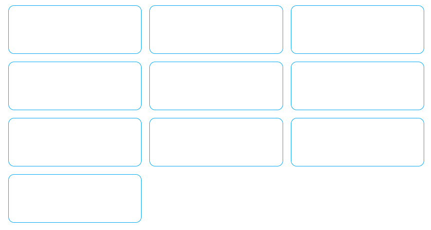
This looks and works great on all resolutions:
enter image description here

enter image description here

Now I want to make some blocks take 2 rows as height, so I’ve added:

.x2 {
  grid-row: span 2;
}

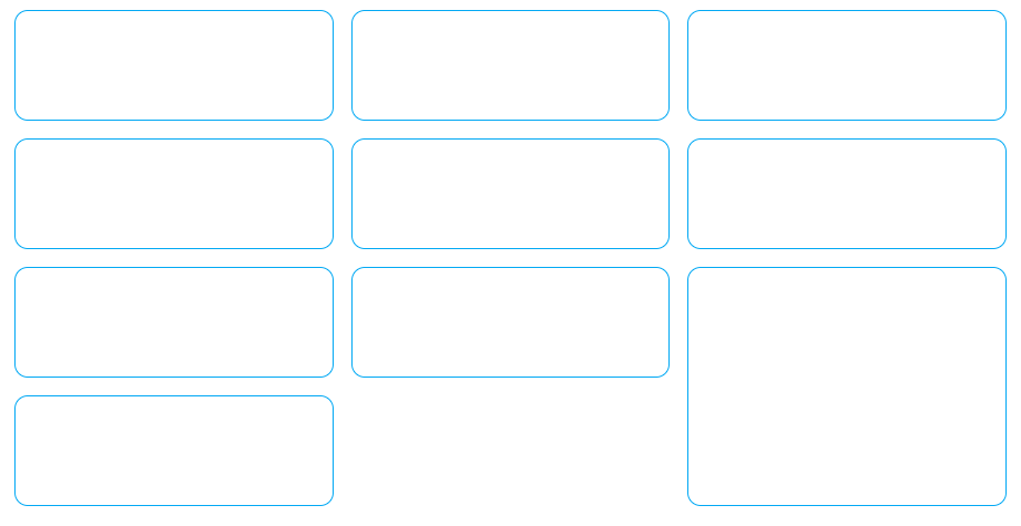
but this doesn’t look good on all resolutions:
enter image description here

enter image description here

In the final application, I display items in cards and the idea is to make the card height depend on the number of items inside (to avoid scrollbars).

How do I fix the layout so I can set grid-row span on specific items and the layout will adapt? I’d like to avoid JS solutions if possible.

EDIT: I’m adding codepen with my current code: https://codepen.io/Misiu/pen/bGmqVBG?editors=1100

2

Answers


  1. The case where you are expecting two rows height that rectangle block is on last row. It is not going through display wrap and so its not taking proper height.

    You can set min-height as you did for other rectangles, keep height min-height: 200px

    Here is the codepen solution link https://codepen.io/abhijeetabnave/pen/ExdWyEQ

    Login or Signup to reply.
  2. The problem, so far as I can tell, seems to be the lack of a specific grid-row size for the auto-generated rows. If you add the following CSS:

    grid-auto-rows: 150px;
    

    to the declaration for the #wrapper element, then everything seems to line up (admittedly, I did "magic-number" the row-height, so adjust to your preference).

    In the following the JavaScript is used purely to assign the x2 class-name to a random element to demonstrate the adaptive nature of the CSS:

    let blockElements = document.querySelectorAll('.block'),
      getRandom = (min, max) => Math.floor(Math.random() * (max - min) + min);
    
    document.querySelector('button').addEventListener('click',
      () => {
        document.querySelectorAll('.x2').forEach(
          (el) => el.classList.remove('x2')
        );
        blockElements[getRandom(0, blockElements.length)].classList.add('x2');
      });
    #wrapper {
      display: grid;
      grid-template-columns: repeat(auto-fit, minmax(250px, 1fr));
      gap: 16px;
      padding: 8px 16px 16px;
      margin-bottom: 64px;
      grid-auto-rows: 150px;
    }
    
    .block {
      display: flex;
      min-height: 100px;
    }
    
    .card {
      background: #fff;
      box-shadow: none;
      box-sizing: border-box;
      border-radius: 12px;
      border-width: 1px;
      border-style: solid;
      border-color: #03a9f4;
      color: black;
      display: block;
      transition: all 0.3s ease-out 0s;
      position: relative;
      height: 100%;
      width: 100%;
    }
    
    .x2 {
      grid-row: span 2;
    }
    
    .x2 .card {
      background-color: transparent;
      background-image: radial-gradient( circle at 0 0, #03a9f4, transparent);
    }
    <button type="button">Embiggen random element</button>
    <div id="wrapper">
      <div class="block">
        <div class="card"></div>
      </div>
      <div class="block">
        <div class="card"></div>
      </div>
      <div class="block">
        <div class="card"></div>
      </div>
      <div class="block">
        <div class="card"></div>
      </div>
      <div class="block">
        <div class="card"></div>
      </div>
      <div class="block">
        <div class="card"></div>
      </div>
      <div class="block">
        <div class="card"></div>
      </div>
      <div class="block">
        <div class="card"></div>
      </div>
      <div class="block">
        <div class="card"></div>
      </div>
      <div class="block">
        <div class="card"></div>
      </div>
    </div>

    JS Fiddle demo.

    References:

    Login or Signup to reply.
Please signup or login to give your own answer.
Back To Top
Search