skip to Main Content

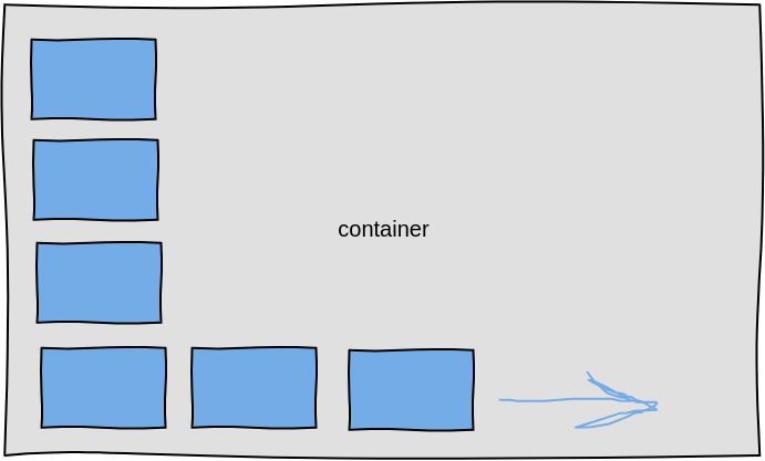
How can I achieve wrapping of elements into an L shape inside of a container? The elements are placed down along the left side. As the container height shrinks, more items should be placed horizontally along the bottom.

enter image description here

How to deal with "leftover" vertical space after wrapping? Ideally everything would be flush against the bottom, and extra space could be on top.

This type of wrapping is needed to wrap the buttons in a toolbar in a landscape screen. I have proposed other alternatives to the client but they want this method. There does not seem to be a way using flexbox to make it go in one direction and then another. Furthermore, there is no way to style items in flexbox based on whether they are on the first line or not, because if there were I could add a large margin to the items not on the first line to cause them to wrap.

2

Answers


  1. Chosen as BEST ANSWER

    I achieved it using a floating DIV that blocks off the space in the upper right. The other elements, if they are inline, are forced to wrap around it. I sized the float to be the container size minus the size of the items using the CSS calc() function.

    .container {
      background: #8080dd;
      height: 300px;
      flex-flow: row wrap;
      position: relative;
    }
    
    /* Just an example item */
    .item {
      border: 3px solid black;
      font: bold 20px sans-serif;
      width: 50px;
      height: 50px;
      flex: 0 0 auto;
      display: inline-block;
      margin: 10px;
    }
    
    /* This is a floating item that blocks out the other items.
       It's size is calculated to be the width of the container
       minus some space for the items.
    */
    .blocker {
      background: #80000030;
      border: 2px #800000;
      display: block;
      width: calc(100% - 80px);
      height: calc(100% - 80px);
      float: right;
    }
    <div class="container">
      <div class="blocker"></div>
      <div class="item">1</div>
      <div class="item">2</div>
      <div class="item">3</div>
      <div class="item">4</div>
      <div class="item">5</div>
      <div class="item">6</div>
      <div class="item">7</div>
      <div class="item">8</div>
      <div class="item">9</div>
      <div class="item">10</div>
    </div>


  2. What I understand of your question is that you want to have a wrapper (for posts for example) shape like L. I think you can’t do this with flexbox. you should do this by grid.

    like your shared image:

        .wrapper{
            display: grid;
            grid-template-columns: repeat(auto-fit, minmax(100px, 1fr));
            grid-template-rows: repeat(3, 100px);
            gap: 20px;
            justify-content: center;
        }
        li{
            border: 3px solid black;
            list-style: none;
        }
        li:nth-child(1){
            grid-column: 1/2;
            grid-row: 1/2;
        }
        li:nth-child(2){
            grid-column: 1/2;
            grid-row: 2/3;
        }
        li:nth-child(3){
            grid-column: 1/2;
            grid-row: 3/4;
        }
        li:nth-child(4){
            grid-column: 2/3;
            grid-row: 3/4;
        }
        li:nth-child(5){
            grid-column: 3/4;
            grid-row: 3/4;
        }
        li:nth-child(6){
            grid-column: 4/5;
            grid-row: 3/4;
        }
        li:nth-child(7){
            grid-column: 5/6;
            grid-row: 3/4;
        }
    <ul class="wrapper">
      <li>1</li>
      <li>2</li>
      <li>3</li>
      <li>4</li>
      <li>5</li>
      <li>6</li>
      <li>7</li>
    </ul>

    this is not dynamic but achieve that goal. Note that what you want is not rational because if you add more lis and even hard coded, the li boxed shrinks unless you define the number of columns and don’t make more items than it should be.

    Login or Signup to reply.
Please signup or login to give your own answer.
Back To Top
Search