skip to Main Content

I realize that when I center text, its enveloping element becomes as wide as possible to be able to display the text in the true center with correct linebreaks and alignment.

But, what if I want to align a subtitle on the left hand side of centered text?

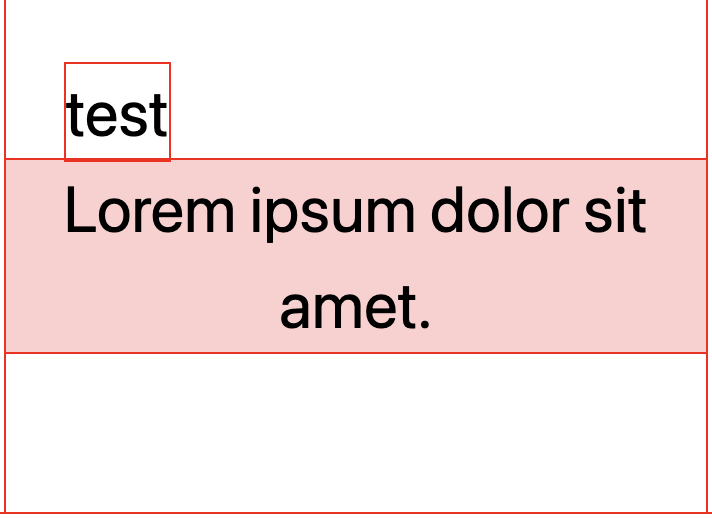
desired situation, 'test' lined out with 'Lorem'

In the above image I simulated the desired outcome with a margin on the ‘test’ element, but is there a way to dynamically align this?

My code:

* {
    outline: 1px solid red;
}

.contain {
    margin: 0 auto;
    max-width: 350px;
}

.wrap {
    margin: 0 auto;
    padding: 80px 0;
}

.content {
    background: #ff000030;
    font-size: 32px;
    position: relative;
    text-align: center;
    width: fit-content;
}

.sub {
    /* margin-left:30px; */
    position: absolute;
    top: 0;
    transform: translateY(-100%);
}
<div class="contain">
    <div class="wrap">
        <div class="content">
            Lorem ipsum dolor sit amet.
            <div class="sub">test</div>
        </div>
    </div>
</div>

If at all possible, I’d like to avoid using javascript for this, and just find a pure css solution.

3

Answers


  1. A solution from the future using the Anchor Positioning: https://drafts.csswg.org/css-anchor-position-1/#anchoring

    Not ready for production but can be tested on Chrome with experimental flag enabled.

    * {
      outline: 1px solid red;
    }
    
    .contain {
      margin: 0 auto;
      max-width: 350px;
    }
    
    .wrap {
      margin: 0 auto;
      padding: 80px 0;
    }
    
    .content {
      background: #ff000030;
      font-size: 32px;
      text-align: center;
      width: fit-content;
    }
    
    /* we use the before pseudo element (an inline element) as the anchor */
    .content::before {
      content: "";
      anchor-name: --align;
    }
    
    .sub {
      position: absolute;
      bottom: anchor(--align 0%);
      left: anchor(--align 0%);
    }
    <div class="contain">
      <div class="wrap">
        <div class="content">
          Lorem ipsum dolor sit amet.
          <div class="sub">test</div>
        </div>
      </div>
    </div>
    Login or Signup to reply.
  2. I could get the effect you want only if the "test" text is before the centered one, and uses an inline-block display; you can test varying the centered text to change the position:

    * {
        outline: 1px solid red;
    }
    
    .contain {
        margin: 0 auto;
        max-width: 350px;
    }
    
    .wrap {
        margin: 0 auto;
        padding: 80px 0;
    }
    
    .content {
        background: #ff000030;
        font-size: 32px;
        position: relative;
        text-align: center;
        width: fit-content;
    }
    
    .sub {
        position: absolute;
        top: 0;
        transform: translateY(-100%);
        display: inline-block;
    }
    <div class="contain">
        <div class="wrap">
            <div class="content">
                <div class="sub">test</div>
                Lorem ipsum dolor sitametameta amet.  
            </div>
        </div>
    </div>
    Login or Signup to reply.
  3. I will leave it as an option, if you have the opportunity to arrange <br>:

    .wrapp {
        max-width: 140px;
        margin: 0 auto;
    }
    
    .title {
        width: max-content;
        text-align: center;
        max-width: 100%;
    }
    <div class="wrapp">
      <div class="subtitle">test</div>
      <div class="title">Lorem ipsum dolor<br> sit amet.</div>
    </div>
    Login or Signup to reply.
Please signup or login to give your own answer.
Back To Top
Search