


I am trying to use a grid display a list of items inside flex display. I was able to display correctly but the grid is overflowing outside the container.
My expected result was the container grows as the data on that is displayed on the grid without overflowing.
As the list goes on increasing, the list is overflowing the height of the container rather than container height increasing.
- How can I expand the flex container without causing overflow?
Note: I’ve tried solutions like adding a vertical scrollbar, which works, but it’s not meeting my requirements.
Update: Added a recreatable html and css
.dis{
    display: flex;
    height:auto;
}

.dlist {
    display: grid;
    row-gap: 5%;
    column-gap: 10%;
    grid-template-columns: 1fr 1fr 1fr;
}

.dgrid {
    display: flex;
    flex-direction: column;
    border-radius: 10px;
    gap: 5px;
}
<!DOCTYPE html>
<html>
<head>
<link rel="stylesheet" href="a.css" />
</head>
<body>
<div class="dis">
  <div class="dlist">
    <article class="dgrid">
      <h3>John elizabeth</h3>
    </article>
    <article class="dgrid">
       <h3>John elizabeth</h3>
     </article>
     <article class="dgrid">
       <h3>John elizabeth</h3>
     </article>
     <article class="dgrid">
       <h3>John elizabeth</h3>
     </article>
     <article class="dgrid">
       <h3>John elizabeth</h3>
     </article>
     <article class="dgrid">
       <h3>John elizabeth</h3>
     </article>
     <article class="dgrid">
       <h3>John elizabeth</h3>
     </article>
     <article class="dgrid">
       <h3>John elizabeth</h3>
     </article>
     <article class="dgrid">
       <h3>John elizabeth</h3>
     </article>
     <article class="dgrid">
       <h3>John elizabeth</h3>
     </article>
     <article class="dgrid">
       <h3>John elizabeth</h3>
     </article>
     <article class="dgrid">
       <h3>John elizabeth</h3>
     </article>
     <article class="dgrid">
       <h3>John elizabeth</h3>
     </article>
     <article class="dgrid">
       <h3>John elizabeth</h3>
     </article>
     <article class="dgrid">
       <h3>John elizabeth</h3>
     </article>
  </div>
</div>
</body>
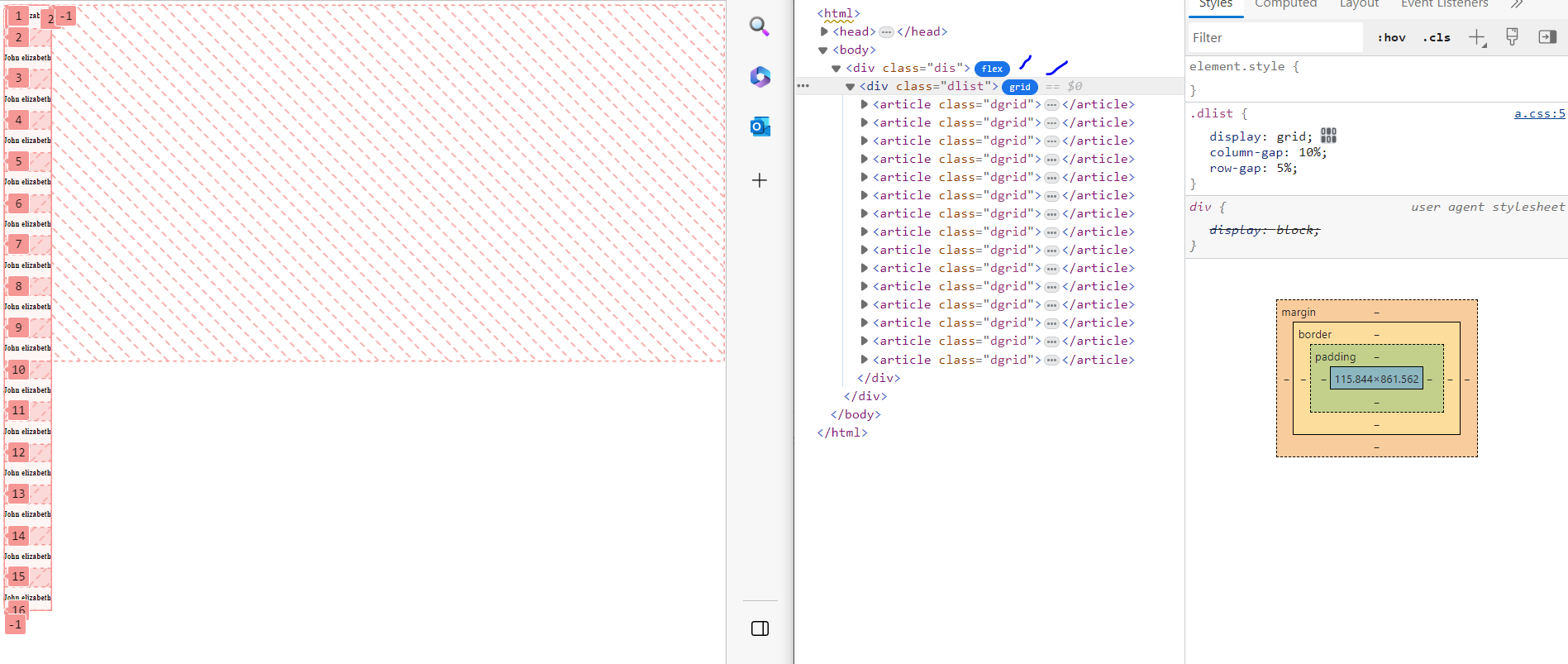
</html>Added a screenshot where the grid is overlapping the container. The problem is the container is not growing and I am unable to figure of why the grid is overflowing and not the outer container.
2
Answers
To make your grid responsive, you can use CSS media queries. These queries enable you to adjust the number of columns based on the screen size. As the screen width changes, the
gridcan adapt accordingly. Here’s an example:In this code, auto-fit allows the grid to automatically adjust the number of columns based on available space, and
minmax(200px, 1fr)sets a minimum columnwidth of 200pxbut allows columns to expand when there’s more space.3. Expanding the Flex Container:
Flex containers typically expand to fit their content by default. However, if you’re facing overflow issues, consider setting a
max-heighton theflexcontainer or using overflow: auto to add avertical scrollbarwhen the content exceeds a certainheight. This ensures that the content remains accessible without overlapping thefooter.Here’s an updated version of your CSS with these adjustments:
You can customize the
minmaxvalues and other styles to create your preferred layout and ensure responsiveness.HTML for running the demo:
If my answer does not Help, go to this StackOverflow question if this also don’t help you see this tutorial very good explaining has been done here how to use flexbox in grid. If this also don’t suit you this is the same StackOverflow question that you asked somewhat same-.
This is caused by the fact that you are using a
gappercentage value. You will have to use other units: