skip to Main Content

I need to create a table-like structure for some data. Half of the rows need to be split into columns (grey in the pic) and the other half needs to have only one column which should span the entire width. Also there needs to be a margin after the wide rows, which is the main reason why I can’t use a <table>.

enter image description here

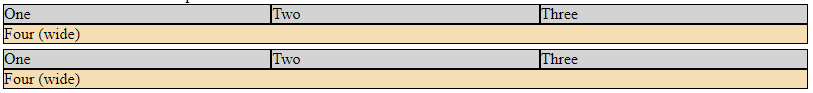
In my snippet below, I have achieved my goal using a grid and grid-template-columns: repeat(3, 1fr);. However, it only works if I have 3 gray columns. In reality, I don’t know in advance how many columns there will be above the wide row. I’m looking for a solution which works for a dynamic number of gray columns (determined by the number of divs in the markup).

I attempted to use auto-fill as well for the column template, but it doesn’t expand the gray columns to fill the width of the row. The columns are constrained by the given 100px value.

How do I make the gray columns fill the entire row without specifying the number of columns in my CSS?

.container {
  width: 100%;
  margin-bottom: 10px;
}

.row {
  display: grid;
  margin-bottom: 5px;
}

.row.static-repeat {  
  grid-template-columns: repeat(3, 1fr); 
}

.row.auto-fill {  
  grid-template-columns: repeat(auto-fill, minmax(100px, 1fr)); 
}

.cell {
  border: 1px solid black;
  background-color: lightgray;
}

.wide {
  grid-column: 1 / -1;
  background-color: wheat;
}
<div class="container">
  Three columns with static repeat:
  <div class="row static-repeat">
    <div class="cell">
      One
    </div>
    <div class="cell">
      Two
    </div>
    <div class="cell">
      Three
    </div>
    <div class="cell wide">
      Four (wide)
    </div>
  </div>
    <div class="row static-repeat">
    <div class="cell">
      One
    </div>
    <div class="cell">
      Two
    </div>
    <div class="cell">
      Three
    </div>
    <div class="cell wide">
      Four (wide)
    </div>
  </div>
</div>

<div class="container">
  Four columns with static repeat (all gray columns should be on the same row):
  <div class="row static-repeat">
    <div class="cell">
      One
    </div>
    <div class="cell">
      Two
    </div>
   <div class="cell">
      Three
    </div>
    <div class="cell">
      Four
    </div>
    <div class="cell wide">
      Five (wide)
    </div>
  </div>
    <div class="row static-repeat">
    <div class="cell">
      One
    </div>
    <div class="cell">
      Two
    </div>
   <div class="cell">
      Three
    </div>
    <div class="cell">
      Four
    </div>
    <div class="cell wide">
      Five (wide)
    </div>
  </div>
</div>

<div class="container">
  Three columns with auto-fill (should take the whole width):
  <div class="row auto-fill">
    <div class="cell">
      One
    </div>
    <div class="cell">
      Two
    </div>
    <div class="cell">
      Three
    </div>
    <div class="cell wide">
      Four (wide)
    </div>
  </div>
    <div class="row auto-fill">
    <div class="cell">
      One
    </div>
    <div class="cell">
      Two
    </div>
    <div class="cell">
      Three
    </div>
    <div class="cell wide">
      Four (wide)
    </div>
  </div>
</div>

<div class="container">
  Four columns with auto-fill (should take the whole width):
  <div class="row auto-fill">
    <div class="cell">
      One
    </div>
    <div class="cell">
      Two
    </div>
   <div class="cell">
      Three
    </div>
    <div class="cell">
      Four
    </div>
    <div class="cell wide">
      Five (wide)
    </div>
  </div>
    <div class="row auto-fill">
    <div class="cell">
      One
    </div>
    <div class="cell">
      Two
    </div>
   <div class="cell">
      Three
    </div>
    <div class="cell">
      Four
    </div>
    <div class="cell wide">
      Five (wide)
    </div>
  </div>
</div>

2

Answers


  1. This is a flexbox job

    .container {
      margin-bottom: 10px;
    }
    
    .row {
      display: flex;
      flex-wrap: wrap;
      margin-bottom: 5px;
    }
    
    .cell {
      flex: 1;
      min-width: 0;
      background-color: lightgray;
      border: 1px solid black;
    }
    
    .wide {
      flex: 100%;
      background-color: wheat;
    }
    <div class="container">
      <div class="row static-repeat">
        <div class="cell">
          One
        </div>
        <div class="cell">
          Two
        </div>
        <div class="cell">
          Three
        </div>
        <div class="cell wide">
          Four (wide)
        </div>
      </div>
        <div class="row static-repeat">
        <div class="cell">
          One
        </div>
        <div class="cell">
          Two
        </div>
        <div class="cell">
          Three
        </div>
        <div class="cell wide">
          Four (wide)
        </div>
      </div>
    </div>
    
    <div class="container">
      <div class="row static-repeat">
        <div class="cell">
          One
        </div>
        <div class="cell">
          Two
        </div>
       <div class="cell">
          Three
        </div>
        <div class="cell">
          Four
        </div>
        <div class="cell wide">
          Five (wide)
        </div>
      </div>
        <div class="row static-repeat">
        <div class="cell">
          One
        </div>
        <div class="cell">
          Two
        </div>
       <div class="cell">
          Three
        </div>
        <div class="cell">
          Four
        </div>
        <div class="cell wide">
          Five (wide)
        </div>
      </div>
    </div>
    
    <div class="container">
      <div class="row auto-fill">
        <div class="cell">
          One
        </div>
        <div class="cell">
          Two
        </div>
        <div class="cell">
          Three
        </div>
        <div class="cell wide">
          Four (wide)
        </div>
      </div>
        <div class="row auto-fill">
        <div class="cell">
          One
        </div>
        <div class="cell">
          Two
        </div>
        <div class="cell">
          Three
        </div>
        <div class="cell wide">
          Four (wide)
        </div>
      </div>
    </div>
    
    <div class="container">
      <div class="row auto-fill">
        <div class="cell">
          One
        </div>
        <div class="cell">
          Two
        </div>
       <div class="cell">
          Three
        </div>
        <div class="cell">
          Four
        </div>
        <div class="cell wide">
          Five (wide)
        </div>
      </div>
        <div class="row auto-fill">
        <div class="cell">
          One
        </div>
        <div class="cell">
          Two
        </div>
       <div class="cell">
          Three
        </div>
        <div class="cell">
          Four
        </div>
        <div class="cell wide">
          Five (wide)
        </div>
      </div>
    </div>
    Login or Signup to reply.
  2. In case the grid usage is not mandatory, it is quite easily achievable using flex:

    p {
     display: flex;
     flex-wrap: wrap;
     margin: 1ch;
     background-color: black; /* For "collapsed borders"… */
     gap: 1px; /* …between "cells"… */
     padding: 1px; /* …and around. */
     color: white;
    }
    p > * {
     flex-grow: 1; /* Fill unclaimed space. */
     flex-basis: 0; /* Disregard width of the content. */
     padding: 0 1ch;
     background-color: lightgrey;
     color: black;
    }
    p > *:last-child {
     flex-basis: 100%; /* Full width. */
     background-color: wheat;
     color: black;
    }
    <p>
     <span>a</span>
     <span>b</span>
     <span>c</span>
     <span>d</span>
     <span>wide</span>
    </p>
    <p>
     <span>a</span>
     <span>b</span>
     <span>c</span>
     <span>wide</span>
    </p>
    <p>
     <span>a</span>
     <span>bbbbbbbbbbb</span>
     <span>wide</span>
    </p>
    <p>
     <span>a</span>
     <span>b</span>
     <span>wide</span>
    </p>
    Login or Signup to reply.
Please signup or login to give your own answer.
Back To Top
Search