skip to Main Content

I have the following elements laid out using both Grid and Flexbox:

<div class="container">
  <div class="inner">
    <h2>Title</h2>
    <div class="square"></div>
  </div>
  <div class="inner">
    <h2>Title</h2>
    <div class="square"></div>
  </div>
  <div class="inner">
    <h2>Title</h2>
    <div class="square"></div>
  </div>
  <div class="inner">
    <h2>Title</h2>
    <div class="square"></div>
  </div>
</div>

I would like the .inner elements to be laid out in a 2-by-2 grid with the .square elements maintaining an aspect-ratio of 1.

So far I have the following CSS:

.container {
  width: 100vw;
  height: 100vh;
  background: lightblue;
  display: grid;
  grid-template-rows: minmax(0, 1fr) minmax(0, 1fr);
  grid-template-columns: minmax(0, 1fr) minmax(0, 1fr);
  gap: 20px;
}
.inner {
  background: lightpink;
  display: flex;
  flex-direction: column;
  align-items: center;
}
.square {
  background: lightgreen;
  aspect-ratio: 1;
  flex-grow: 1;
}

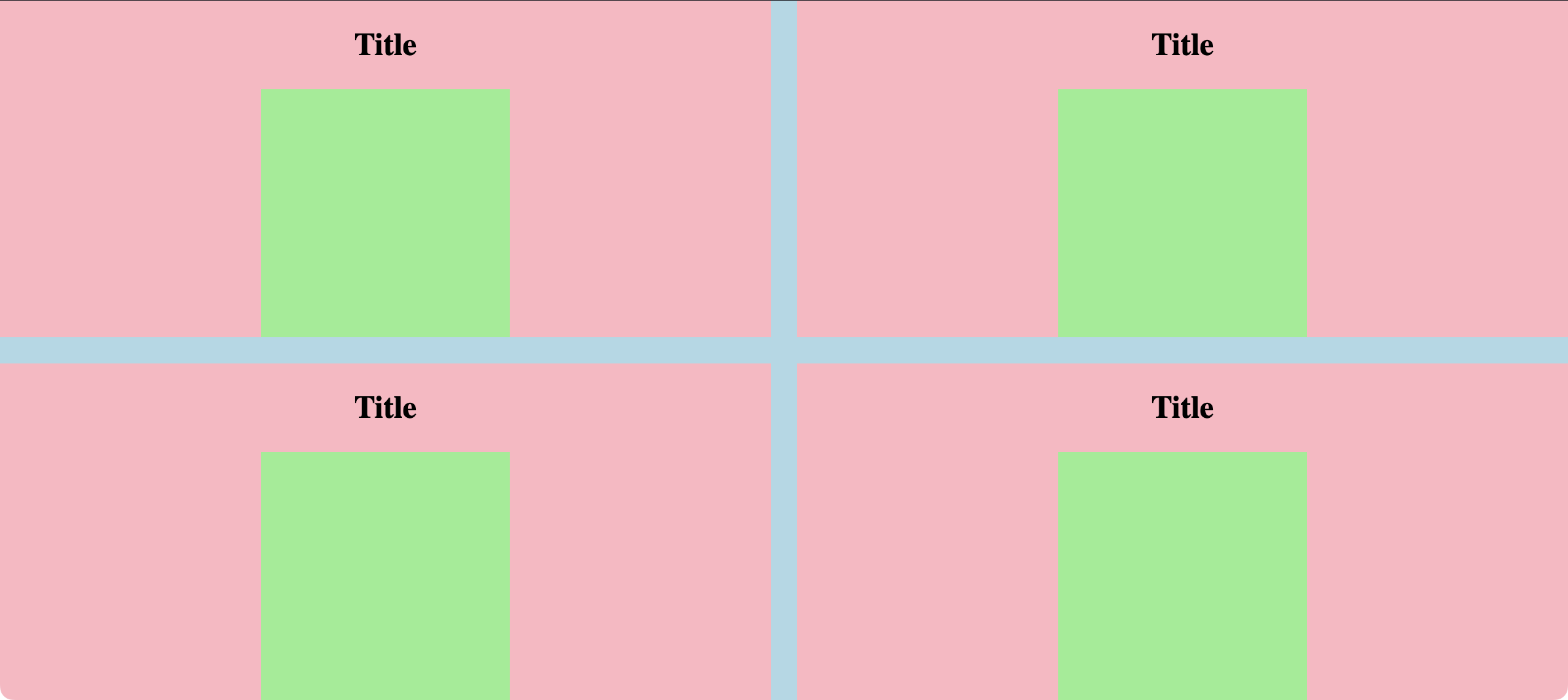
This works fine when the width of the viewport is greater than the height (e.g. landscape):

Working fine in landscape

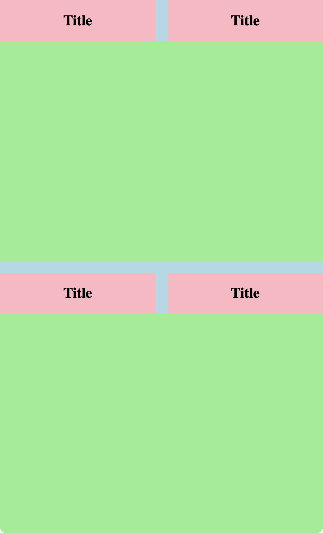
But when the height is greater than the width (e.g. portrait), the squares overlap:

not working in portrait

I can fix the issue for portrait by changing align-items: center; in .inner to align-items: self but this then breaks the layout for landscape.

Is there any way I can get it to work on both?

CodePen here: https://codepen.io/danielgibbsnz/pen/KKbWoWL (just resize the window to portrait to see the problem).


Note: I would ideally like to accomplish this using aspect-ratio and not resorting to the padding hack (if at all possible).

2

Answers


  1. Would something like this work better? (Note: it involves a random width on the square, so may not be what you want.)

    body {
      margin: 0;
    }
    
    .container {
      width: 100vw;
      min-height: 100vh;
      background: lightblue;
      display: grid;
      grid-template-rows: 1fr 1fr;
      grid-template-columns: 1fr 1fr;
      gap: 20px;
    }
    .inner {
      background: lightpink;
      display: grid;
      place-items: center;
    }
    .square {
      background: lightgreen;
      aspect-ratio: 1;
      width: 70%;
    }
    <div class="container">
      <div class="inner">
        <h2>Title</h2>
        <div class="square"></div>
      </div>
      <div class="inner">
        <h2>Title</h2>
        <div class="square"></div>
      </div>
      <div class="inner">
        <h2>Title</h2>
        <div class="square"></div>
      </div>
      <div class="inner">
        <h2>Title</h2>
        <div class="square"></div>
      </div>
    </div>
    Login or Signup to reply.
  2. Looks like you’ll need a wrapper for .square with the same aspect-ratio: 1;:

    body {
      margin: 0;
    }
    
    .container {
      width: 100vw;
      height: 100vh;
      background: blue;
      display: grid;
      grid-template-columns: 1fr 1fr;
      gap: 20px;
    }
    .inner {
      background: yellow;
      display: flex;
      flex-direction: column;
      align-items: center;
    }
    .square-wrapp {
      aspect-ratio: 1;
      flex: auto;
      display: flex;
      flex-direction: column;
      justify-content: center;
      max-width: 100%;
    }
    
    .square{
      background: lightgreen;
      aspect-ratio: 1;
    }
    <div class="container">
      <div class="inner">
        <h2>Title</h2>
        <div class="square-wrapp">
          <div class="square"></div>
        </div>
      </div>
      <div class="inner">
        <h2>Title</h2>
        <div class="square-wrapp">
          <div class="square"></div>
        </div>
      </div>
      <div class="inner">
        <h2>Title</h2>
        <div class="square-wrapp">
          <div class="square"></div>
        </div>
      </div>
      <div class="inner">
        <h2>Title</h2>
        <div class="square-wrapp">
          <div class="square"></div>
        </div>
      </div>
    </div>
    Login or Signup to reply.
Please signup or login to give your own answer.
Back To Top
Search