


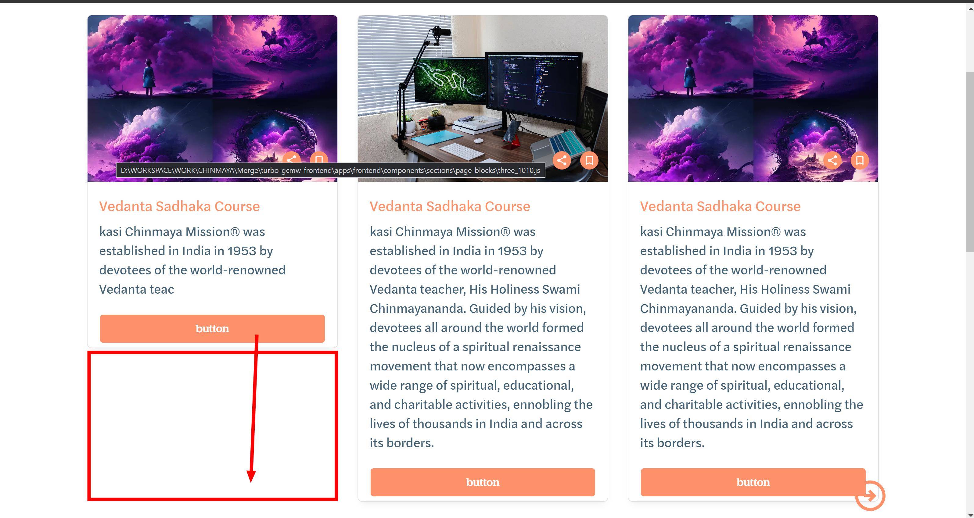
How to make this card height is same in mui?
i don’t like to set a fixed height. this will dynamically need to change. all card heights need to set what is the tallest height in the website.
between button & content we can add space for that.how to do this?
The issue you seem to be facing is that you want to create cards with variable content heights using the Material-UI library, but you want all cards to have the same height without setting a fixed height. You also want to add space between the button and content.
function ItemRow({ page_block }) {
    return page_block.map((page_block_item, index) => (
        <Grid
            justifyContent="space-between"
            alignItems="center"
            align="center"
            xs={12}
            sm={6}
            md={4}
            lg={4}
        >
            <Grid
                justifyContent="center"
                // alignItems="center"
                xs={10.5}
                sm={12}
                md={11}
                lg={12}
            >
                <Card page_block_item={page_block_item} key={index} />
            </Grid>
        </Grid>
    ));
}

const Card = ({ page_block_item: block_detail }) => {
    const [open, setOpen] = useState(false);
    const router = useRouter();
    const [cart, setCart] = useAtom(cartAtom);

    return (
        <Grid
            key={block_detail.id}
            justifyContent="center"
            display={'flex'}
            flexGrow={1}
            alignItems="stretch"
        >
            <Box
                sx={{
                    position: 'relative',
                    display: 'flex',
                    flexDirection: 'column',
                    height: '100%',
                    boxShadow: '0px 6px 12px -6px rgba(24, 39, 75, 0.12)',
                }}
                justifyContent="space-between"
                border="1px solid #E3E3E3"
                borderRadius="8px"
                overflow="hidden"
                margin={2}
                flexGrow={1}
                alignItems="stretch"
            >
                <Grid sx={{ position: 'relative' }}>
                    <Grid
                        item
                        position="relative"
                        sx={{ aspectRatio: '3/2', height: '100%' }}
                    >
                        <NextImage
                            className="image-cover"
                            media={block_detail.media}
                        />
                    </Grid>
                    <Box
                        sx={{
                            position: 'absolute',
                            right: 0,
                            bottom: 20,
                        }}
                    >
                        <ShareIcon
                            sx={{
                                background: '#FC916A',
                                marginRight: '15px',
                                padding: '5px',
                                height: '30px',
                                width: '30px',
                                borderRadius: '50%',
                                color: '#FFFFFF',
                                cursor: 'pointer',
                                '&:hover': {
                                    background: '#FFFFFF',
                                    color: '#FC916A',
                                },
                            }}
                        />
                        <BookmarkBorderIcon
                            sx={{
                                background: '#FC916A',
                                marginRight: '15px',
                                padding: '5px',
                                height: '30px',
                                width: '30px',
                                borderRadius: '50%',
                                color: '#FFFFFF',
                                cursor: 'pointer',
                                '&:hover': {
                                    background: '#FFFFFF',
                                    color: '#FC916A',
                                },
                            }}
                        />
                    </Box>
                </Grid>

                <Box
                    sx={{
                        flexGrow: 1,
                        display: 'flex',
                        flexDirection: 'column',
                        height: '100%',
                        maxHeight: 'fix-content',
                    }}
                    padding={2}
                >
                    <Grid item sx={{ textAlign: 'left' }}>
                        <StyledText
                            my={1}
                            variant="H_Regular_Tagline"
                            color="primary.main"
                            content={block_detail.info_title}
                        />
                    </Grid>
                    <Grid item sx={{ textAlign: 'left' }}>
                        <StyledText
                            my={1}
                            variant="H_Regular_Body"
                            color="secondary.dark"
                            content={block_detail.info_description}
                        />
                    </Grid>
                </Box>

                <Grid item sx={{ position: 'relative' }}>

                        <Link
                            href={`/${router.query.centerName}/post/donation/${block_detail?.slug}`}
                        >
                            <StyledButton
                                variant="H_Regular_H4"
                                sx={{ width: '90%' }}
                            >
                                {block_detail.info_action_button?.text}
                            </StyledButton>
                        </Link>
                </Grid>
            </Box>
        </Grid>
    );
};
2
Answers
By default, each grid item has same height which is greatest.
You can set the height to
100%for the component under the grid item.Here is an example.
https://stackblitz.com/edit/react-8qnvck?file=demo.tsx,MediaControlCard.tsx
In this example, The
MediaControlCardcomponent useCardwithsxprop which is setup height to 100%.If you remove the
sxprops, you will see a similar one to your case.And I think you don’t need to use
display:flexinBoxcomponent.Because you don’t take effect of
height:100%if you usedisplay:flex.you have to add following properties to .MuiCard-root
Other Method is :
How to make Material-UI CardActions always stick to the bottom of parent
Same Height Cards in Material UI
Got the answer from these link. Hope, it might help.