


I am creating a CSS Grid layout, and I’m unable to get the "auto" value to work for the sizing of row height.
The items keep a minimum height of 1fr, even if their content is small enough to allow them to shrink.
I wrote some text in my children div but I get a lot of space between rows and columns..
I want to create a 3 parent div : A B C, every parent have a grid system as a child, and when I get A1 from server I must put it into A column, B1 into B and so on, but when I get more than 3 children in same column I should create another column inside parent, I’m trying with css grid but I don’t know how to achive this mechanism.
this is what I’ve tried :
 .container {
    display: grid;
    grid-template-columns: 1fr;
    background: #faf;
    border-radius: 5px;
    grid-template-rows: 1fr 1fr 1fr;
    grid-auto-columns: 1fr;
    grid-auto-flow: column;
    width: fit-content;
  }

  .item {
    color: #fff;
    padding: 15px;
    margin: 5px;
    background: #3db5da;
    border-radius: 3px;
    width: 90px;
    height: fit-content;
  }
<div class="container">
  <div class="item">
    Item 1
    <p>Hi, I'm a test</p>
  </div>
  <div class="item">Item 2</div>
  <div class="item">Item 3</div>
  <div class="item">Item 4</div>
  <div class="item">Item 5</div>
  <div class="item">Item 6</div>
</div>
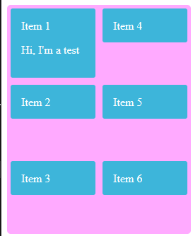
fot he moment the result is this :
And I want to remove space between items, whatever content is.
I’m trying with display: flex, but for the moment it not work as expected
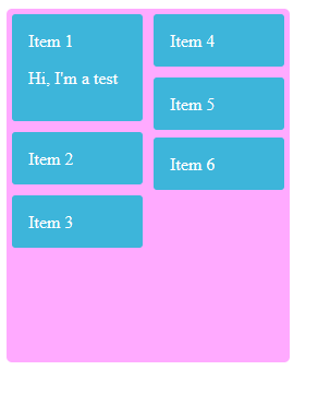
Expected output :
3
Answers
I am still learning English, so if I make any mistakes, I apologize.
From what I understood, the issue is that the item’s height is not decreasing correctly, right? This happens because you set the value of height as fit-content and a very large padding of 15px. I changed the padding to 5px and instead of height: fit-content, I used min-height: fit-content.
Image
Was this what you were looking for, or did I get lost?
Can you use display:block with column-count? Looks like it’s well supported
HTML:
CSS:
https://jsfiddle.net/7bvmp3hu/1/
This looks more like a multi column layout than a grid as it is a requirement that the layout adjusts when content is added dynamically. e.g. the first column could have so much text in it compared to all the others that it occupies the first column alone.
This snippet shows the layout using CSS column-count instead of grid.
Note: for the demo to result in the same layout as shown in the question I had to decrease the font-size as at the default size, at least on my browser, the p element had to span two lines. This I suppose is just a simple example of how multi column works. It will overall minimise the height of the container.