skip to Main Content

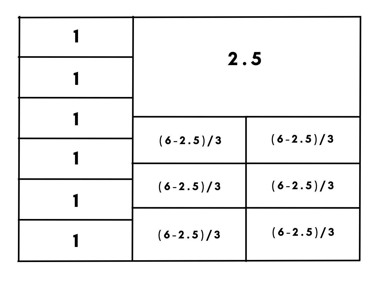
I am trying to create a SCSS grid, like in the image below. The issue is to calculate the 2nd and the 3rd columns. Do u maybe know, how to achieve that?

Thanks for any hints and help!

enter image description here

2

Answers


  1. try making each line with separate classes

    .a {
    position: absolute;
    top: 50%;
    left: 50%;
     width: 2px;
     height: 100px;
     background: black;
    }
    
    .b {
    position: absolute;
    top: 50%;
    left: 80%;
     width: 2px;
     height: 100px;
     background: black;
    }
    
    .c {
    position: absolute;
    top: 50%;
    left: 50%;
     width: 160px;
     height: 2px;
     background: black;
    }
    
    .d {
    position: absolute;
    top: 50%;
    left: 40%;
     width: 2px;
     height: 100px;
     background: black;
    }
    
    .e {
    position: absolute;
    top: 50%;
    left: 60%;
     width: 2px;
     height: 100px;
     background: black;
    }
    
    .ab
    {
    position: absolute;
    top: 55%;
    left: 52%;
    font-size: 10px;
    }
    <div class="a"></div>
    
    <div class="ab">EXAMPLE</div>
    
    <div class="b"></div>
    
    <div class="c"div>
    
    <div class="d"></div>
    
    <div class="e"></div>

    I know its pretty rough but it might help also you can use inspect element to change your code positioning in real time so that might help

    Login or Signup to reply.
  2. Try with this one:

    grid-template-areas:
        "a1 b1 b1"
        "a1 b1 b1"
        "a2 b1 b1"
        "a2 b1 b1"
        "a3 b1 b1"
        "a3 c1 c1"
        "a4 c1 c1"
        "a4 c2 c2"
        "a5 c2 c2"
        "a5 c3 c3"
        "a6 c3 c3"
        "a6 c3 c3;
    

    Give class to each element.
    each "1" is with "a[num]",
    the big "2.5" is under "b" and the third is "c[num]".

    Login or Signup to reply.
Please signup or login to give your own answer.
Back To Top
Search