I’d like to add image and icons to my video, but I don’t know how to do that using CSS.
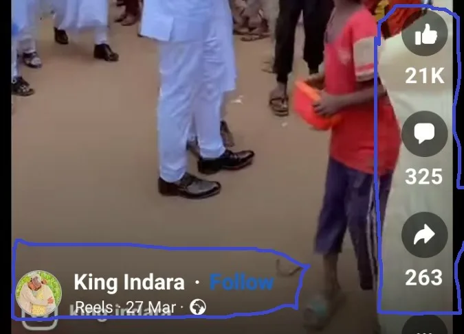
I want the image that serve as profile picture and my icons to be like these icons in the picture down below:
I’m trying to use position: absolute, transform: translate(-50%, -50%) and use bottom: 100%, but the method did not work. This is what I have tried, but feel like I can’t make it to work:
This template contains Bootstrap-5 classes and Video.js with google icons.
.img_wrapper.a img {
        position: absolute;
        transform: translate(-50%, -50%);
        bottom: 100%;
    }

 .thumb{
        width: 30px;
        height: auto;
    }
<link href="https://cdn.jsdelivr.net/npm/[email protected]/dist/css/bootstrap.min.css"
rel="stylesheet" integrity="sha384-EVSTQN3/azprG1Anm3QDgpJLIm9Nao0Yz1ztcQTwFspd3yD65VohhpuuCOmLASjC"
crossorigin="anonymous">
<link rel="stylesheet"
href="https://cdn.jsdelivr.net/npm/[email protected]/font/bootstrap-icons.css">
<link href="https://vjs.zencdn.net/8.0.4/video-js.css" rel="stylesheet" />
<link rel="stylesheet" href="https://fonts.googleapis.com/css2?family=Material+Symbols+Outlined:opsz,wght,FILL,[email protected],100..700,0..1,-50..200" />
<div class="container">
<div class="row justify-content-center">
<div class="col-md-2">
<div class="row">
<video id="my-video"
class="video-js text-center"
controls
preload="auto"
height="400px"
data-setup="{}"
poster="https://thumbs.dreamstime.com/b/confident-black-business-man-stylish-suit-standing-folded-arms-rooftop-n-office-block-looking-camera-69650703.jpg"
muted>
<source src="" type="video/mp4">
</video>
<div class="img_wrapper">
<a style="text-decoration: none;" href="{{ video.get_user_public_url }}">
<p><img class="rounded-circle thumb" src="https://thumbs.dreamstime.com/b/confident-black-business-man-stylish-suit-standing-folded-arms-rooftop-n-office-block-looking-camera-69650703.jpg" alt="">
<b>Bamagujen Bahaushe</b>
</p>
</a>
</div>
<div class="video-icons">
<a href="">
<span class="material-symbols-outlined">
fingerprint
</span>
</a>
<a href="{% url 'Play-Video' video.slug %}">
<span class="material-symbols-outlined">
comment
</span>
</a>
<a href="{% url 'Complain-Video' video.pk %}">
<span class="material-symbols-outlined">
flag
</span>
</a>
</div>
</div>
</div>
<div class="col-md-6">
<div class="content-right">
<p>Lorem ipsum dolor sit, amet consectetur
adipisicing elit. Qui, minus, optio atque nostrum
repellendus delectus eos non veritatis,
illum soluta quas id aliquid facilis molestiae
facere nam neque? Fugiat, repellendus.</p>
</div>
</div>
</div>
</div> 


2
Answers
I could be wrong but there are a couple of things to note here.
Firstly I think
img_wrapper.a imgshould beimg_wrapper a img. The former is looking for theimg_wrapperclass that also has a class ofabecause you are concatenating it with a period. The latter looks for theimg_wrapperwith an anchor as a child node, with an image as a child node of the anchor.Secondly, ensure that the
img_wrapperhas a relative position.And then I removed the translate css, and just passed in bottom and left attributes. I think this should do what you want, but you might have to tweak the px values for left and bottom. The other thing to note is you might have an issue with responsiveness, but that can be tackled separately. And it might not be an issue at all actually, but it depends.
EDIT
I have made two jsfiddles. Both contain a wrapper which is positioned absolutely but we pass in a px value for
right. In the first example I am using a list which naturally reads top to bottom for each list item, then just added a little styling to remove the default bullet items, and margins, padding.The second is the same but using a flex layout to control the flow of content inside the wrapper.
The parts to note are:
HTML1:
CSS1:
HTML2:
CSS2:
If it was me I would try and abstract this code. Make multiple class names and pass attributes to them as needed. Then the main class name can be inherited. Something like
etc.
JSFIDDLE1: https://jsfiddle.net/lharby/06vb932e/
JSFIDDLE2: https://jsfiddle.net/lharby/7g89bthv/
EDIT 2
Just reread your question about the
video-iconsfor this to work you have to use relative positioning on the nearest common parent. In your case it is therowjust above, as this contains both theimg_wrapperand thevideo-iconsas direct children. Add a classname to therow, and position it relatively, then you can position both theimg_wrapperand thevideo-iconsinside this container using absolute positioning.You have to do the following:
rowto place text to the left and icons to the right.position-absolute bottom-0to therowandposition-relativeto the parent(!)rowto place text and icons inside the video at the bottom.d-flex flex-columnto the right column to stack icons vertically.d-flex align-items-endto therowto push text down to the bottom of therowbecause the right column with icons is taller than the left column with text.mb-3to therowto add somemargin-bottomfor better UX.mx-autoto therowto center it horizontally.<img>rounded on every screen size (you can also replacepxwithvwif you like):.rounded-circle { width: 25px; height: 25px; }.pe-1(i.e.,padding-right) to the leftcolandps-1(i.e.,padding-left) to the rightcolto make a smaller space between the image and "Bamagujen Bahaushe" text.See the snippet below.