


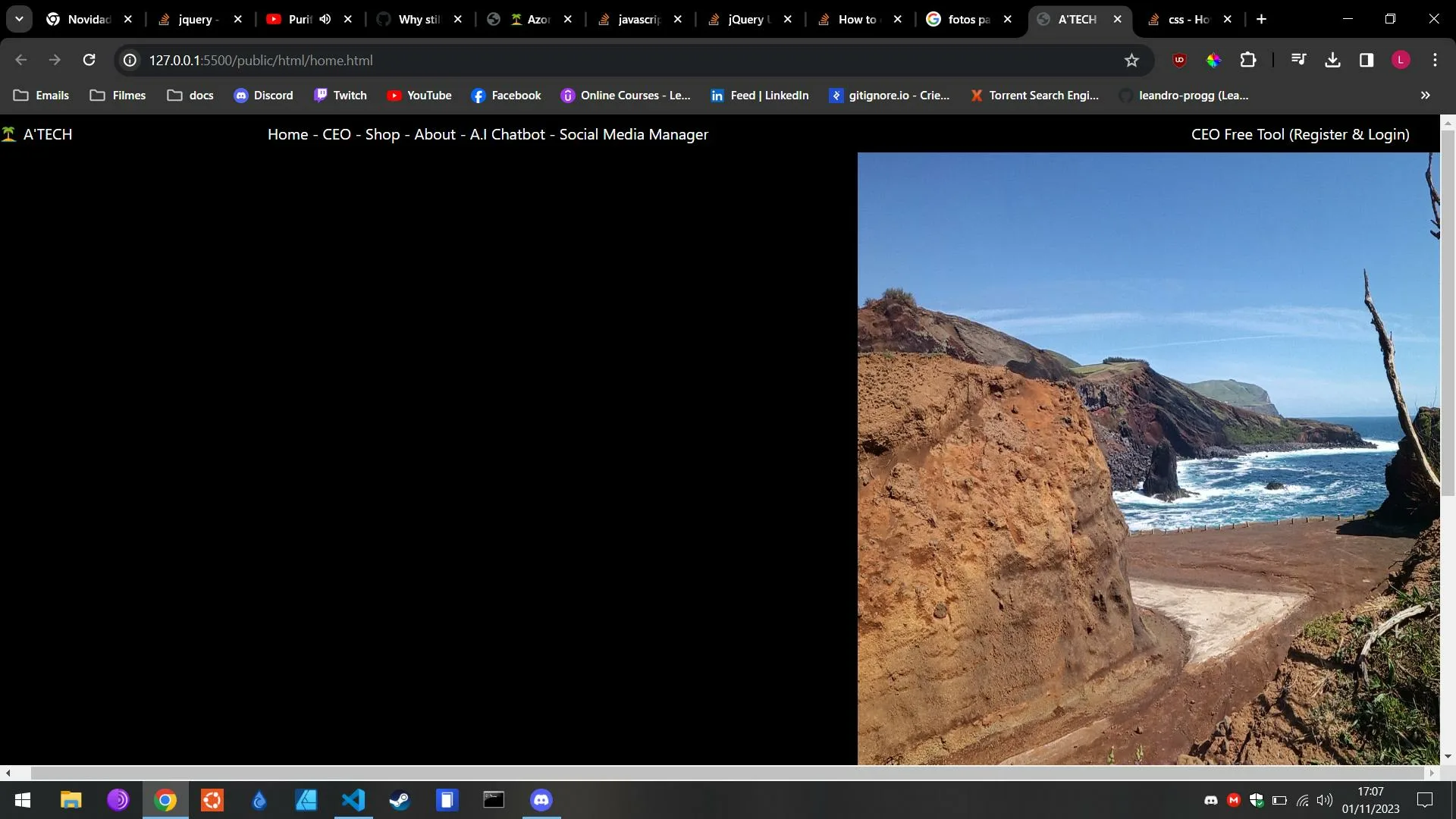
I wanted to know how do I align the image with the right side of the screen so it covers the white area.I would like also to remove the vertical scroll. I Have tried to use float right and flex in css but no luck. Thanks for helping.
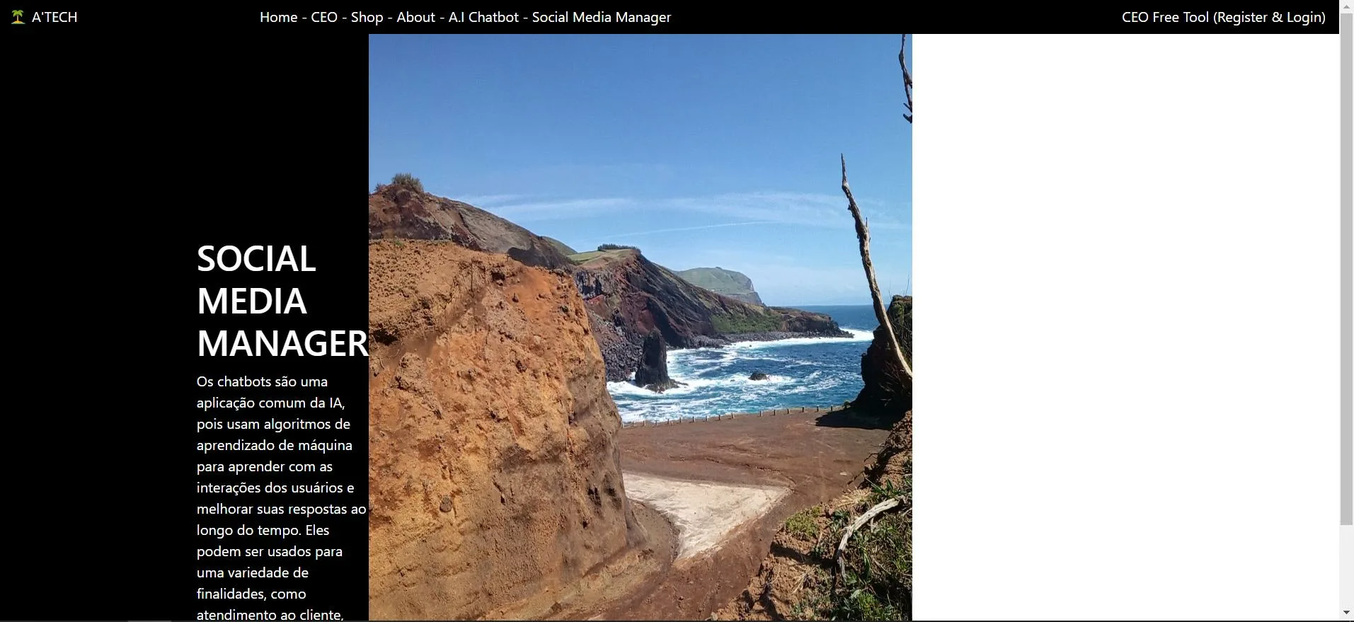
How I want to it too look but without the scrollings
problem image
HTML Code
<!DOCTYPE html>
<html lang="pt-PT">
<head>
    <meta charset="UTF-8">
    <meta name="viewport" content="width=device-width, initial-scale=1.0">
    <title>A'TECH - Home</title>

    <link rel="stylesheet" href="../css/common-css.css">
    <link rel="stylesheet" href="../css/home.css">
</head>
<body>
    <div class="navbar">
        <div class="brand-logo">🏝️ A'TECH</div>
        <div class="navbar-links">
            <a href="../html/home.html">Home</a> <span>-</span>
            <a href="../html/work.html">CEO</a> <span>-</span>
            <a href="../html/work.html">Shop</a> <span>-</span>
            <a href="../html/about.html">About</a> <span>-</span>
            <a href="../html/work.html">A.I Chatbot</a> <span>-</span>
            <a href="../html/work.html">Social Media Manager</a>
        </div>
        <div class="auth-links">
            <a href="../html/work.html">CEO Free Tool (Register & Login)</a>
        </div>
    </div>

    <div class="sections">
        <div class="carousel-section">
            <div class="carousel">
                <h1 class="carousel-header">A.I CHATBOT</h1>
                <p class="carousel-description">
                    Chat Bot (inteligência artificial - IA). Um chatbot é um programa de computador que simula conversas humanas por meio de mensagens de texto ou voz. Já a IA é um campo da ciência da computação que se concentra em criar máquinas capazes de realizar tarefas que normalmente exigiriam inteligência humana.
                </p>
            </div>
        </div>
        <div class="carousel-image">
            <img class="ocean-view-image" src="/public/images/ocean-view.jpg" alt="Ocean View">
        </div>
    </div>

    <script src="../../node_modules/bootstrap/dist/js/bootstrap.bundle.min.js"></script>
    <script src="../../node_modules/jquery/dist/jquery.min.js"></script>
    <script src="../js/home.js"></script>
</body>
</html>
CSS Code
// Include any default variable overrides here (though functions won't be available)

@import "../../node_modules/bootstrap/scss/bootstrap";

// Then add additional custom code here

.sections {
  width:50%;

  color: white;

  display: flex;

  justify-content: start;
}

.carousel-section {
    margin-top: 30%;
    margin-left: 30%;

  position: ab;
}

.carousel-section > h1 {
    text-decoration: underline;
}

.auth-links {
  margin-right: 1%;
}

.brand-logo {
  margin-left: 1%;
}

.ocean-view-image {
  width: 40vw;
  height: 110vh;
}
I tried to use float right
2
Answers
To align an image to the right side of the screen and make it cover the white area while removing the vertical scroll, you can use CSS. Here’s how you can do it:
First, create a CSS class for the image and apply the following properties to it:
Explanation of the CSS properties used:
position: fixed;: This positions the image relative to the viewport, so it stays in the same place even when you scroll the page.
top: 0; and right: 0;: These properties position the image at the top-right corner of the screen.
height: 100vh;: This sets the image’s height to 100% of the viewport height, ensuring it covers the entire screen vertically.
width: auto;: This allows the image’s width to adjust proportionally to maintain its aspect ratio.
z-index: -1;: This places the image behind other content on the page.
Add the CSS class ocean-view-image to your image element in your HTML:
With these CSS styles and HTML structure, your image should be aligned to the right side of the screen, covering the white area, and there should be no vertical scroll. Adjust the image source and class as needed for your specific setup.