skip to Main Content

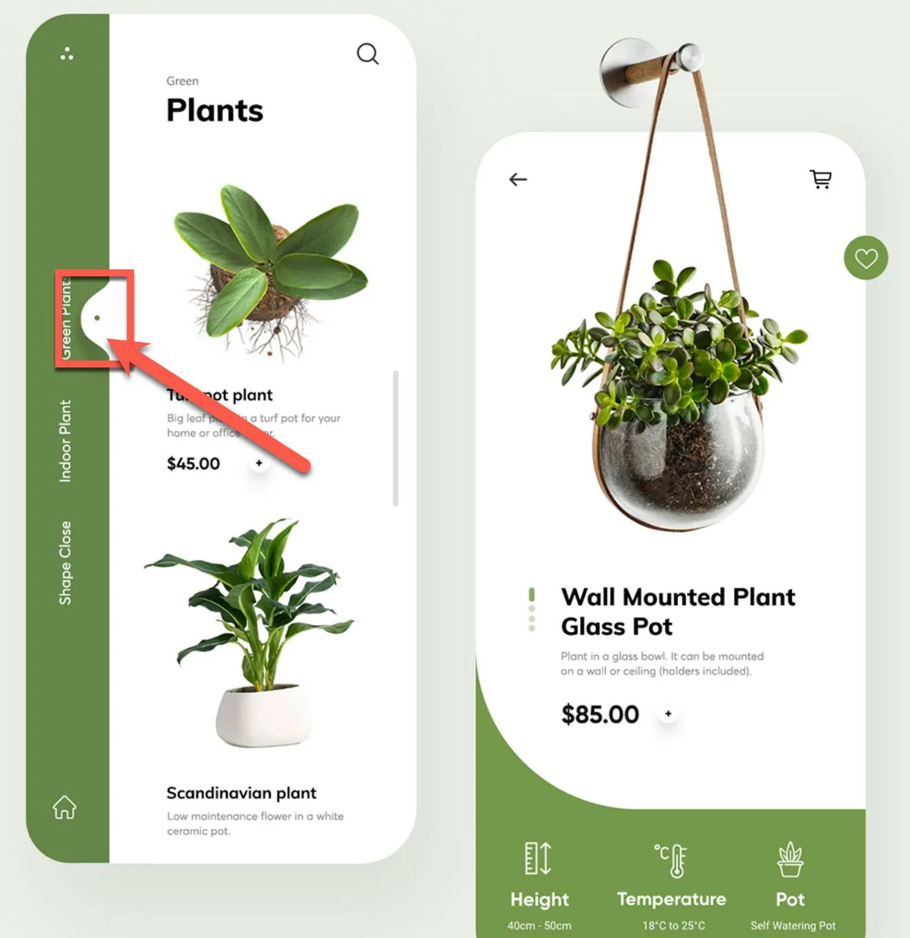
just wanted a little bit of help for this UI I’m trying to replicate. I know this can be achieved using css clip path but can’t seem to figure out how can I replicate the curved edges using css clip path because of its nature.

Here’s the screenshot of the UI I’m trying to replicate:

This sample
And this sample

For the longest time I can’t seem to figure out how this could be done.

I’ve used sites like clippy to try and replicate it but the predefined and sample shapes were too pointy that I can’t basically use it as reference.

2

Answers


  1. I came across your question and thought that I really was a cool looking navigation bar, so, I tried to make it myself, here is my attempt at it.

    Oh and, yeah, it’s not that good looking, but you can play with the border radii that I put to make it look better. If you don’t know how they work let me know.

    It probably isn’t the best and could by optimized a LOT, but I already spent too much time on that haha. I think this answer should make you happy 🙂

    Let me know if you have some more questions about something I did, or if you want me to optimize something in here!

    let selectedLink = document.querySelector(".selectedLink");
    
    function checkActive() {
      document.querySelectorAll("nav li").forEach((item) => {
        if (item.dataset.active == "true") {
          selectedLink.style.transform = `translateX(${
            item.offsetLeft + item.offsetWidth / 2 - 24 + "px"
          })`;
        }
      });
    }
    
    document.querySelectorAll("nav li").forEach((item) => {
      item.addEventListener("click", (e) => {
        document.querySelectorAll("nav li").forEach((i) => {
          i.dataset.active = "false";
        });
        e.currentTarget.dataset.active = "true";
        checkActive();
      });
    });
    
    checkActive();
    *,
    *::before,
    *::after {
      box-sizing: border-box;
      margin: 0;
      padding: 0;
    }
    
    body {
      font-family: system-ui, -apple-system, BlinkMacSystemFont, "Segoe UI", Roboto,
        Oxygen, Ubuntu, Cantarell, "Open Sans", "Helvetica Neue", sans-serif;
    }
    
    header {
      display: flex;
      justify-content: center;
      padding-block: 1rem;
      background: royalblue;
    }
    
    nav {
      min-width: 28rem;
      background: white;
      color: #0e0e0e;
      border-radius: 100vw;
    }
    
    nav ul {
      padding: 1.5rem;
      list-style: none;
      display: flex;
      justify-content: space-between;
      align-items: center;
      position: relative;
      isolation: isolate;
    }
    
    nav ul li a {
      color: #0e0e0e;
      text-decoration: none;
      padding: 1.5rem;
      font-weight: 700;
    }
    
    .selectedLink {
      position: absolute;
      width: 1.5rem;
      aspect-ratio: 1/1;
      background: royalblue;
      border-radius: 50%;
      z-index: -1;
      top: 0;
      left: 12px;
      transition: transform 0.5s ease;
    }
    
    .selectedLink .side {
      background: royalblue;
      width: 1.5rem;
      aspect-ratio: 1/1;
      position: absolute;
      top: 0;
      border-radius: 0 0 0 100%;
    }
    
    .side.left {
      left: -50%;
    }
    
    .side.right {
      right: -50%;
      transform: rotateY(180deg);
    }
    
    .selectedLink .outside {
      background: royalblue;
      width: 1.5rem;
      aspect-ratio: 1/1;
      position: absolute;
      top: 0;
      z-index: 9999;
      clip-path: polygon(79% 25%, 30% 0, 100% 0, 100% 100%);
    }
    
    .outside.left {
      left: -140%;
    }
    
    .outside.right {
      right: -140%;
      transform: rotateY(180deg);
    }
    
    .selectedLink .outside::after {
      content: "";
      position: absolute;
      inset: 0;
      z-index: -9999;
      background: white;
      border-radius: 0 100% 0 0 / 0 50% 0 0;
    }
    
    .selectedLink .dot {
      position: absolute;
      width: 0.5rem;
      aspect-ratio: 1/1;
      background: white;
      border-radius: 50%;
      top: 50%;
      left: 50%;
      transform: translate(-50%, -50%);
    }
    <header>
          <nav>
            <ul>
              <div class="selectedLink">
                <div class="side left"></div>
                <div class="side right"></div>
                <div class="outside left"></div>
                <div class="outside right"></div>
                <div class="dot"></div>
              </div>
              <li data-active="true"><a href="#">Home</a></li>
              <li data-active="false"><a href="#">About</a></li>
              <li data-active="false"><a href="#">Contact</a></li>
            </ul>
          </nav>
        </header>
    Login or Signup to reply.
  2. So yes, clip-path can help you create the effect you want. Design your path in an SVG editor (such as Boxy SVG), then just copy-paste the path into your CSS.

    .d1 {
      width: 100px;
      height: 200px;
      background-color: blue;
      clip-path: path('M 100 100 C 100 108.284 93.284 115 85 115 C 76.716 115 70 108.284 70 100 C 70 91.716 76.716 85 85 85 C 93.284 85 100 91.716 100 100 Z M 100 200 L 100 160 C 99.994 150.156 95.322 149.925 90 150 C 20 150 20 50 90 50 C 100 50 99.88 45.308 100 40 L 100 0 L 0 0 L 0 200');
    }
    <div class="d1"></div>
    Login or Signup to reply.
Please signup or login to give your own answer.
Back To Top
Search