


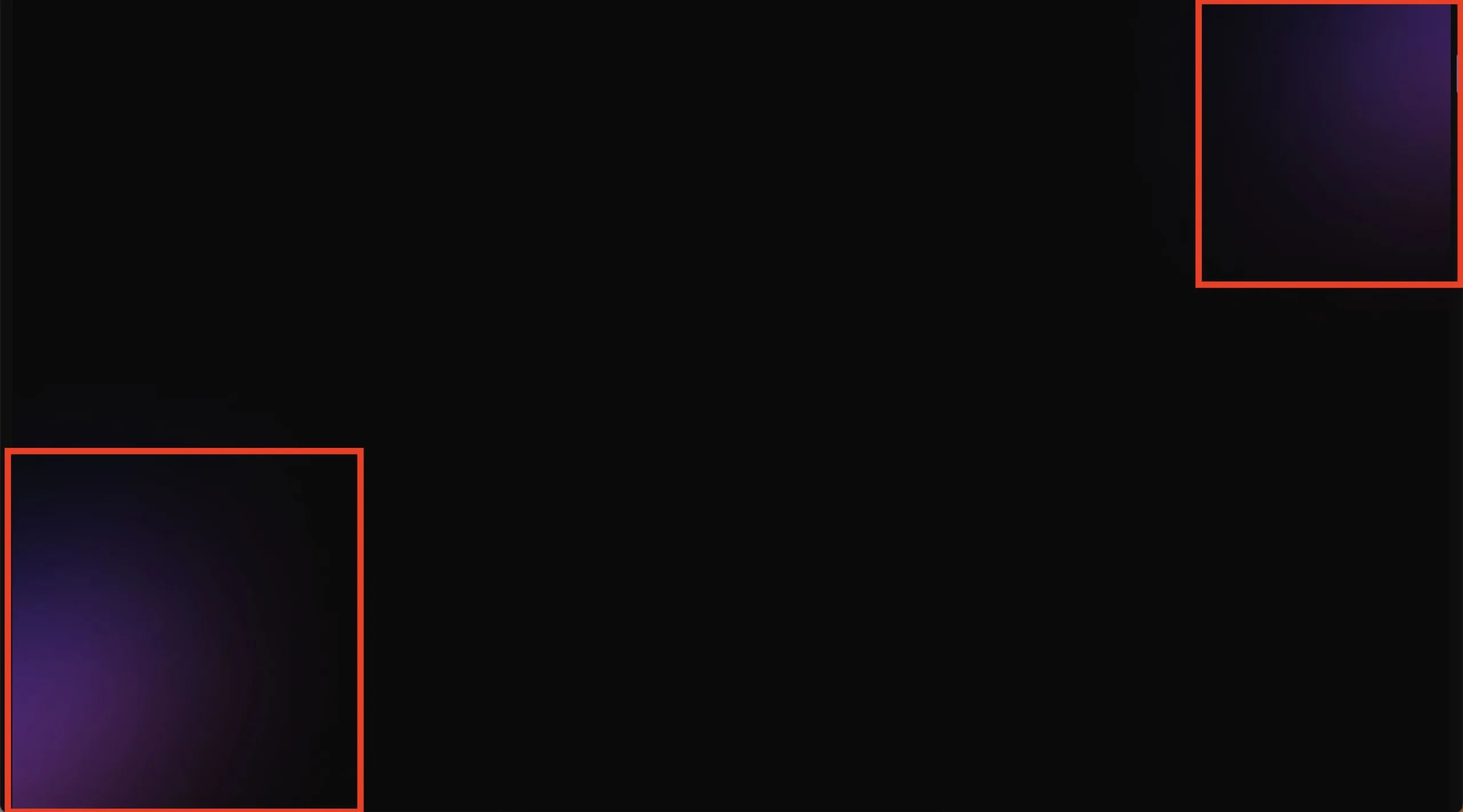
I’m trying to achieve the two effects you see below in CSS, but I can’t find how to do them.
Does anyone know the name of this CSS effect or how to achieve something similar with pure CSS?
I’m trying to achieve the two effects you see below in CSS, but I can’t find how to do them.
Does anyone know the name of this CSS effect or how to achieve something similar with pure CSS?
2
Answers
I would try to achieve this using a simple gradient with the outermost color matching the background color at the 100% marker or fading it out completely toward the end with the same color all the way through. Below is an example of the last bit.
To turn a background image effect into CSS, you can use various CSS properties and techniques. The specific approach will depend on the effect you want to achieve. Here are a few examples of popular background image effects and how to implement them using CSS:
Grayscale Effect:
.element {
background-image: url(‘your-image.jpg’);
filter: grayscale(100%);
}
Blur Effect:
.element {
background-image: url(‘your-image.jpg’);
filter: blur(5px);
}
Overlay Effect (using a semi-transparent overlay color):
.element {
background-image: url(‘your-image.jpg’);
position: relative;
}
.element::before {
content: "";
position: absolute;
top: 0;
left: 0;
width: 100%;
height: 100%;
background-color: rgba(0, 0, 0, 0.5); /* Adjust the color and opacity as needed */
}
Background Image Parallax Effect:
.element {
background-image: url(‘your-image.jpg’);
background-attachment: fixed;
background-position: center;
background-repeat: no-repeat;
background-size: cover;
}