


I have a container with a bunch children that I want to layout like this using CSS:
(I cannot control the HTML, and the contents of the children may vary in size to some extent. This is a minimal example; in actuality, the layout might be more complex.)
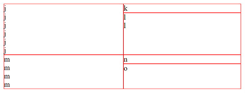
I am trying to use CSS grids, as the language of grid-template seems to be conveying my idea most clearly. However, I’ve ran into an issue; in the screenshot, you can see that items k and n are as high as their contents, and items l and o take the remaining space. I don’t know how to express this with CSS.
If there’s only one item that should span the remaining space, I seem to be able to use min-content (or auto) and 1fr.
container {
  display: grid;
  grid-template:
    "j k" min-content
    "j l" 1fr;
}

j { grid-area: j; }
k { grid-area: k; }
l { grid-area: l; }

container > * {
  border: 1px solid red;
}
<container>
<j>j<br>j<br>j<br>j<br>j<br>j<br></j>
<k>k</k>
<l>l<br>l</l>
</container>However, this trick doesn’t work when I have more items that should take the remaining space. Rows that are 1fr high seem to be trying to take equal amount of vertical space:
container {
  display: grid;
  grid-template:
    "j k" min-content
    "j l" 1fr
    "m n" min-content
    "m o" 1fr;
}

j { grid-area: j; }
k { grid-area: k; }
l { grid-area: l; }
m { grid-area: m; }
n { grid-area: n; }
o { grid-area: o; }

container > * {
  border: 1px solid red;
}
<container>
<j>j<br>j<br>j<br>j<br>j<br>j<br></j>
<k>k</k>
<l>l<br>l</l>
<m>m<br>m<br>m<br>m<br></m>
<n>n</n>
<o>o</o>
</container>For the record, if not specifying any values for row heights, it seems that the engine is trying to make the free space in the rows equal height.
container {
  display: grid;
  grid-template:
    "j k"
    "j l"
    "m n"
    "m o";
}

j { grid-area: j; }
k { grid-area: k; }
l { grid-area: l; }
m { grid-area: m; }
n { grid-area: n; }
o { grid-area: o; }

container > * {
  border: 1px solid red;
}
<container>
<j>j<br>j<br>j<br>j<br>j<br>j<br></j>
<k>k</k>
<l>l<br>l</l>
<m>m<br>m<br>m<br>m<br></m>
<n>n</n>
<o>o</o>
</container>It is also possible to set the height of k and n rows to a fixed value. However, in my case the contents of items is slightly variable and I can’t use this trick.
container {
  display: grid;
  grid-template:
    "j k" 1em
    "j l"
    "m n" 1em
    "m o";
}

j { grid-area: j; }
k { grid-area: k; }
l { grid-area: l; }
m { grid-area: m; }
n { grid-area: n; }
o { grid-area: o; }

container > * {
  border: 1px solid red;
}
<container>
<j>j<br>j<br>j<br>j<br>j<br>j<br></j>
<k>k</k>
<l>l<br>l</l>
<m>m<br>m<br>m<br>m<br></m>
<n>n</n>
<o>o</o>
</container>So the question is, how can I achieve the layout like in the screenshot above?
2
Answers
This
grid-auto-rowscombination seems to do what you need:Probably not the best solution but
position: absolutecan fix this but you need to be sure thejanmare always bigger than the right elements