skip to Main Content

I’d like to position Items "inline" behind Text. And when they wrap, they should be wrapped directly under Text. I don’t want to change HTML markup, since my actual use case is more complicated and won’t allow that. Is something like that possible?

.outer-container {
  background-color: lightgray;
  display: flex;
  flex-wrap: wrap;
}

.item-container {
  display: inline-flex;
  flex-wrap: wrap;
}

.text {
  border: 1px solid black;
}

.item {
  min-width: 200px;
  border: 1px solid black;
}
<div class="outer-container">
  <div class="text">Text</div>
  <div class="item-container">
    <div class="item">Item 1</div>
    <div class="item">Item 2</div>
    <div class="item">Item 3</div>
    <div class="item">Item 4</div>
    <div class="item">Item 5</div>
  </div>
</div>

I tried using inline-flex, but it didn’t work.
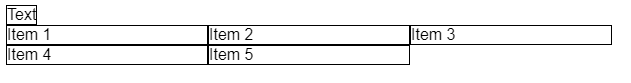
Current :

enter image description here

Wanted result:

enter image description here

CodeSandBox: https://codesandbox.io/s/boring-hertz-idh1fb?file=/index.html

4

Answers


  1.  I hope this finds you well..
    
    .outer-container {
      background-color: lightgray;
      display: flex;
      width:600px;
    }
    
    .item-container {
      display: flex;
      flex-wrap:wrap;
      width:100%;
    }
    
    .text {
      border: 1px solid black;
      width:60px;
      height:30px;
    }
    
    .item {
      min-width: 170px;
      border: 1px solid black;
    }
    <div class="outer-container">
       
       <div class="item-container">
       <div class="text">Text </div>
         <div class="item">Item 1</div>
         <div class="item">Item 2</div>
         <div class="item">Item 3</div>
         <div class="item">Item 4</div>
         <div class="item">Item 5</div>
      </div>
     
    </div>
    Login or Signup to reply.
  2. The thing is that the 2 children of outer-container are divided by display: flex; where .text is getting full height 😀 if you get rid of the wrap property :(.

    The only solution is to insert .text item into the same container where you give display: flex; property as this:

    body {
      font-family: sans-serif;
    }
    
    .outer-container {
      display: flex;
      flex-wrap: wrap;
    }
    
    .text {
      outline: 1px solid red;
      min-width: 10%;
    }
    
    .item {
      min-width: 30%;
      outline: 1px solid black;
    }
     <div class="outer-container">
        <div class="text">Text</div>
        <div class="item">Item 1</div>
        <div class="item">Item 2</div>
        <div class="item">Item 3</div>
        <div class="item">Item 4</div>
        <div class="item">Item 5</div>
    </div>
    Login or Signup to reply.
  3. Try display: contents

    contents
    These elements don’t produce a specific box by themselves. They are replaced by their pseudo-box and their child boxes.

    .item-container {
      display: contents;
    }
    
    Login or Signup to reply.
  4. Use display contents rather than flex on the item container. Its children are then treated by the flex in the outer container as though they were directly in it.

    .outer-container {
      background-color: lightgray;
      display: flex;
      flex-wrap: wrap;
    }
    
    .item-container {
      display: contents;
       
      flex-wrap: wrap;
    }
    
    .text {
      border: 1px solid black;
    }
    
    .item {
      min-width: 200px;
      border: 1px solid black;
    }
    <div class="outer-container">
      <div class="text">Text</div>
      <div class="item-container">
        <div class="item">Item 1</div>
        <div class="item">Item 2</div>
        <div class="item">Item 3</div>
        <div class="item">Item 4</div>
        <div class="item">Item 5</div>
      </div>
    </div>
    Login or Signup to reply.
Please signup or login to give your own answer.
Back To Top
Search