


Is it possible to get this grid with flexbox or css grid without changing the HTML?
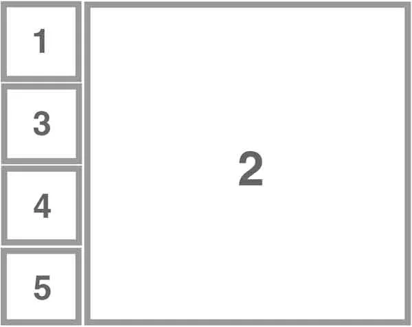
<div class="container">
  <div>1</div>
  <div>2</div>
  <div>3</div>
  <div>4</div>
  <div>5</div>
 </div>
I know it can be done with wrapping flex or grid containers, but I am really looking to not change the HTML at all. Also the number of items might be more so need a way to do it without knowing the number of items.
Thanks
2
Answers
I found a solution, but it requires a high number on grid-row like 9999 and you can't use gap as it will cause a lot of space with the high number.
Answering your question – yes, it is possible.
If the number of elements is known:
If the number of elements is unknown: