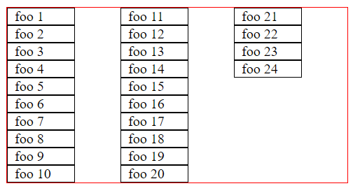
Is it possible to set a maximum number of columns for a column-direction flexbox? I’d like these columns to not create a third column when the second column fills. Instead, I’d prefer if it could overflow such that both the first columns were extended, keeping the order of elements.
Here is a fiddle, my code is also below:
div.columns {
  display: flex;
  flex-wrap: wrap;
  flex-direction: column;
  height: 200px;
  border: 1px solid red;
}

div.columns>div {
  width: 60px;
  padding: 0 8px;
  border: 1px solid black;
}
<div class="columns">
<div>foo 1</div>
<div>foo 2</div>
<div>foo 3</div>
<div>foo 4</div>
<div>foo 5</div>
<div>foo 6</div>
<div>foo 7</div>
<div>foo 8</div>
<div>foo 9</div>
<div>foo 10</div>
<div>foo 11</div>
<div>foo 12</div>
<div>foo 13</div>
<div>foo 14</div>
<div>foo 15</div>
<div>foo 16</div>
<div>foo 17</div>
<div>foo 18</div>
<div>foo 19</div>
<div>foo 20</div>
<div>foo 21</div>
<div>foo 22</div>
<div>foo 23</div>
<div>foo 24</div>
</div>If flexbox is the wrong tool for this, what would be a better fit? I don’t have to support any old browsers.


2
Answers
Flex columns usually require the container to have a fixed height, you might want to try using css columns instead
As an alternative option, if the number of elements (for example from the backend) and the desired number of columns are known, you can be applied
display: gridandgrid-auto-flow: column: