


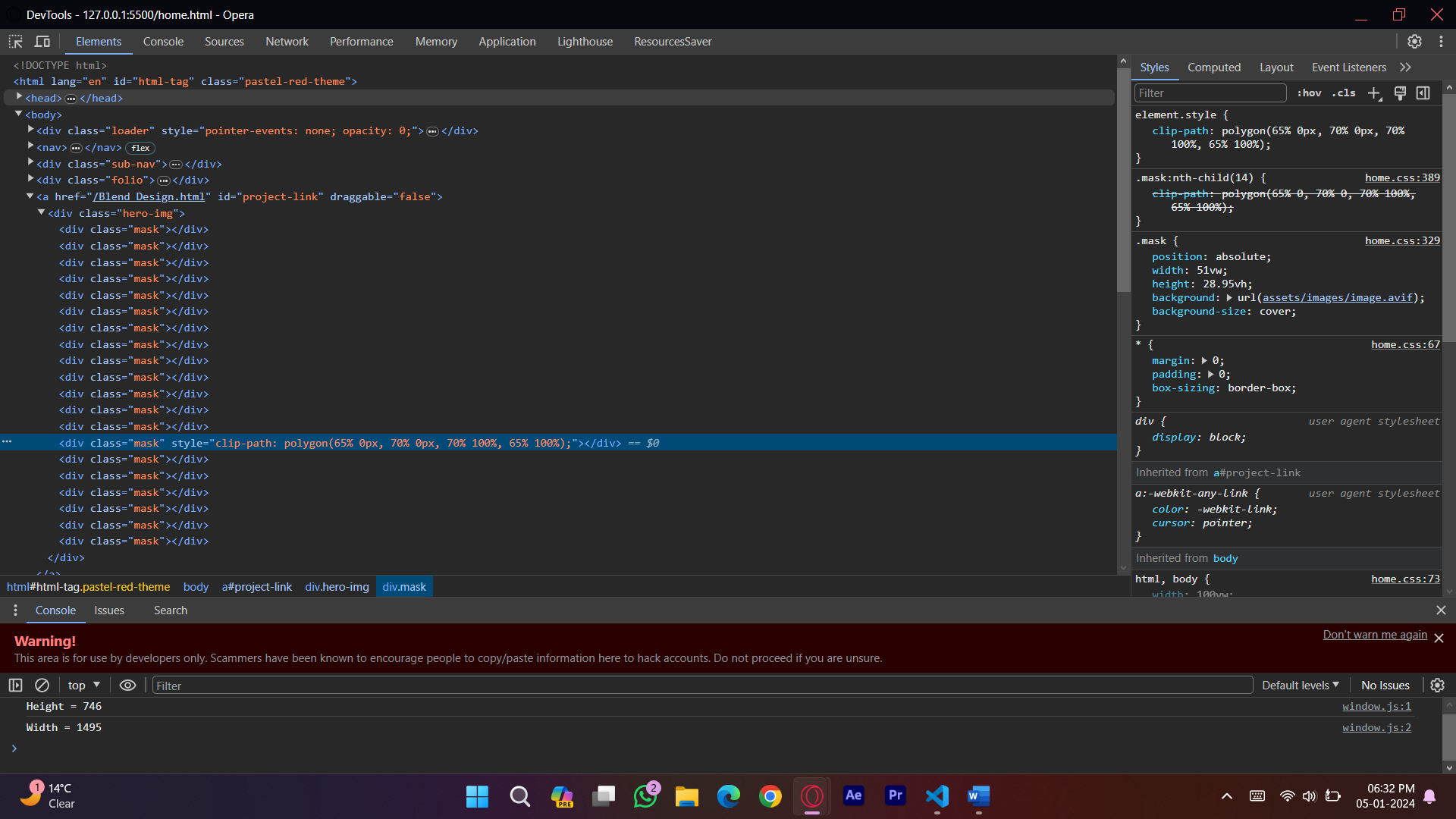
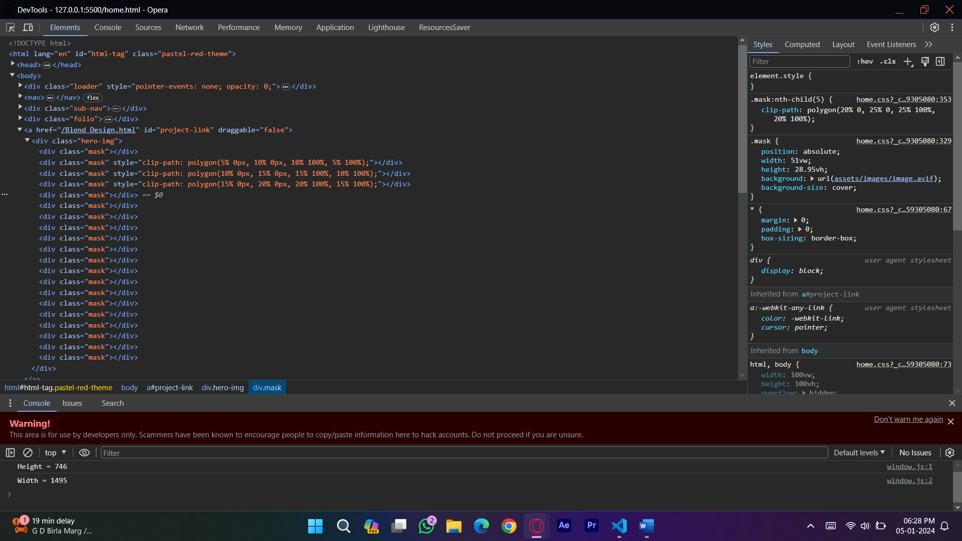
I want to create a entry transition to my website but the polygons are not rendering like they should. The polygons animate on entry from right to left like window bind. It was working before with 10 Masks but I thought 20 would look better.
I tried adding % to 0s but no luck
The polygon values sometimes change style, sometimes not
document.addEventListener("DOMContentLoaded", () => {
  const counter = document.querySelector(".counter");
  const loader = document.querySelector(".loader");
  const elementsToAnimate = document.querySelectorAll(
    "p:not(.intro), .logo h1"
  );
  const introTag = document.querySelector(".intro");
  let animationIntialized = false;

  function shuffleText(finalText, duration, callback) {
    let i = 0;
    const shuffleInterval = setInterval(() => {
      if (i < duration) {
        counter.innerHTML = Math.random().toString(36).substring(2, 8);
        i++;
      } else {
        clearInterval(shuffleInterval);
        counter.innerHTML = finalText;
        if (callback) callback();
      }
    }, 100)
  }


  function removeLetters() {
    let text = counter.innerHTML;
    const removeInterval = setInterval(() => {
      if (text.length > 0) {
        text = text.substring(0, text.length - 1);
        counter.innerHTML = text;
      } else {
        clearInterval(removeInterval);

        if (!animationIntialized) {
          animateElements();
          animateIntroTag();
        }
        fadeOutLoader();
      }
    }, 100);
  }

  function animateElements() {
    if (animationIntialized) return;
    animationIntialized = true;

    elementsToAnimate.forEach((element) => {
      let originalText = element.textContent;
      let index = 0;

      const shuffleElement = setInterval(() => {
        if (index < originalText.length) {
          let shuffledText = "";
          for (let i = 0; i <= index; i++) {
            shuffledText +=
              i < index ? originalText[i] : Math.random().toString(36)[2];
          }
          element.textContent =
            shuffledText + originalText.substring(index + 1);
          index++;
        } else {
          clearInterval(shuffleElement);
          element.textContent = originalText;
        }
      }, 100);
    });
  }

  function animateIntroTag() {
    let originalText = introTag.textContent;
    let currentText = "";
    let index = 0;

    const revealText = setInterval(() => {
      if (index < originalText.length) {
        currentText += originalText[index];
        introTag.textContent = currentText;
        index++;
      } else {
        clearInterval(revealText);
      }
    }, 25);
  }

  function animateMasks() {
    const masks = document.querySelectorAll(".hero-img .mask");
    const clipPathValues = [
      "clip-path: polygon(0% 0%, 5% 0%, 5% 100%, 0% 100%)",
      "clip-path: polygon(5% 0%, 10% 0%, 10% 100%, 5% 100%)",
      "clip-path: polygon(10% 0%, 15% 0%, 15% 100%, 10% 100%)",
      "clip-path: polygon(15% 0%, 20% 0%, 20% 100%, 15% 100%)",
      "clip-path: polygon(20% 0%, 25% 0%, 25% 100%, 20% 100%)",
      "clip-path: polygon(25% 0%, 30% 0%, 30% 100%, 25% 100%)",
      "clip-path: polygon(30% 0%, 35% 0%, 35% 100%, 30% 100%)",
      "clip-path: polygon(35% 0%, 40% 0%, 40% 100%, 35% 100%)",
      "clip-path: polygon(40% 0%, 45% 0%, 45% 100%, 40% 100%)",
      "clip-path: polygon(45% 0%, 50% 0%, 50% 100%, 45% 100%)",
      "clip-path: polygon(50% 0%, 55% 0%, 55% 100%, 50% 100%)",
      "clip-path: polygon(55% 0%, 60% 0%, 60% 100%, 55% 100%)",
      "clip-path: polygon(60% 0%, 65% 0%, 65% 100%, 60% 100%)",
      "clip-path: polygon(65% 0%, 70% 0%, 70% 100%, 65% 100%)",
      "clip-path: polygon(70% 0%, 75% 0%, 75% 100%, 70% 100%)",
      "clip-path: polygon(75% 0%, 80% 0%, 80% 100%, 75% 100%)",
      "clip-path: polygon(80% 0%, 85% 0%, 85% 100%, 80% 100%)",
      "clip-path: polygon(85% 0%, 90% 0%, 90% 100%, 85% 100%)",
      "clip-path: polygon(90% 0%, 95% 0%, 95% 100%, 90% 100%)",
      "clip-path: polygon(95% 0%, 100% 0%, 100% 100%, 95% 100%)",
    ];

    setTimeout(() => {
      masks.forEach((mask, index) => {
        gsap.to(mask, {
          clipPath: clipPathValues[index % clipPathValues.length],
          duration: 1,
          delay: index * 0.1,
        });
      });
    });
  }

  gsap.to(counter, {
    innerHTML: 100 + "%",
    duration: 2.5,
    snap: "innerHTML",
    ease: "none",
    onComplete: () => {
      setTimeout(
        () =>
        shuffleText("ISAN/24", 5, () => {
          setTimeout(removeLetters, 800);
        }),
        800
      );
    },
  });

  function fadeOutLoader() {
    gsap.to(loader, {
      opacity: 0,
      pointerEvents: "none",
      duration: 1,
      onComplete: () => {
        animateMasks();
      },
    });
  }
});
.hero-img {
position: absolute;
right: 3.9464882943144%;
top: 37.68538874%;
width: 51vw;
height: 28.95vh;
}
.mask {
position: absolute;
width: 51vw;
height: 28.95vh;
background: url(assets/images/image.avif);
background-size: cover;
}
.mask:nth-child(1) {
clip-path: polygon(0% 0%, 5% 0%, 5% 100%, 0% 100%);
}
.mask:nth-child(2) {
clip-path: polygon(5% 0, 10% 0, 10% 100%, 5% 100%);
}
.mask:nth-child(3) {
clip-path: polygon(10% 0, 15% 0, 15% 100%, 10% 100%);
}
.mask:nth-child(4) {
clip-path: polygon(15% 0, 20% 0, 20% 100%, 15% 100%);
}
.mask:nth-child(5) {
clip-path: polygon(20% 0, 25% 0, 25% 100%, 20% 100%);
}
.mask:nth-child(6) {
clip-path: polygon(25% 0, 30% 0, 30% 100%, 25% 100%);
}
.mask:nth-child(7) {
clip-path: polygon(30% 0, 35% 0, 35% 100%, 30% 100%);
}
.mask:nth-child(8) {
clip-path: polygon(35% 0, 40% 0, 40% 100%, 35% 100%);
}
.mask:nth-child(9) {
clip-path: polygon(40% 0, 45% 0, 45% 100%, 40% 100%);
}
.mask:nth-child(10) {
clip-path: polygon(45% 0, 50% 0, 50% 100%, 45% 100%);
}
.mask:nth-child(11) {
clip-path: polygon(50% 0, 55% 0, 55% 100%, 50% 100%);
}
.mask:nth-child(12) {
clip-path: polygon(55% 0, 60% 0, 60% 100%, 55% 100%);
}
.mask:nth-child(13) {
clip-path: polygon(60% 0, 65% 0, 65% 100%, 60% 100%);
}
.mask:nth-child(14) {
clip-path: polygon(65% 0, 70% 0, 70% 100%, 65% 100%);
}
.mask:nth-child(15) {
clip-path: polygon(70% 0, 75% 0, 75% 100%, 70% 100%);
}
.mask:nth-child(16) {
clip-path: polygon(75% 0, 80% 0, 80% 100%, 75% 100%);
}
.mask:nth-child(17) {
clip-path: polygon(80% 0, 85% 0, 85% 100%, 80% 100%);
}
.mask:nth-child(18) {
clip-path: polygon(85% 0, 90% 0, 90% 100%, 85% 100%);
}
.mask:nth-child(19) {
clip-path: polygon(90% 0%, 95% 0%, 95% 100%, 90% 100%);
}
.mask:nth-child(20) {
clip-path: polygon(95% 0, 100% 0, 100% 100%, 95% 100%);
}<a href="" id="project-link" draggable="false">
<div class="hero-img">
<div class="mask"></div>
<div class="mask"></div>
<div class="mask"></div>
<div class="mask"></div>
<div class="mask"></div>
<div class="mask"></div>
<div class="mask"></div>
<div class="mask"></div>
<div class="mask"></div>
<div class="mask"></div>
<div class="mask"></div>
<div class="mask"></div>
<div class="mask"></div>
<div class="mask"></div>
<div class="mask"></div>
<div class="mask"></div>
<div class="mask"></div>
<div class="mask"></div>
<div class="mask"></div>
<div class="mask"></div>
</div>
</a>
<script src="https://cdnjs.cloudflare.com/ajax/libs/gsap/3.12.4/gsap.min.js"></script>
2
Answers
Its fixed just remove "clip-path:" prefix from JavaScript it will work fine
I only hope to be helpful and I am wondering why pure css animation (webkit keyframes) is not your preferred method for animating html elements? I believe you are missing a comma in this line:
const masks = document.querySelectorAll(".hero-img .mask"); – The classes must be separated by a comma – (".hero-img, .mask")