


I am using Angular 15 and trying to resize the color palette based on zoom level.
<input #primaryColor (change)="colorChange($event,'primary')" formControlName="primaryColor" class="color-input" type="color">
The type is color for this.
When I change the view to Mobile Mode in Developer Tools and change the zoom level from 100% to 50% for example, the color palette is going out of the screen when I select zoom level from the Dropdown of the browser.
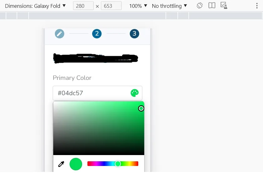
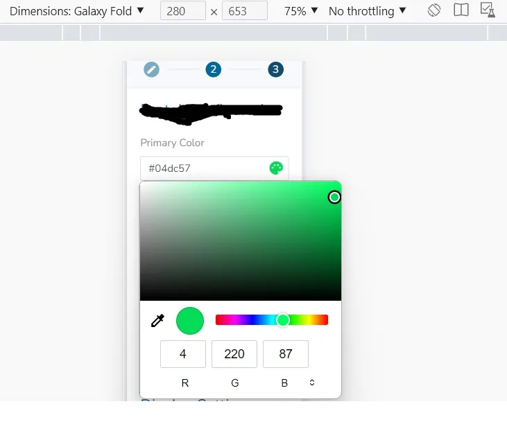
The screenshots for Galaxy Fold Mobile device is shown with 100% and 75% zoom levels. In 100%, the color palette fits properly. But when the zoom level is changed to 75%, the color palette is going out of scope.
How to resize and fit the color palette based on zoom level here?
2
Answers
The color selection is OS and browser based. So if its in android mobile the color selection will be done based on screen available and color picker will be different. So if you want to change the picker you can choose angular package available to use.
I hope this help.
Use a media query to achieve this task.
The class is
The media query is:
You can add more media queries for different sizes.
now just apply this class to the color input.