skip to Main Content

Some context

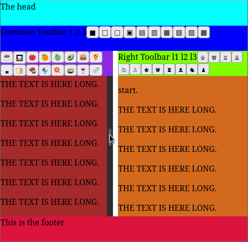
Given a 2×5 css grid covering whole viewport defined as :

#grid-wrapper {
  display: grid;
  grid-template-columns: 50% 50%;
  grid-template-rows: 50px 50px 50px calc(100vh - 200px) 50px;
  grid-template-areas:    
    "header header"
    "common-toolbar common-toolbar"
    "left-toolbar right-toolbar"
    "left-panel right-panel"
    "footer footer";
  width: 100vw;
  height: 100vh;
}

left-panel and right-panel grid cells are both overflow-y: scroll; scrollable divs.

This setup works as intended.
screenshot for reference

The question

I would like common-toolbar and (left/right)-toolbars row height not to be defined as fixed (50px) height but to size automatically to their content height (the toolbars height, which is not static) while (left/right)-panel still taking the rest of available viewport height.

Something like :

grid-template-rows: 50px auto auto calc(100vh - sum_of_height_of_other_rows) 50px;

Is that achievable in a grid ?

edit : snippet

const squares = [
  ['■', 'Black square'],
  ['□', 'White square'],
  ['▢', 'White square with rounded corners'],
  ['▣', 'White square containing small black square'],
  ['▤', 'Square with horizontal fill'],
  ['▥', 'Square with vertical fill'],
  ['▦', 'Square with orthogonal crosshatch fill'],
  ['▧', 'Square with upper left to lower right fill'],
  ['▨', 'Square with upper right to lower left fill'],
  ['▩', 'Square with diagonal crosshatch fill '],
]
const fruits = [
  ['☕', 'hot beverage'],
  ['⛾', 'restaurant'],
  ['🍅', 'tomato'],
  ['🍊', 'tangerine'],
  ['🍏', 'green apple'],
  ['🥑', 'avocado'],
  ['🍔', 'hamburger'],
  ['🍕', 'slice of pizza'],
  ['🍙', 'rice ball'],
  ['🍞', 'bread'],
  ['🍣', 'sushi'],
  ['🍨', 'ice cream'],
  ['🍭', 'lollipop'],
  ['🍲', 'pot of food'],
  ['🍷', 'wine glass'],
  ['🍼', 'baby bottle'],
  ['🍓', 'strawberry'],
]
const chess = [
  ['♔', 'white chess king'],
  ['♕', 'white chess queen'],
  ['♖', 'white chess rook'],
  ['♗', 'white chess bishop'],
  ['♘', 'white chess knight'],
  ['♙', 'white chess pawn'],
  ['♚', 'black chess king'],
  ['♛', 'black chess queen'],
  ['♜', 'black chess rook'],
  ['♝', 'black chess bishop'],
  ['♞', 'black chess knight'],
  ['♟', 'black chess pawn']
]


const fillToolbar = (toolbar, fillWith) => {
  fillWith.forEach(([symbol, name]) => {
    const $button = document.createElement('button')
    $button.setAttribute("title", name)
    $button.textContent = symbol;
    toolbar.append($button)
  })
}
fillToolbar(document.getElementById("common-toolbar"), squares)
fillToolbar(document.getElementById("left-toolbar"), fruits)
fillToolbar(document.getElementById("right-toolbar"), chess)

const fillText = (panel, count) => {
  panel.innerHTML = '';
  if (count > 0) {
    panel.innerHTML =
      "<p>start.<p> "
      + "<p>THE TEXT IS HERE LONG.<p> ".repeat(count)
      + "<p>end.<p> "
  }
}

const count = 1000;
fillText(document.getElementById("left-panel"), count)
fillText(document.getElementById("right-panel-content"), count)
body {
  margin: 0;
}

#grid-wrapper {
  display: grid;
  grid-template-columns: calc(50%-5px) 50%;
  grid-template-rows: 50px 50px 50px calc(100vh - 200px) 50px;
  grid-template-areas:    
    "header header"
    "common-toolbar common-toolbar"
    "left-toolbar right-toolbar"
    "left-panel right-panel"
    "footer footer";

  width: 100vw;
  height: 100vh;
  column-gap: 10px;
}

#header {
  background-color: aqua;
  grid-column: span 2;
  grid-area: header;
}

#common-toolbar {
  background-color: blue;
  grid-column: span 2;
  grid-area: common-toolbar;
}

#left-toolbar {
  background-color: blueviolet;
  grid-area: left-toolbar;
}
#left-panel {
  background-color: brown;
  grid-area: left-panel;
  overflow-y: scroll;
}
#right-toolbar {
  background-color: chartreuse;
  grid-area: right-toolbar;
}

#right-panel {
  background-color: chocolate;
  grid-area: right-panel;
  
}
#right-panel-content {
  overflow-y: scroll;
  height: 100%;
}
#footer {
  background-color: crimson;
  grid-column: span 2;
  grid-area: footer;
}
<!doctype html>
<html lang="en">
  <head>
    <meta charset="UTF-8" />
    <meta name="viewport" content="width=device-width, initial-scale=1.0" />
    <title>Test box</title>
  </head>
  <body>    
    <div id="grid-wrapper">
      <div id="header">The head</div>
      
      <div id="common-toolbar">Common Toolbar 1 2 3</div>
      
      <div id="left-toolbar"></div>
      <div id="left-panel"><div id="left-panel-content"></div></div>
      <div id="right-toolbar">Right Toolbar l1 l2 l3</div>
      <div id="right-panel"><div id="right-panel-content"></div></div>
      <div id="footer">This is the footer</div>
    </div>
    <div id="root"></div>
    <script type="module" src="/src/main.jsx"></script>
  </body>
</html>

3

Answers


  1. One approach is as below, there are many possible variations on this theme (and, course, many others); explanatory comments are in the code:

    /* some simple utility functions to avoid copious typing where possible */
    const D = document,
      create = (tag, props) => Object.assign(D.createElement(tag), props),
      createSampleText = (wrapper = "p", count = 0) => {
        let text = Array.from({
            length: count
          })
          .map(() => words[random(0, words.length)])
          .join(" ")
          .replace(/[a-z]/, (match) => match.toUpperCase())
        return create(wrapper, {
          textContent: text
        })
      },
      fragment = () => D.createDocumentFragment(),
      get = (selector, context = D) => context.querySelector(selector),
      getAll = (selector, context = D) => [...context.querySelectorAll(selector)],
      random = (min, max) => Math.floor(Math.random() * (max - min) + min),
      words = [
        "lorem",
        "ipsum",
        "dolor",
        "sit",
        "amet",
        "consectetur",
        "adipisicing",
        "elit",
        "provident",
        "unde",
        "velit",
        "totam",
        "mollitia",
        "iste",
        "voluptatibus",
        "iure",
        "repellat",
        "modi",
        "non",
        "expedita",
        "facere",
        "ducimus",
        "maiores",
        "tenetur",
        "magnam",
        "voluptate",
        "placeat",
        "perferendis",
        "debitis",
        "accusantium",
        "hic",
        "nisi",
        "omnis",
        "corrupti",
        "quas",
        "saepe",
        "laborum",
        "voluptates",
        "ratione",
        "porro",
        "cupiditate",
        "aliquam",
        "quo",
        "sint",
        "doloribus",
        "deleniti",
        "ad",
        "eum",
        "consequatur",
        "veniam",
        "nemo",
        "optio",
        "quos",
        "quasi",
        "molestias",
        "adipisci",
        "delectus",
        "eos",
        "quae",
        "et",
        "necessitatibus",
        "quis",
        "libero",
        "magni",
        "enim",
        "officiis",
        "reprehenderit",
        "laudantium",
        "aut",
        "accusamus",
        "quisquam",
        "ab",
        "dolores",
        "minus",
        "rerum",
        "consequuntur",
        "illo",
        "alias",
        "id",
        "praesentium",
        "quam",
        "error",
        "ipsa",
      ];
    
    /* an object created from your posted content-generation */
    const content = [{
        // String, CSS selector for the element fow which the
        // following array would be the content:
        selector: "common-toolbar",
        content: [
          ["■", "Black square"],
          ["□", "White square"],
          ["▢", "White square with rounded corners"],
          ["▣", "White square containing small black square"],
          ["▤", "Square with horizontal fill"],
          ["▥", "Square with vertical fill"],
          ["▦", "Square with orthogonal crosshatch fill"],
          ["▧", "Square with upper left to lower right fill"],
          ["▨", "Square with upper right to lower left fill"],
          ["▩", "Square with diagonal crosshatch fill "],
        ],
      },
      {
        selector: "left-toolbar",
        content: [
          ["☕", "hot beverage"],
          ["⛾", "restaurant"],
          ["🍅", "tomato"],
          ["🍊", "tangerine"],
          ["🍏", "green apple"],
          ["🥑", "avocado"],
          ["🍔", "hamburger"],
          ["🍕", "slice of pizza"],
          ["🍙", "rice ball"],
          ["🍞", "bread"],
          ["🍣", "sushi"],
          ["🍨", "ice cream"],
          ["🍭", "lollipop"],
          ["🍲", "pot of food"],
          ["🍷", "wine glass"],
          ["🍼", "baby bottle"],
          ["🍓", "strawberry"],
        ],
      },
      {
        selector: "right-toolbar",
        content: [
          ["♔", "white chess king"],
          ["♕", "white chess queen"],
          ["♖", "white chess rook"],
          ["♗", "white chess bishop"],
          ["♘", "white chess knight"],
          ["♙", "white chess pawn"],
          ["♚", "black chess king"],
          ["♛", "black chess queen"],
          ["♜", "black chess rook"],
          ["♝", "black chess bishop"],
          ["♞", "black chess knight"],
          ["♟", "black chess pawn"],
        ],
      },
    ];
    
    // iterating over the content Array of Objects:
    content.forEach(
    // using destructuring assignment to retrieve the property-values of the
    // named properties, and assigning them to variables of the same name as
    // the property:
    ({
      selector,
      content
    }) => {
      // using getAll(), which takes a CSS selector and returns an Array of
      // element nodes retrieved by the underlying document.querySelectorAll();
      // iterating through the returned Array using Array.prototype.forEach()
      getAll(`.${selector}`).forEach(
        // el: a reference (the name is entirely irrelevant so long as it's valid
        //     in JavaScript) to the current element/node of the Array of elements/
        //     nodes:
        (el) => {
        
        // creating a document fragment to hold the content we're generating:
        let frag = fragment()
        
        // appending a new <span> element, with the textContent matching the
        // (capitalised) 'selector' variable; this is created via the create()
        // function defined above:
        frag.append(
          create("span", {
            textContent: `${selector.replace(/[a-z]/, (a) => a.toUpperCase())}:`,
          })
        );
        // here we iterate over the content Array, again using Array.prototype.forEach():
        content.forEach(
        // using Array destructuring, by which the first element of the Array is assigned
        // to the variable 'text', and the second assigned to the variable 'title':
        ([text, title]) =>
          // again using create() to create <button> elements, with the textContent of
          // the emoji/glyph, the title set to the title property, and the type of
          // the <button> set to "button" (in order to guard against accidental
          // form submission (dependant on the use-case):
          frag.append(
            create("button", {
              textContent: text,
              title,
              type: "button"
            })
          )
        );
        // we append the document fragment to the current element:
        el.append(frag);
      });
    });
    
    // retrieving all '.panel' elements, again using getAll(), along with Array.prototype.forEach():
    getAll(".panel").forEach((el) => {
      // creating a document fragment:
      let frag = fragment();
      // using Array.from() to create an Array of length 35:
      Array.from({
        length: 35
      // iterating over the created Array; again using Array.prototype.forEach():
      }).forEach(() => {
        // in each iteration we call the created <p> element, each of which has
        // 20 words:
        frag.append(createSampleText("p", 20))
      });
      // appending the document fragment to the current '.panel' element:
      el.append(frag)
    });
    /*
      a simple, naive reset to remove browser default margins, padding, and font-size;
      also ensuring that all elements are sized according to the same sizing algorithm,
      that of 'border-box' which includes borders and padding within the assigned element
      sizes:
    */
    *,
    ::before,
    ::after {
      box-sizing: border-box;
      font-family: inherit;
      font-size: inherit;
      margin: 0;
      padding: 0;
    }
    
    /*
      ensuring that the <body> fills the viewport,
      and setting the default font-family for the document:
    */
    body {
      block-size: 100vh;
      font-family: system-ui;
    }
    
    main {
      /* using a logical property ('block-size') to set the element's size on
         the block-axis, the axis on which block elements are placed; in
         most European languages (left-to-right, top-to-bottom) this is
         equivalent to height (depending on the user's preferred language and
         layout): */
      block-size: 100%;
    }
    
    section {
      /* filling 100% of the block-axis of the parent: */
      block-size: 100%;
      /* using CSS grid, as required by the question: */
      display: grid;
      /* defining two columns, each of 1 fraction (1fr) of the available space): */
      grid-template-columns: repeat(2, 1fr);
      /* defining four rows:
        max-content: allowing the content of this row to take the maximum size
                     to fit its contents,
        min-content: allowing only the minimum size in order to show the content,
        1fr:         one fraction of the available space after the explicit rows,
                     and those that have sizes constrained to their content have
                     been calculated,
        min-content: as above */
      grid-template-rows: max-content min-content 1fr min-content;
    }
    
    section > * {
      /* defining the background-color of the various children of the <section>
         element, using the var function which will take the value of the --bgc
         custom property (if it's defined), and will default to papayawhip if
         the custom property is not available: */
      background-color: var(--bgc, papayawhip);
      /* padding on the block axis, the first value relates to the
         padding-block-start (in top-to-bottom languages this equates to 'padding-top',
         and the second to padding-block-end, which equates to 'bottom' in the same
         top-to-bottom languages: */
      padding-block: 0.5em 0.3em;
      /* padding on the inline-axis, the axis on which inline content is laid out (and
         is perpendicular to the block-axis, so is the horizontal axis in left-to-right
         languages), the use of a single value sets that value to both the
         padding-inline-start and padding-inline-end: */
      padding-inline: 0.7rem;
    }
    
    header,
    .common-toolbar,
    footer {
      /*
        these elements are positioned to start in the first grid-column (1),
        and end in the last (-1), taking up the full grid-row:
      */
      grid-column: 1 / -1;
    }
    
    h1 {
      font-size: 2.5rem;
      font-weight: 600;
    }
    
    header {
      /* setting the --bgc custom property for the <header> element: */
      --bgc: lavender;
    }
    
    .common-toolbar {
      /* setting the --bgc custom property for the .common-toolbar element(s): */
      --bgc: thistle;
      /* and centering the content via the justify-content property: */
      justify-content: center;
    }
    
    .panel {
      --bgc: plum;
      /* these elements have hidden overflow on the y axis: */
      overflow-y: scroll;
      /* for no particular reason I chose to use CSS nesting to set the property of
         <p> elements found within the .panel element(s); note that this selects
         all <p> elements, not just children; if you did wish to select only children
         then:
            & > p {...}
         could be used instead: */
      p {
        margin-block: 0.5rem;
        padding: 0.2rem;
      }
    }
    
    footer {
      --bgc: orchid;
    }
    
    .toolbar {
      /* using flex layout on all .toolbar elements: */
      display: flex;
      /* blurring the content that appears "behind" the
         .toolbar elements: */
      backdrop-filter: blur(2px);
      /* using color-mix() to set the background-colour of the elements,
         this is the oklch colour space ('in oklch'), and produces a colour
         that is 80% var(--bgc), and 20% #fff1 (a mostly-transparent white) */
      background-color: color-mix(in oklch, var(--bgc) 80%, #fff1);
      /* defining:
          flex-direction: row;
          flex-wrap: wrap;
         in the flex shorthand
      */
      flex-flow: row wrap;
      gap: 0.5em;
      padding: 0.2em;
      /* using position: sticky to have the elements remain in place regardless
         of the scroll of the parent's content: */
      position: sticky;
      top: 0;
      left: 0;
    }
    
    .toolbar:not(.common-toolbar)>*:first-child {
      flex-grow: 1;
    }
    
    .toobar button {
      padding: 0.2em;
    }
    <main>
      <section>
        <header>
          <h1>Arbitrary Heading</h1>
        </header>
        <div class="common-toolbar toolbar"></div>
        <!-- please note that I've nested the 'left-toolbar' and 'right-toolbar'
             within the relative panels; this isn't required but it more easily
             associates the related content/controls (although obviously the CSS
             that I've written is designed to work with this HTML) -->
        <div class="left-panel panel">
          <div class="left-toolbar toolbar left"></div>
        </div>
        <div class="right-panel panel">
          <div class="right-toolbar toolbar right"></div>
        </div>
        <footer>Footer content</footer>
      </section>
    </main>

    JS Fiddle demo.

    If, however, you would prefer – or are required – to keep the .left-toolbar and .right-toolbar elements outside of the .panel elements, then the following also works:

    /* some simple utility functions to avoid copious typing where possible */
    const D = document,
      create = (tag, props) => Object.assign(D.createElement(tag), props),
      createSampleText = (wrapper = "p", count = 0) => {
        let text = Array.from({
            length: count
          })
          .map(() => words[random(0, words.length)])
          .join(" ")
          .replace(/[a-z]/, (match) => match.toUpperCase())
        return create(wrapper, {
          textContent: text
        })
      },
      fragment = () => D.createDocumentFragment(),
      get = (selector, context = D) => context.querySelector(selector),
      getAll = (selector, context = D) => [...context.querySelectorAll(selector)],
      random = (min, max) => Math.floor(Math.random() * (max - min) + min),
      words = [
        "lorem",
        "ipsum",
        "dolor",
        "sit",
        "amet",
        "consectetur",
        "adipisicing",
        "elit",
        "provident",
        "unde",
        "velit",
        "totam",
        "mollitia",
        "iste",
        "voluptatibus",
        "iure",
        "repellat",
        "modi",
        "non",
        "expedita",
        "facere",
        "ducimus",
        "maiores",
        "tenetur",
        "magnam",
        "voluptate",
        "placeat",
        "perferendis",
        "debitis",
        "accusantium",
        "hic",
        "nisi",
        "omnis",
        "corrupti",
        "quas",
        "saepe",
        "laborum",
        "voluptates",
        "ratione",
        "porro",
        "cupiditate",
        "aliquam",
        "quo",
        "sint",
        "doloribus",
        "deleniti",
        "ad",
        "eum",
        "consequatur",
        "veniam",
        "nemo",
        "optio",
        "quos",
        "quasi",
        "molestias",
        "adipisci",
        "delectus",
        "eos",
        "quae",
        "et",
        "necessitatibus",
        "quis",
        "libero",
        "magni",
        "enim",
        "officiis",
        "reprehenderit",
        "laudantium",
        "aut",
        "accusamus",
        "quisquam",
        "ab",
        "dolores",
        "minus",
        "rerum",
        "consequuntur",
        "illo",
        "alias",
        "id",
        "praesentium",
        "quam",
        "error",
        "ipsa",
      ];
    
    /* an object created from your posted content-generation */
    const content = [{
        // String, CSS selector for the element fow which the
        // following array would be the content:
        selector: "common-toolbar",
        content: [
          ["■", "Black square"],
          ["□", "White square"],
          ["▢", "White square with rounded corners"],
          ["▣", "White square containing small black square"],
          ["▤", "Square with horizontal fill"],
          ["▥", "Square with vertical fill"],
          ["▦", "Square with orthogonal crosshatch fill"],
          ["▧", "Square with upper left to lower right fill"],
          ["▨", "Square with upper right to lower left fill"],
          ["▩", "Square with diagonal crosshatch fill "],
        ],
      },
      {
        selector: "left-toolbar",
        content: [
          ["☕", "hot beverage"],
          ["⛾", "restaurant"],
          ["🍅", "tomato"],
          ["🍊", "tangerine"],
          ["🍏", "green apple"],
          ["🥑", "avocado"],
          ["🍔", "hamburger"],
          ["🍕", "slice of pizza"],
          ["🍙", "rice ball"],
          ["🍞", "bread"],
          ["🍣", "sushi"],
          ["🍨", "ice cream"],
          ["🍭", "lollipop"],
          ["🍲", "pot of food"],
          ["🍷", "wine glass"],
          ["🍼", "baby bottle"],
          ["🍓", "strawberry"],
        ],
      },
      {
        selector: "right-toolbar",
        content: [
          ["♔", "white chess king"],
          ["♕", "white chess queen"],
          ["♖", "white chess rook"],
          ["♗", "white chess bishop"],
          ["♘", "white chess knight"],
          ["♙", "white chess pawn"],
          ["♚", "black chess king"],
          ["♛", "black chess queen"],
          ["♜", "black chess rook"],
          ["♝", "black chess bishop"],
          ["♞", "black chess knight"],
          ["♟", "black chess pawn"],
        ],
      },
    ];
    
    // iterating over the content Array of Objects:
    content.forEach(
    // using destructuring assignment to retrieve the property-values of the
    // named properties, and assigning them to variables of the same name as
    // the property:
    ({
      selector,
      content
    }) => {
      // using getAll(), which takes a CSS selector and returns an Array of
      // element nodes retrieved by the underlying document.querySelectorAll();
      // iterating through the returned Array using Array.prototype.forEach()
      getAll(`.${selector}`).forEach(
        // el: a reference (the name is entirely irrelevant so long as it's valid
        //     in JavaScript) to the current element/node of the Array of elements/
        //     nodes:
        (el) => {
        
        // creating a document fragment to hold the content we're generating:
        let frag = fragment()
        
        // appending a new <span> element, with the textContent matching the
        // (capitalised) 'selector' variable; this is created via the create()
        // function defined above:
        frag.append(
          create("span", {
            textContent: `${selector.replace(/[a-z]/, (a) => a.toUpperCase())}:`,
          })
        );
        // here we iterate over the content Array, again using Array.prototype.forEach():
        content.forEach(
        // using Array destructuring, by which the first element of the Array is assigned
        // to the variable 'text', and the second assigned to the variable 'title':
        ([text, title]) =>
          // again using create() to create <button> elements, with the textContent of
          // the emoji/glyph, the title set to the title property, and the type of
          // the <button> set to "button" (in order to guard against accidental
          // form submission (dependant on the use-case):
          frag.append(
            create("button", {
              textContent: text,
              title,
              type: "button"
            })
          )
        );
        // we append the document fragment to the current element:
        el.append(frag);
      });
    });
    
    // retrieving all '.panel' elements, again using getAll(), along with Array.prototype.forEach():
    getAll(".panel").forEach((el) => {
      // creating a document fragment:
      let frag = fragment();
      // using Array.from() to create an Array of length 35:
      Array.from({
        length: 35
      // iterating over the created Array; again using Array.prototype.forEach():
      }).forEach(() => {
        // in each iteration we call the created <p> element, each of which has
        // 20 words:
        frag.append(createSampleText("p", 20))
      });
      // appending the document fragment to the current '.panel' element:
      el.append(frag)
    });
    *,
    ::before,
    ::after {
      box-sizing: border-box;
      font-size: inherit;
      margin: 0;
      padding: 0;
    }
    
    body {
      block-size: 100vh;
      font-family: system-ui;
    }
    
    main {
      background-color: lavenderblush;
      block-size: 100%;
    }
    
    section {
      align-self: stretch;
      block-size: 100%;
      display: grid;
      grid-template-columns: repeat(2, 1fr);
      grid-template-rows: max-content repeat(2, min-content) 1fr min-content;
      /* having seen this demo in full-page, I added the following line to prevent
         the content from being impractically wide; the min() declaration will
         return the smallest value of the supplied comma-separated values and
         is able to compare relative and absolute sizes; in the following the
         element will take 100% of the inline-axis (100vw) until that 100vw
         evaluates to a size larger than 1300px at which point the size will
         be constrained to 1300px: */
      inline-size: min(100vw, 1300px);
      /* the following is added simply to center the element on the inline-axis: */
      margin-inline: auto;
    }
    
    section > * {
      background-color: var(--bgc, papayawhip);
      padding-block: 0.5em 0.3em;
      padding-inline: 0.7rem;
    }
    
    header,
    .common-toolbar,
    footer {
      grid-column: 1 / -1;
    }
    
    h1 {
      font-size: 2.5rem;
      font-weight: 600;
    }
    
    header {
      --bgc: lavender;
    }
    
    .panel {
      --bgc: plum;
      overflow-y: scroll;
    
      p {
        margin-block: 0.5rem;
        padding: 0.2rem;
      }
    }
    
    footer {
      --bgc: orchid;
    }
    
    .toolbar {
      display: flex;
      backdrop-filter: blur(2px);
      gap: 0.5em;
      padding: 0.2em;
    }
    
    .common-toolbar {
      --bgc: thistle;
      justify-content: center;
    }
    
    .toolbar:not(.common-toolbar) {
      --bgc: mediumpurple;
    }
    
    .toolbar:not(.common-toolbar)>*:first-child {
      flex-grow: 1;
    }
    
    .toobar button {
      padding: 0.2em;
    }
    <!--
      HTML below from a posted code snippet on Stack Overflow: https://stackoverflow.com/questions/77330430/setting-css-grid-row-height-to-remaining-viewport-height,
      author: Alice Oualouest,
      user-page: https://stackoverflow.com/u/5565079/
    -->
    <main>
      <section>
        <header>
          <h1>Arbitrary Heading</h1>
        </header>
        <div class="common-toolbar toolbar"></div>
        <!--
          the left and right toolbar elements are now children
          of the wrapping <section> element, rather than nested
          within their "associated" .panel elements:
        -->
        <div class="left-toolbar toolbar left"></div>
        <div class="right-toolbar toolbar right"></div>
        <div class="left-panel panel">
        </div>
        <div class="right-panel panel">
        </div>
        <footer>Footer content</footer>
      </section>
    </main>

    JS Fiddle demo.

    References:

    Login or Signup to reply.
  2. I think you’re looking for something like this:

    grid-template-rows: 50px 50px auto 1fr 50px;
    

    Let grid’s auto-placement figure out the hard stuff for you. No need for calculating remaining height…that’s what 1fr or one fractional unit will do for you.

    Hope this helps.

    Login or Signup to reply.
  3. Set #grid-wrapper { grid-auto-rows: minmax(50px, auto) minmax(50px, auto) minmax(50px, auto) minmax(50px, 1fr) minmax(50px, auto); }.
    Also, if you specify grid-area, you can omit grid-column

    body {
      margin: 0;
    }
    
    #grid-wrapper {
      display: grid;
      grid-template-columns: 1fr 1fr;
      grid-auto-rows: minmax(50px, auto) minmax(50px, auto) minmax(50px, auto) minmax(50px, 1fr) minmax(50px, auto);
      grid-template-areas:    
        "header header"
        "common-toolbar common-toolbar"
        "left-toolbar right-toolbar"
        "left-panel right-panel"
        "footer footer";
      height: 100vh;
      column-gap: 10px;
      min-height:fit-content;
    }
    
    #header {
      background-color: aqua;
      grid-area: header;
    }
    
    #common-toolbar {
      background-color: blue;
      grid-area: common-toolbar;
    }
    
    #left-toolbar {
      background-color: blueviolet;
      grid-area: left-toolbar;
    }
    #left-panel {
      background-color: brown;
      grid-area: left-panel;
      overflow-y: scroll;
    }
    #right-toolbar {
      background-color: chartreuse;
      grid-area: right-toolbar;
    }
    
    #right-panel {
      background-color: chocolate;
      grid-area: right-panel;
      overflow-y: scroll;
    }
    #footer {
      background-color: crimson;
      grid-area: footer;
    }
    <div id="grid-wrapper">
      <div id="header">The head<br>The head<br>The head</div>
    
      <div id="common-toolbar">Common Toolbar 1 2 3</div>
    
      <div id="left-toolbar"></div>
      <div id="left-panel">Lorem ipsum dolor sit amet, consectetur adipisicing elit. Voluptate, commodi in placeat quibusdam dolores reprehenderit quaerat. Voluptate, molestiae, blanditiis, minus perferendis eligendi est repellendus qui ex reiciendis aspernatur aliquam porro ipsa! Incidunt, obcaecati, fugit, debitis, alias nam rem exercitationem harum esse repellendus itaque dolorum quo earum reiciendis eum similique officiis veritatis velit accusantium cupiditate vero. Autem, consequatur, illo debitis eum qui incidunt quo. Adipisci, facilis ut officia unde et possimus doloremque voluptate aut nisi odio assumenda cum voluptatum ab ratione inventore sequi cupiditate quos sed quasi molestias odit porro ad impedit incidunt quis accusamus ex id neque aliquam nostrum amet alias sint omnis recusandae temporibus officiis dignissimos voluptatem sit expedita at tempore autem. Vitae, quia, officia, dolores, officiis distinctio sint dicta sed inventore adipisci dolorem hic velit cum fugit nam voluptas deleniti numquam dolorum atque animi odit corporis rerum eum repellendus incidunt natus explicabo libero voluptatum tempora magnam! Nesciunt, ipsa, neque, reprehenderit minus sed doloribus eos libero sunt repellat officiis fugiat sapiente quaerat ipsum ab illum eligendi atque! Eveniet, explicabo, fugiat, suscipit assumenda accusamus hic minus itaque eligendi rerum sunt vero consequatur amet saepe. Aperiam, laborum, obcaecati id reprehenderit enim sapiente ab amet ratione. Molestias minus delectus sint dicta dolorum. Suscipit, natus, reprehenderit, sint consectetur fuga aperiam dolorum et eum voluptatum repudiandae praesentium nam vero dolores autem deserunt accusantium omnis at officia distinctio officiis quae dolor nesciunt nihil facilis tempora consequuntur iusto quisquam maiores magni recusandae alias iure porro debitis repellendus cupiditate sunt laudantium aut illum ex eos. Laudantium, cupiditate, enim iusto modi soluta sint omnis dignissimos expedita necessitatibus consectetur non laboriosam qui quae nihil repellat placeat quas quibusdam eligendi laborum illum rem voluptatum incidunt dicta atque maiores veniam minima sit. Tenetur, nesciunt veritatis voluptatibus vel ipsam accusantium optio aspernatur praesentium nulla non saepe eius facere debitis assumenda incidunt esse!</div>
      
      <div id="right-toolbar">Right Toolbar l1 l2 l3</div>
      
      <div id="right-panel">Lorem ipsum dolor sit amet, consectetur adipisicing elit. Itaque, totam accusamus atque repellendus quos reprehenderit possimus consequuntur placeat fuga ipsam iure officia obcaecati beatae quo cum sed libero deleniti expedita inventore incidunt quasi rem et accusantium blanditiis autem necessitatibus impedit nisi facilis alias saepe dicta aliquam earum magni fugiat dolore tenetur officiis vel eaque omnis quis ratione dolores? Iste, doloribus, delectus, officiis repellat ducimus accusamus aliquam obcaecati ipsam rerum aliquid at consequatur voluptate earum tenetur nam hic distinctio. Nisi, placeat, ab, iure autem ad repellat ea perferendis porro eaque at beatae ullam ducimus consequatur voluptas repudiandae itaque nemo possimus laboriosam.</div>
      
      <div id="footer">This is the footer</div>
    </div>
    Login or Signup to reply.
Please signup or login to give your own answer.
Back To Top
Search