skip to Main Content

I am trying to generate a specific layout using CSS grids.
The layout I want is something like this:
enter image description here

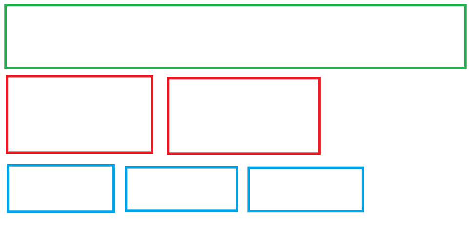
Entire page is split into 12 columns. The first row cell is spanning entire first row, the second row has 2 cells spanning 4 columns each. The third row has 3 cells, spanning 3 columns each. But as per my code, the 3 cells of the third row, start in the second row itself.

My code:

* {
  border: 1px solid;
}

.wrapper {
  display: grid;
  grid-template-columns: repeat(12, 1fr);
  grid-template-rows: auto;
  gap: 24px;
}

.item {
  padding: 24px;
}

.banner-img {
  grid-column: span 12;
}

.card {
  grid-column: span 4;
}

.note {
  grid-column: span 3;
}
<div class="wrapper">
  <div class="item banner-img">Hello</div>
  <div class="item card">Hello</div>
  <div class="item card">Hello</div>
  <div class="item note">Note</div>
  <div class="item note">Note</div>
  <div class="item note">Note</div>
</div>

How do I specify that .note div should start in a new row.

3

Answers


  1. Because you aren’t specifying which row to go in, there’s room for the first .note element in the second row, so it goes there. So just tell these elements which row to sit in, with grid-row: 3 etc.

          * {
            border: 1px solid;
          }
          .wrapper {
            display: grid;
            grid-template-columns: repeat(12,1fr);
            grid-template-rows: auto;
            gap: 24px;
          }
          .item{
            padding: 24px;
          }
    
          .banner-img{
            grid-column: span 12;
          }
    
          .card{
            grid-row: 2;
            grid-column: span 4;
          }
    
          .note{
            grid-row: 3;
            grid-column: span 3;
          }
    <div class="wrapper">
          <div class="item banner-img">Hello</div>
          <div class="item card">Hello</div>
          <div class="item card">Hello</div>
          <div class="item note">Note</div>
          <div class="item note">Note</div>
          <div class="item note">Note</div>
        </div>
    Login or Signup to reply.
  2. 1 way would be to add a 3rd card item with span 4.
    if you can’t, you can give another span to the second card item which is the 3rd item in wrapper

    * {
      border: 1px solid;
    }
    
    .wrapper {
      display: grid;
      grid-template-columns: repeat(12, 1fr);
      grid-template-rows: auto;
      gap: 24px;
    }
    
    .item {
      padding: 24px;
    }
    
    .banner-img {
      grid-column: span 12;
    }
    
    .card {
      grid-column: span 4;
    }
    
    .card:nth-child(3) {
      grid-column: span 8;
    }
    
    .note {
      grid-column: span 3;
    }
    <div class="wrapper">
      <div class="item banner-img">Hello</div>
      <div class="item card">Card</div>
      <div class="item card">Card</div>
      <div class="item note">Note</div>
      <div class="item note">Note</div>
      <div class="item note">Note</div>
    </div>
    Login or Signup to reply.
  3. Setting grid-row: 3 to note should fix your issue

    * {
      border: 1px solid;
    }
    
    .wrapper {
      display: grid;
      grid-template-columns: repeat(12, 1fr);
      grid-template-rows: auto;
      gap: 24px;
    }
    
    .item {
      padding: 24px;
    }
    
    .banner-img {
      grid-column: span 12;
    }
    
    .card {
      grid-column: span 4;
    }
    
    .note {
      grid-column: span 3;
      grid-row: 3;
    }
    <div class="wrapper">
      <div class="item banner-img">Hello</div>
      <div class="item card">Hello</div>
      <div class="item card">Hello</div>
      <div class="item note">Note</div>
      <div class="item note">Note</div>
      <div class="item note">Note</div>
    </div>
    Login or Signup to reply.
Please signup or login to give your own answer.
Back To Top
Search