skip to Main Content

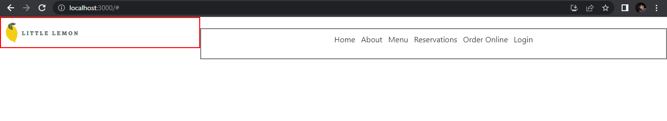
I have a Header and a Nav component in my React.js application. Inside the Header component I have placed my logo and the Nav contains usual navigation links. Since both are separate components and I don’t want to wrap them inside another semantic tag. I just want both to get displayed adjacent to each other. I set both of their display property to inline-flex along with certain width. The Header components occupies the place it should have while the Nav component get displayed in a peculiar way with a little space above it as if I have provided margin-top to it. Here is the screenshot.

enter image description here

Here is my Header Component followed by Nav component App component and index.css code.

Header.js

import React from "react";
import logo from '../assets/Logo .svg';

const Header = () => {
    return (
        <header className="header">
            <img className="nav-logo" src={logo} alt="Little Lemon" />
        </header>
    );
}

export default Header;

Nav.js

import React from "react";

const Nav = () => {
    return (
        <nav className="nav">
            <ul className="nav-list">
                <li><a className="nav-item" href="#"> Home </a></li>
                <li><a className="nav-item" href="#"> About </a></li>
                <li><a className="nav-item" href="#"> Menu </a></li>
                <li><a className="nav-item" href="#"> Reservations </a></li>
                <li><a className="nav-item" href="#"> Order Online </a></li>
                <li><a className="nav-item" href="#"> Login </a></li>
            </ul>
        </nav>
    );
}

export default Nav;

App.js

import './App.css';
import Header from './components/Header';
import Main from './components/Main';
import Nav from './components/Nav';
import Footer from './components/Footer';

function App() {
    return (
        <>
            <Header />
            <Nav />
            <Main />
            <Footer />
        </>
    );
}

export default App;

index.css

*{
    margin: 0;
    padding: 0;
    box-sizing: border-box;
}

.header {
     display: inline-flex;
     width: 30%;
     border: 2px solid red;
     padding: 10px;
}

.nav-logo{
}

.nav {
     display: inline-flex;
     justify-content: center;
     align-items: left;
     width: 70%;
     padding: 10px;
     border: 2px solid gray;
     height: 64px;
}

.nav-list{
     display: flex;
}

.nav-list li{
     list-style: none;
}

.nav-item{
     padding: 6px;
     text-decoration: none;
     color: #333333;
}

2

Answers


  1. Try to give maxHight and maxWidth to navLogo class

    *{
        margin: 0;
        padding: 0;
        box-sizing: border-box;
    }
    
    .header {
         display: inline-flex;
         width: 30%;
         border: 2px solid red;
         padding: 10px;
    }
    
    .nav-logo{
    maxHeight:'15px'
    *///////*
    }
    
    .nav {
         display: inline-flex;
         justify-content: center;
         align-items: left;
         width: 70%;
         padding: 10px;
         border: 2px solid gray;
         height: 64px;
    }
    
    .nav-list{
         display: flex;
    }
    
    .nav-list li{
         list-style: none;
    }
    
    .nav-item{
         padding: 6px;
         text-decoration: none;
         color: #333333;
    }


    Login or Signup to reply.
  2. You just need to make the parent of those 2 items a flex container so that they’re aligned at the top:

    #react {
        display: flex;
    }
    
    const { useState } = React;
    
    const Header = () => {
        return (
            <header className="header">
                <img className="nav-logo" src={'https://placehold.co/75'} alt="Little Lemon" />
            </header>
        );
    }
    
    const Nav = () => {
        return (
            <nav className="nav">
                <ul className="nav-list">
                    <li><a className="nav-item" href="#"> Home </a></li>
                    <li><a className="nav-item" href="#"> About </a></li>
                    <li><a className="nav-item" href="#"> Menu </a></li>
                    <li><a className="nav-item" href="#"> Reservations </a></li>
                    <li><a className="nav-item" href="#"> Order Online </a></li>
                    <li><a className="nav-item" href="#"> Login </a></li>
                </ul>
            </nav>
        );
    }
    
    function App() {
        return (
            <React.Fragment>
                <Header />
                <Nav />
            </React.Fragment>
        );
    }
    
    ReactDOM.render(<App />, document.getElementById("react"));
    *{
        margin: 0;
        padding: 0;
        box-sizing: border-box;
    }
    
    #react {
        display: flex;
    }
    
    .header {
         display: inline-flex;
         width: 30%;
         border: 2px solid red;
         padding: 10px;
    }
    
    .nav-logo{
    }
    
    .nav {
         display: inline-flex;
         justify-content: center;
         align-items: left;
         width: 70%;
         padding: 10px;
         border: 2px solid gray;
         height: 64px;
    }
    
    .nav-list{
         display: flex;
    }
    
    .nav-list li{
         list-style: none;
    }
    
    .nav-item{
         padding: 6px;
         text-decoration: none;
         color: #333333;
    }
    <script src="https://cdnjs.cloudflare.com/ajax/libs/react/17.0.1/umd/react.production.min.js"></script>
    <script src="https://cdnjs.cloudflare.com/ajax/libs/react-dom/17.0.1/umd/react-dom.production.min.js"></script>
    <div id="react"></div>
    Login or Signup to reply.
Please signup or login to give your own answer.
Back To Top
Search