skip to Main Content

I’m trying to layout some search result cards using tailwind. The cards are arranged using css grid while the content inside the cards – a header image, a title, and some metadata – are laid out using flex. The intention is that all the cards should expand to show the full title and all the cards in a row should match that height. The card footers should all be at the bottom of their card.

A simplified version of my markup for two cards looks like this:

<ul class="grid grid-cols-3 justify-center justify-items-center gap-x-8 gap-y-8">
  <li class="w-full">
    <div class="border-iwsr-blue flex h-full flex-col gap-2 overflow-hidden rounded-lg shadow-md">
      <div class="relative h-64 w-full overflow-hidden rounded-lg"><div class="h-full w-full" style="background:red"></div></div>
      <div class="flex h-full w-full flex-col p-4">
        <div class="flex h-full flex-col justify-between">
          <div class="pb-2 font-serif text-2xl leading-7">Article 1</div>

          <div class="mt-2 text-xs text-gray-700"><span class="mr-3 font-bold">Article</span>29th November 2023</div>
        </div>
      </div>
    </div>
  </li>
  <li class="w-full">
    <div class="border-iwsr-blue flex h-full flex-col gap-2 overflow-hidden rounded-lg shadow-md">
      <div class="relative h-64 w-full overflow-hidden rounded-lg">
        <div class="h-full w-full" style="background:red"></div>
      </div>
      <div class="flex h-full w-full flex-col p-4">
        <div class="flex h-full flex-col justify-between">
          <div class="pb-2 font-serif text-2xl leading-7">Article with a longer title that goes over multiple lines</div>

          <div class="mt-2 text-xs text-gray-700"><span class="mr-3 font-bold">Article</span>17th October 2023</div>
        </div>
      </div>
    </div>
  </li>
</ul>

See this in the tailwind playground.

The result of the above markup looks like this

Search cards with height issue

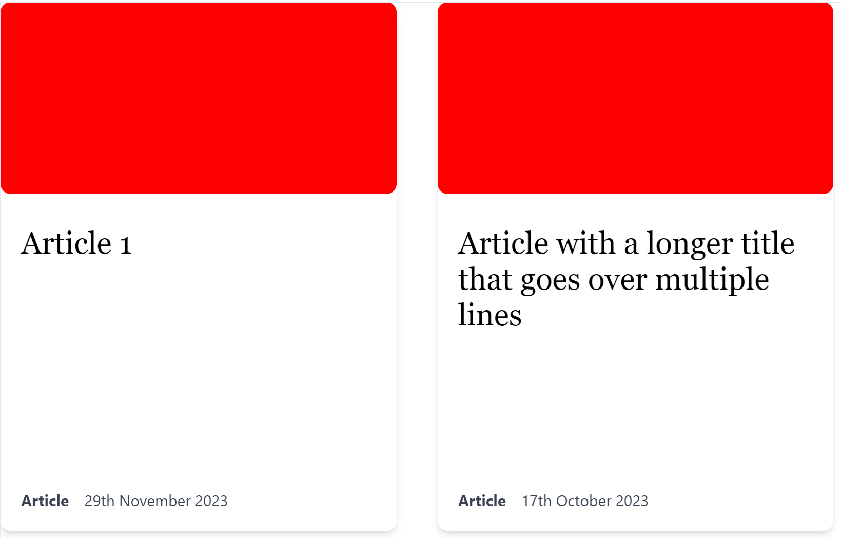
The problem is that there’s a load of unwanted white space between the title and the footer of each card. Possibly relatedly, the red box (what would be an image on the real site) is not showing at the full h-64 height.

Can anyone help me identify what’s introducing this extra whitespace?

2

Answers


  1. Chosen as BEST ANSWER

    I worked out that the problem was using h-full on the div that surrounded the title and metadata. Changing that to flex-1 retains the desired elements of making the cards equal height with space between the title and metadata, but without adding unintended extra whitespace.

    <script src="https://cdn.tailwindcss.com/3.4.1"></script>
    
    <ul class="grid grid-cols-3 justify-center justify-items-center gap-x-8 gap-y-8">
      <li class="w-full">
        <div class="border-iwsr-blue flex h-full flex-col gap-2 overflow-hidden rounded-lg shadow-md">
          <div class="relative h-64 w-full overflow-hidden rounded-lg"><div class="h-full w-full" style="background:red"></div></div>
          <div class="flex flex-1 w-full flex-col p-4">
            <div class="flex h-full flex-col justify-between">
              <div class="pb-2 font-serif text-2xl leading-7">Article 1</div>
    
              <div class="mt-2 text-xs text-gray-700"><span class="mr-3 font-bold">Article</span>29th May 2023</div>
            </div>
          </div>
        </div>
      </li>
      <li class="w-full">
        <div class="border-iwsr-blue flex h-full flex-col gap-2 overflow-hidden rounded-lg shadow-md">
          <div class="relative h-64 w-full overflow-hidden rounded-lg">
            <div class="h-full w-full" style="background:red"></div>
          </div>
          <div class="flex flex-1 w-full flex-col p-4">
            <div class="flex h-full flex-col justify-between">
              <div class="pb-2 font-serif text-2xl leading-7">Article with a longer title that goes over multiple lines</div>
    
              <div class="mt-2 text-xs text-gray-700"><span class="mr-3 font-bold">Article</span>17th October 2023</div>
            </div>
          </div>
        </div>
      </li>
    </ul>


  2. The white space is caused by the fact that the elements are taller than the content, and the vertical flex layout parent of the title and footer has justify-content: space-between applied via the justify-between class. You could consider removing this class to remove the whitespace between the title and footer:

    <script src="https://cdn.tailwindcss.com/3.4.1"></script>
    
    <ul class="grid grid-cols-3 justify-center justify-items-center gap-x-8 gap-y-8">
      <li class="w-full">
        <div class="border-iwsr-blue flex h-full flex-col gap-2 overflow-hidden rounded-lg shadow-md">
          <div class="relative h-64 w-full overflow-hidden rounded-lg"><div class="h-full w-full" style="background:red"></div></div>
          <div class="flex h-full w-full flex-col p-4">
            <div class="flex h-full flex-col">
              <div class="pb-2 font-serif text-2xl leading-7">Article 1</div>
    
              <div class="mt-2 text-xs text-gray-700"><span class="mr-3 font-bold">Article</span>29th November 2023</div>
            </div>
          </div>
        </div>
      </li>
      <li class="w-full">
        <div class="border-iwsr-blue flex h-full flex-col gap-2 overflow-hidden rounded-lg shadow-md">
          <div class="relative h-64 w-full overflow-hidden rounded-lg">
            <div class="h-full w-full" style="background:red"></div>
          </div>
          <div class="flex h-full w-full flex-col p-4">
            <div class="flex h-full flex-col">
              <div class="pb-2 font-serif text-2xl leading-7">Article with a longer title that goes over multiple lines</div>
    
              <div class="mt-2 text-xs text-gray-700"><span class="mr-3 font-bold">Article</span>17th October 2023</div>
            </div>
          </div>
        </div>
      </li>
    </ul>

    And/or you could reduce the heights of the element parents so that they are only as tall as the content they encompass by removing some the height: 100% values being applied to some elements:

    <script src="https://cdn.tailwindcss.com/3.4.1"></script>
    
    <ul class="grid grid-cols-3 justify-center justify-items-center gap-x-8 gap-y-8">
      <li class="w-full self-start">
        <div class="border-iwsr-blue flex h-full flex-col gap-2 overflow-hidden rounded-lg shadow-md">
          <div class="relative h-64 w-full overflow-hidden rounded-lg"><div class="h-full w-full" style="background:red"></div></div>
          <div class="flex w-full flex-col p-4">
            <div class="flex h-full flex-col">
              <div class="pb-2 font-serif text-2xl leading-7">Article 1</div>
    
              <div class="mt-2 text-xs text-gray-700"><span class="mr-3 font-bold">Article</span>29th November 2023</div>
            </div>
          </div>
        </div>
      </li>
      <li class="w-full self-start">
        <div class="border-iwsr-blue flex h-full flex-col gap-2 overflow-hidden rounded-lg shadow-md">
          <div class="relative h-64 w-full overflow-hidden rounded-lg">
            <div class="h-full w-full" style="background:red"></div>
          </div>
          <div class="flex w-full flex-col p-4">
            <div class="flex h-full flex-col">
              <div class="pb-2 font-serif text-2xl leading-7">Article with a longer title that goes over multiple lines</div>
    
              <div class="mt-2 text-xs text-gray-700"><span class="mr-3 font-bold">Article</span>17th October 2023</div>
            </div>
          </div>
        </div>
      </li>
    </ul>
    Login or Signup to reply.
Please signup or login to give your own answer.
Back To Top
Search