 Question posted in


EDIT: My website can be found at http://caconline.ca/.
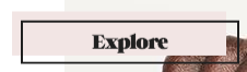
I’m currently revamping a website for a school club using Elementor on WordPress. Basically, I want to achieve an effect that can be found on the buttons on the website http://www.fleshbeauty.com. When you hover on any one of the buttons that has a black border around it, you can see a light pink drop-shadow that is pushed a bit upon hover. I’m trying to achieve that same effect on my school club’s website, but reversed – so the regular button would have a red-coloured fill already, and when you hover on the button, a border will appear that is pushed a bit from the button.
One of the solutions I found so far was to use the ::before selector in the custom CSS, but Elementor doesn’t recognize it.
This is what my code looks like so far:
a.elementor-button-link.elementor-button.elementor-size-xl:hover {
z-index: -1;
border: 3px solid #000000;
margin: -10px -10px 10px 10px; }
And again, this is what I want my desired result to look like, but reversed:
Any help is appreciated. Thank you!
2
Answers
I’m not completely sure I understand you correctly. But I tried to recreate what I think you wanted.
https://codepen.io/Lumnezia/pen/wNZvaZ
( Also here is another version, where the text will move with the border aswell
https://codepen.io/Lumnezia/pen/KJYKad )
If you have any questions on how to use ::after or ::before, feel free to drop a comment. The code should be rather simple if you have a basic understanding of CSS.
It would be better if you add your html and css, here is something which I understand from your question.