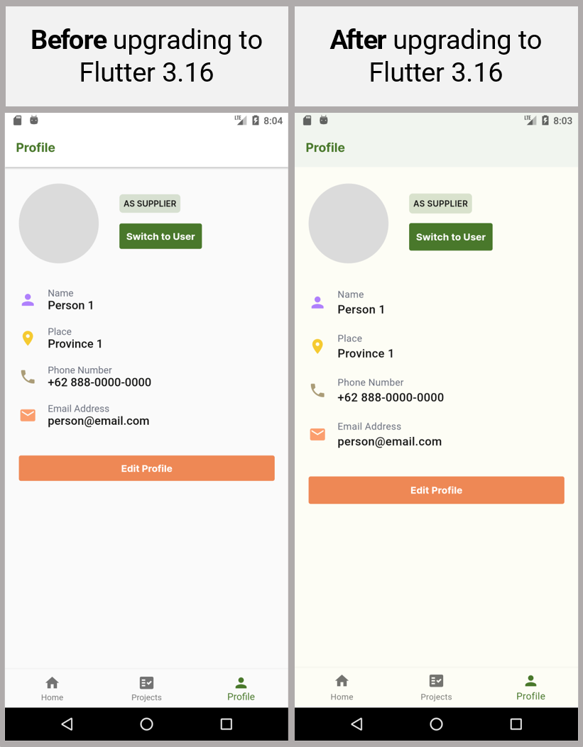
I upgraded my Flutter version to 3.16. When I run my app, I notice a lot of changes in the UI.
- The app bar doesn’t have shadows anymore. When I scroll, the app bar is now tinted with a color and shown without shadows.
- The background of the body was previously white, but now it’s a bit tinted with a color.
- Buttons and spaces appear to be larger now.
- Alert dialogs, time pickers, date pickers, and other material components look different now. They appear with a tinted light purple color (or the color from theme I’m using).
How do I get the same UI appearance as I had before the upgrade to Flutter 3.16?


2
Answers
This is the result of using Material 3, which is enabled by default since Flutter 3.16. It's one of the breaking changes from the Flutter 3.16 update.
You can opt out of Material 3 by specifying
useMaterial3: falsein yourThemeData:To see the differences between Material 2 and Material 3, go to this interactive demo: https://flutter.github.io/samples/web/material_3_demo/#/
To see all the breaking changes in the Flutter 3.16 update, go to this link: https://docs.flutter.dev/release/breaking-changes#released-in-flutter-316
Yes, Material 3 is enabled by default since Flutter 3.16. So, to fix it, you can disable Material 3 as shown below or you can change the default value in your AppTheme like this:
This example is for the BottomSheet, but you can do it for all your widgets.